• Get Inspired
  • Design Matters
  • Luxembourg Matters
  • About Me
Menu

Foundations & Facades

Design Thoughts
From the Edge
Of Luxembourg
Design - Property - Urban Spaces

Your Custom Text Here

Foundations & Facades

  • Get Inspired
  • Design Matters
  • Luxembourg Matters
  • About Me

Village Hearts and Stone Spires: Inherited Luxury

May 22, 2025 Helen Krauss

Silence, slate, and a cat with territorial confidence - climbing the village centre steps towards something older than memory.

There’s a certain silence you only find near old churches. Not the absence of sound, but a kind of acoustic environment. Slate underfoot. Bell chimes overhead. A cat crosses the street like it owns the place. Nothing urgent, nothing rushed. Just the quiet pulse of a village that still remembers where it began.

It’s the kind of setting you don’t notice on Instagram. There are no dramatic views. No rooftop Jacuzzis. Just age, presence, and a sense that life has been folding itself quietly into this corner of the world for centuries.

In many countries, this is exactly the kind of place people seek out. A house near the village church is considered a cultural asset, a premium slice of real estate, not a logistical compromise. You’re in the heart of things, not on the edge. And the heart still matters.

Centre Stage, Historically

Churches weren’t just religious landmarks. They were the original anchor tenants. The spiritual, architectural, and social core of the town or village. People gathered there, not just to pray, but to marry, to chat, to flirt, to grieve, to hear the latest gossip and make some of their own.

In the UK, houses with “church views” routinely appear in property listings with a knowing wink, a visual shortcut for charm, heritage, and status. You don’t need to go to church to want to live beside one. It’s about landscape and layering - the pleasure of opening your window onto something that matters.

In Germany, it’s even more structured: the “Altstadt”, the old town, is protected, prized, and often expensive. Market squares, timber frames, fountains, spires. These aren’t relics; they’re assets. Living there isn’t quaint, it’s a lifestyle.

In Mediterranean countries like Italy and Spain, the church piazza is the beating heart of daily life. Shops, cafés, old men playing cards, children chasing pigeons, life happens in concentric circles around that stone square.

Real estate in those zones is highly coveted and premium. Not despite the church. Because of it.

And in places like Cambridge, where I once studied, even the smallest old houses are treated as part of a protected cultural fabric. No one would dream of tearing down a row of modest Victorian homes near Parker’s Piece to build something taller or shinier. It would feel absurd. Because heritage isn’t about grandeur. It’s about continuity.

Even under Mediterranean skies, the church remains the social and spatial compass — a reminder that beauty and orientation are not mutually exclusive.

And Yet, We Drift

Somewhere along the line, in some places more than others, we forgot.

Village centres became less popular. Parking is tight. The streets are narrow. It is not car centric. And so, slowly, the gravitational pull shifted. New builds sprouted on the edges. Houses came with garages, driveways, fences and silence - the curated kind, not the organic kind. And the old core? That was left to the romantics.

Maybe we thought we were modernising. Maybe we were just drifting. Like buying bigger jeans instead of questioning the dessert menu.

Architectural Harmony

One overlooked joy of living near a historic church is the quiet coherence of the built environment. These homes weren’t designed to impress on their own; they were designed to belong. Proportions align. Materials echo one another. Roof angles respond to bell towers. The effect is a kind of architectural ensemble, less like a showroom, more like a symphony. Camillo Sitte, the 19th century Austrian city planner and architect, would have approved and argued fiercely for it. Read more here.

Architecture as conversation: windows, stones, and streets in harmonious dialogue. Camillo Sitte would nod in approval.

Modern developments often strive for contrast or novelty. But there’s a different kind of beauty in streetscapes that have evolved over time, where even the imperfections feel orchestrated.

Camillo Sitte would have looked at today's housing estates with their identical facades and mathematically perfect spacing and likely suffered an aesthetic breakdown. He understood that beauty in urban spaces comes from informed irregularity, not cookie-cutter precision.

Living Memory

A house in the village centre, near the church, isn’t just well-situated. It’s rooted.

There’s continuity in hearing the bell chime on weekends. In knowing which neighbour leaves for work before sunrise. In seeing the same crooked paving stone outside your front step and thinking: someone else noticed this, a hundred years ago.

Light behaves differently in the village centre. It bounces off pale pastel stone façades. It catches iron railings. It filters through vines that have seen more springs than you have. And the buildings? They don’t compete for attention. They frame one another, and you.

I’ve experienced this first-hand that moment when you're sipping coffee by the window and suddenly the church bells mark noon, and you realise you're sharing this exact acoustic experience with someone who lived in your house a century ago. There’s something unexpectedly grounding about that.

Churches are more than silhouettes. They’re emotional metronomes. They give a village a skyline - and a spine. Even if you’re not attending Sunday services, even if you don’t know the name of the priest, you still live in relation to the spire. It orients you.

And orientation, these days, is underrated, yet needed.

Social Texture

Village centres aren’t just spatially dense, they’re socially textured.

You don’t need grand gestures to feel connected. You need proximity. A wave from the woman opposite watering her plants. A dog barking in a front garden. The opening of shutters in the morning. A chat with your neighbour returning from a trip to the bakery.

You not only watch life happen from your window, you experience it through proximity and connection, but because it’s there. Real and uncurated. The rhythms of daily life unfolding in slow, familiar loops.

There is a recurring theme about “community” in abstract terms. But in the village centre, it’s not abstract. And sometimes five steps away when you realise you’ve forgotten the salt.

Morning light glances off the canals of Bruges, while the towering church quietly anchors the scene — proof that charm and structure can coexist.

The Real Luxury

We talk a lot about luxury in real estate. Space. Light. Privacy. Amenities. A house in the village centre can give you all that and more.

There’s another kind of luxury that comes from living somewhere with memory. Somewhere that didn’t appear on a spreadsheet two years ago but grew over generations.

The discerning buyer understands that true luxury isn’t manufactured, it’s inherited. A home near a historic church offers something no developer can replicate: authenticity.

It’s the difference between buying new furniture and living with pieces that have been inherited, passed down, marked by use and meaning.

While cookie-cutter developments rise and fall with market trends, homes with historic context and architectural integrity tend to hold their value through economic cycles. They’re the blue chips of real estate.

Because the ultimate amenity might not be underfloor heating or a wine fridge. It might be walking home past the church on a foggy evening and realising you’re part of something older, and possibly wiser, than you.

Final Thought: Maybe the Centre Still Holds

We’ve built enough cul-de-sacs. Enough garage-fronted rows. Enough places designed to be left.

Maybe it’s time to return to the centre, physically and culturally. To see village churches and the surrounding centre not as inconveniences but as ensembles, as indicators. Not as outdated anchors, but as steady ones.

Because what we’ve lost in efficiency, we might gain back in human scale. In coherence.

And who knows, maybe that old house near the church isn’t just a leftover from the past.

Maybe it’s the beginning of something better.

In Design Matters
Comment

Our New Roof: Slate, Supervision, and A Fear of Heights

May 19, 2025 Helen Krauss

There’s something humbling about realising your house is taller than you thought. Thirteen metres, to be exact, from ground to rooftop on the gable side (Giebelseite, if we’re being technical). Not that we’d measured it before. It was just... our house. You live inside it, not on top of it. Until you suddenly have to.

We only became intimately acquainted with its full height when scaffolding arrived. Poles, platforms, metallic clinks at 7 a.m., and the peculiar intimacy of strangers peering into your upstairs windows while you’re still making coffee. The roofers had promised a two-week job - efficient, clean, no fuss. They said it with the confidence of men who assumed we wouldn’t be checking.

And to be fair, who checks a roof? Most people don’t. That’s sort of the point of a roof: you forget about it, until it fails.

But we didn’t forget. We climbed. We looked. We photographed. We had an expert on call. And we quickly discovered that our gable side, high, hidden, and far from street view, was being treated like a blind spot. A perfect place, in other words, to skip a few steps, cut a few corners, and assume no one would notice.

They were wrong.

Because here’s what we’d learned from other renovations: just because something is out of sight doesn’t mean it should be out of mind. Especially when it’s holding the house together.

So we did what any design-obsessed, renovation-weary homeowners would do: we took a holiday. But not the relaxing kind. The kind where you spend your mornings documenting zinc flashing and your afternoons decoding builder small talk. We were there every day - balancing on a blank with a clipboard and clenched jaw.  And slowly, the work began to match the promise.

Also, I should mention: I have a mild fear of heights. That fear did not appreciate climbing scaffoldings at seven in the morning to peer over details with a cup of coffee in one hand and my phone camera in the other. But necessity is a powerful motivator.

By week three, the two-week project had become five. But something else had changed, too: the roof was beginning to look… right. Precise. Like it belonged not just on any house, but on this house, with its tall silhouette, its quiet grandeur, and its long memory.

And after all the scaffolding, setbacks, and sideways glances, our house was finally getting the roof it deserved.

Slate: A Short Cultural History (and a Subtle Status Marker)

Slate is one of those materials that doesn’t shout. It doesn’t gleam like zinc or flash like copper. But its dignity is unmistakable. For centuries, slate has covered everything from grand civic buildings to quiet mountain homes. It’s the roof you choose when you want something to last, and when you’re not trying to impress anyone but yourself.

Historically, slate was expensive to quarry, difficult to transport, and even trickier to install. Which is why it was often found on properties that mattered - architecturally, symbolically, or socially. In much of Europe, a slate roof was a mark of distinction.

We opted for high-quality natural slate from Spain, dense, dark grey, smooth-textured, and with excellent longevity. Compared to softer varieties from other regions, this one ages gracefully and holds up beautifully in Luxembourg’s climate.

Which brings us to the 1960s and ’70s. A time of mass construction and minimal budgets. Eternit, that eternally problematic fibre cement product, was everywhere. Light, cheap, and often riddled with asbestos, it became the default choice for developers and budget-conscious owners alike. Our house, like many others, had been “updated” in that era with a practical but joyless grey Eternit roof. Function? Yes. Charm? Not exactly.

So when the time came to replace it, we didn’t just want new tiles. We wanted to restore a level of grandeur. We wanted slate.

The Details They Don’t Tell You

Here’s something most roofing companies won’t advertise: the devil is in the details. And if you don’t ask about them, you won’t get them.

You’d think a new roof quote would include information about the metalwork - what material is being used for gutters, downpipes, and flashing. But no. Unless you insist, you’ll get the cheapest possible option. Aluminium, or worse. Thin, generic, and guaranteed to corrode or buckle within a few years.

We recommend Rheinzink. And proper Spenglerarbeiten. No shortcuts.

And we learned something else: most sample tiles they show you are meaningless unless you understand what you’re looking at. There’s Spanish slate, Brazilian slate, Welsh slate, all wildly different in durability, colour, porosity, and finish. Some age gracefully. Others age like milk.

Slate, to its credit, also wins on sustainability. It’s a natural material, non-toxic, recyclable, and incredibly long-lived, often 80 to 100 years or more. Compare that to synthetic options or fibre cement with 15–30 year lifespans and it’s clear: slate isn’t just beautiful, it’s ecological common sense.

So we did our research. We wandered the neighbourhood. We photographed good roofs. We found examples we liked and referenced them in every conversation. If the roofer looked surprised, that was a good sign. It meant we were on the right track.

Supervise. Supervise. Supervise.

There’s no polite way to say it: our roofers were lazy. Not catastrophically bad, just complacent. They assumed the height of the house would protect them from scrutiny. They weren’t prepared for homeowners with a camera, a daily checklist, and the preparedness to call an expert if needed.

We caught small things: uneven edges, inconsistent spacing, rushed detailing around the dormers. And we flagged them all. Calmly, professionally - and persistently.

And then there were the comic moments. Us showing up out of nowhere, smiling brightly and offering coffee, while they hastily tried to cover up some slapdash shortcut they’d hoped we wouldn’t notice. Or the way they looked slightly guilty, like children caught drawing on the walls - which, to be fair, they were doing, just with slate.

And on the final day, we stood in front of the house with a bottle of wine and some chocolates, trying to wrap things up graciously. They smiled back, all wide-eyed sincerity, and said: “Wir haben das Maximum für euch rausgeholt.”

We smiled. Froze a little. Perhaps twitched. Because what they meant was: We tried our best for you. But what we heard, standing there in awkward silence, was: we squeezed the maximum out of you. And they did. Imagine the exhaustion after this daily climbing marathon for five weeks!

A Roof Reborn

The state of the roof when we bought the house: old Eternit tiles and in overall bad state.

The finished slate roof doesn’t shout. But it doesn’t need to.

It frames the house with quiet elegance. It reflects the sky in soft, matte blues. It anchors the structure in a way that the old Eternit never could. And it signals to those who care to look, that someone paid attention. That this house was worth it.

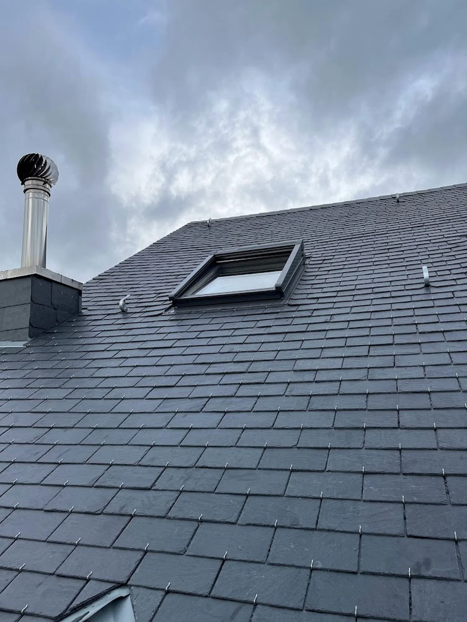
Year 2022: The new slate roof in all its glory. What a change and it will hopefully hold for another 100 years.

Yes, it cost more. Yes, it took longer. And yes, it required daily vigilance, an uncanny ability to detect laziness from a distance, and a surprising number of emails about how to put slate on a roof.

But it was worth it.

Because quality always is, especially when it’s attached to a building with soul.

We don’t know what kind of roof it had in 1870. But we know what it has now: one that will last, one that belongs, and one that finally matches the architectural soul of the building beneath it.

Final Thought: Restoration Requires Care, Respect and Long-term Thinking

A good roof isn’t just protection from the rain. It’s a declaration of care, of values, of design integrity. It’s what happens when you treat a house not as a commodity, but as a story worth preserving.

This approach of demanding quality, respecting character, and thinking long-term, applies to every part of restoration. Whether you’re choosing tiles, plastering walls, or defending a crooked doorway from demolition logic, the philosophy is the same: build with care. Renovate with conscience. And supervise like your dignity depends on it.

Because sometimes, it does.

written by Helen M. Krauss

In Design Matters
Comment

The Old House Paradox: Why Tearing Down Is Tearing Us Apart

May 12, 2025 Helen Krauss

The Wrecking Ball in Action!

I stood across the street, watching dust rise where a house used to be.

It wasn’t particularly grand. Not listed. Not the kind of place that would end up in a glossy book on European architecture. But it had charm. Wooden shutters, modest proportions, an old iron railing wrapped in ivy. A house you wouldn’t notice unless you cared. And clearly, nobody did. Because now it’s gone.

In its place: nothing yet. Just churned soil and a developer’s sign promising “Prestige Living in Luxembourg”. Prestige, in this case, soon to be rendered in beige render, perforated aluminium, and a strangely hostile number of balconies.Because nothing says “luxurious living” quite like a façade that looks perpetually annoyed.

We demolish quickly. We build quickly. But we lose slowly.

From Façades to Forgetting

Luxembourg has perfected a curious contradiction: we revere our castle ruins while casually signing demolition permits for heritage homes that are perfectly sound. We speak of national identity, of rootedness, of preserving the Luxembourgish language, and then we bulldoze the built evidence of the people who spoke it.

Call it cultural amnesia, paved in granite and LED spotlights.

There was a time when buildings were repaired. Adapted. Reused. But somewhere along the way, preservation became an inconvenience. And demolition? A default.

Walk through towns and village centres today. Count the original buildings. Then count the new white cubes.

The math tells a story, doesn’t it?

What Are We Really Replacing?

In Luxembourg demolition has become the go-to gesture for "improvement." Tear down a villa from the 1930s, possibly with hand-crafted stonework, mature trees, maybe even a story, and replace it with six flats, all priced for investors. The gain is financial. The loss is everything else.

Architecture used to be part of memory. Now it’s just a placeholder until the next build. We are flattening character for yield. And the result?

A landscape that feels newer, taller, shinier - and somehow emptier. Like a new smartphone that's somehow less satisfying than the one it replaced, despite the extra camera lenses.

When did we decide that a 1950s villa had nothing to teach us? That a century-old façade had nothing to show us?

The Book Metaphor, or Why Not Every Story Needs a Sequel

Think of buildings as books.

Some are classics. They deserve to be preserved, re-read, passed on. Others could use revision: a new foreword, a cleaned-up layout, better margins. But very few need to be pulped.

And yet, that’s how we treat them. Entire buildings tossed aside, as if what they offered - their story, their materials, their place in the streetscape - had no value.

As if beauty and proportion could be reproduced in a 3D BIM file and slapped onto a concrete box. Spoiler: they can’t. That’s like saying you can replace Hemingway with ChatGPT. The words might be there, but something essential is missing.

Elsewhere in Europe, They Chose to Read

Vienna has quietly renovated hundreds of thousands of homes, many still occupied during works, preserving neighbourhoods and affordability alike. In Paris and Bordeaux, architects like Lacaton & Vassal have added space and dignity to social housing blocks without evicting a single resident or demolishing a wall.

In Brussels, office towers have been turned into housing with breathtaking speed and minimal carbon cost.

They chose to read what was already there. To edit, not erase.

And the result? Cities that feel like cities, not PowerPoint decks with balconies and investor brochures that somehow became three-dimensional.

Meanwhile here...

Here, demolition is often speculative. Developers knock down before they know what they’re building. Sometimes before they secure financing. That’s how you end up with half-finished holes in the ground where beautiful buildings used to stand.

Like the Hôtel du Grand Chef in Mondorf, a graceful structure that held both memory and presence. It was partially demolished for a luxury flat project that later stalled. And the new apartments? Not even built.

A Wealthy Country That Demolishes Its Wealth

Luxembourg is one of the richest countries in Europe. We can afford to preserve. We can afford to renovate.

And yet, we behave like a place in a rush - to replace, to erase, to sell.

It’s as if we’ve collectively decided that architectural character is the one luxury we can’t afford. We apply for EU heritage status while destroying the ordinary buildings that make our towns liveable.

We talk about housing shortages while letting vacant buildings rot. Or worse: tear them down to build five unaffordable units in their place.

It’s not just short-sighted. It’s absurd.

Demolition, Sitte, and the Aesthetic Undercomplexity of It All

Camillo Sitte once warned against cities becoming too geometrically clean, too orderly, too stripped of layers. He championed the complexity of lived-in space, the richness that comes from history pressing up against the present.

Demolition, especially when done en masse, flattens that complexity. It replaces narrative with neutrality. Texture with efficiency.

In short, it gives us the very aesthetic undercomplexity that Sitte spent his career warning against.

And we’re doing it not out of need, but out of habit.

So What Are We Really Preserving?

Preserving a building isn’t about nostalgia. It’s about continuity. It’s about trusting that not everything valuable must be new. That age can mean richness. That imperfection can be beautiful.

When we demolish indiscriminately, we erase the physical proof that someone was here before us - someone who built, lived, planted, repaired, walked the same pavement.

We erase context. We erase continuity. We erase past.

And it’s not just a personal concern. Across Europe, and now in Luxembourg too, citizens are beginning to push back. The HouseEurope! Initiative, recently launched with support from Luxembourg’s architects, planners, and cultural organisations, calls for exactly this shift: renovation over demolition, care over erasure.

Their message is simple: stop wasting buildings, stop wasting identity, and start seeing the value that’s already there.

Final Thought: What Would a Renovation Culture Look Like?

Imagine if, instead of tearing down and starting over, we chose to see what already exists - really see it. Its weight, its craft, its quiet presence on the street.

Imagine a Luxembourg where architects and developers were required to live in what they build. Where investors couldn’t demolish until they proved renovation wasn’t possible. Where our first instinct wasn’t clearance, but care.

Maybe we should measure cities not by what they built and add to their skylines, but by what they choose to keep.

By how generously they repair. By what they refuse to throw away.

Because in the end, saving a building saves more than just stone and timber.

It saves a story.

And maybe, if we’re lucky, our place in it.


written by Helen M. Krauss

In Design Matters
Comment

Camillo Sitte and the Case for Complexity: Why Your Brain Prefers Winding Streets Over Wide Open Nothingness

May 3, 2025 Helen Krauss

There’s a strange little thing that happens when you walk through certain places. You turn a corner. You stop. You linger. Not because the signage tells you to. But because the space invites you. Makes you curious to explore.

It’s not the café. It’s not the cathedral. It’s the composition. Another example is the small moselle town of Remich here in Luxembourg: The old centre has small little openings and winding tiny footpaths between houses. They pique your interest, you feel the impulse to explore and find out where the path leads. Irresistible.

Camillo Sitte (1843 - 1903), the Austrian urban planner with more common sense than most modern zoning boards combined, understood that.

Back in 1889, he wrote “Der Städtebau nach seinen künstlerischen Grundsätzen” (“City Building According to its Artistic Fundamentals”) and argued, quite radically, for his time, that cities should be designed like art, not spreadsheets.

Today, you wouldn’t know it.

Walk through most new developments in Luxembourg (or anywhere else where the planning software and developers get more say than the people).

What do you see?

Vast spaces. Flat façades. Identikit balconies, doors and garages. Colours mostly white and grey. A tragic excess of “rational layout.” It’s not offensive. But it’s not beautiful either. It’s just... there.

And as Sitte might have said: beauty rarely comes from “just there.”

Aesthetic Undercomplexity - Or Why Bland Hurts

Sitte didn’t use the phrase “ästhetische Unterkomplexität” himself, that came later, but he would’ve nodded in grim agreement and everything he wrote was a rejection of it.

He believed that when we strip cities of visual richness, variation, and spatial rhythm, we’re not simplifying, we’re impoverishing.

The plazas and streets he admired weren’t efficient. They were emotionally intelligent.

Irregular. Enclosed. Multi-perspectival. They played with light, surprise, and scale. They created places where people actually wanted to pause. To stay. To belong.

That's why his body of work speaks to me. I lived in quite a few places, and the ones which stuck in my mind and still fill me with longing sometimes, are the ones with aesthetic layering, with delicious visual complexity. They hold your attention in a curious way, they give your mind space to think while anchored by buildings, like for instance, the Heath in Blackheath Village, London.

The village for intimacy, cosiness, human scale, and the heath to expand your mind. All within a bustling city. I believe, you know that a place works when you live there for years and years and still it touches and delights you. 

Compare that to today’s planning: functional rectangles with generous parking and zero soul.

Further, mixed use according to a PAG in Luxembourg also often means in practice: the bakery and the yoga studio share a concrete wall in a building that looks like a converted insurance office. Interspersed with Bauhaus style bland residences. People come and go, but no one ever stays.

The Science Backs Him Up

Modern neuroscience research agrees with Sitte. Our brains are wired to respond to complexity, not chaos, but structured variation.

Environments with texture, depth, and contrast stimulate cognitive activity and emotional well-being. Flatness, uniformity, repetition? That’s how you drain a person’s spirit without saying a word.

No wonder people flee the village core the moment it’s filled with new “units.” The rhythm is gone. The charm evaporates. And nobody wants to live inside an Excel file.

From Vienna to the PAG

It’s curious, really. Sitte was writing in Vienna, a city that still carries layers of old urban intelligence in its bones. But his insights land sharply here in Luxembourg, too - especially in how village centres are being “densified.”

I look out from my own house and see what’s coming. Not bad intentions. Just bad proportions. The idea that function alone is enough to create place.

But we know better.

We’ve walked the streets that work. The ones that hold you, soften you, surprise you. They’re not accidents. They’re compositions. Spatial symphonies. And Sitte understood that and could compose the music.

Final Thought: Complexity Is Not a Flaw

We don’t need more diagrams. We don’t need more Bauhaus architecture. We need more delight.

Camillo Sitte knew that beauty wasn’t a luxury. It was the organising principle. Without it, cities may function, but they will never sing.

And honestly, when was the last time a zoning plan gave you goosebumps?

written by Helen M. Krauss

In Design Matters
Comment

“Packing Them In”: A Short Cultural History of Density

May 1, 2025 Helen Krauss

Why today's approach to housing density misses the lessons of centuries.

We’ve heard the sermon by now:

Density is good. It’s sustainable. It saves land. It prevents urban sprawl. It encourages neighbourly interactions, public transport, shared infrastructure. And when done well, it can indeed be a triumph of urban design - think of the historic cores of Florence or Lisbon.

But then there’s modern density.

The kind that slips in under the banner of “smart growth” and “vibrant communities”, only to materialize as a few dozen small flats wedged into what used to be a family home with garden, character, and breathing space. The kind where you start hearing every single cough, argument, and phone notification from next door. The kind where public space becomes private smoking territory, and staircases turn into daily theatre.

Somewhere between Vitruvius, the famous Roman architect, and value engineering, something went very wrong.

To understand where today's density goes wrong, we need to look at where historical density got it right.

A Brief History of Living Close

Let’s be clear: humans have lived densely for millennia. Ancient cities were tightly packed. Medieval towns were rabbit warrens of overlapping lives. In many ways, we’re wired for proximity, it’s where culture happens. Where the market buzzes, the festival spills into the street, and ideas rub elbows with one another. Density, in theory, is not the problem.

But in historic high-density environments, craft met constraint. Narrow alleyways gave way to beautiful courtyards. Buildings touched, but they were lovingly detailed. Streets bustled, but were scaled to humans, not delivery vans. The density was social, architectural, and artisanal. Not just numerical.

Density, the old-fashioned way. Tight quarters, but with restraint and respect.

What we see today is something completely different: a soulless spreadsheet density.

Take, for example, the recent developments here in Luxembourg, where single-family homes were replaced by apartment buildings with lots of small apartments. The developer's brochure calls it “luxury urban living”. The neighbours call it something else entirely. This isn't just a housing solution - it's a cultural imposition.

Measured in units per hectare, not quality per square metre. A top-down policy logic that says “add housing”, without stopping to ask what kind of housing, for whom, in what kind of cultural fabric?

Density vs. Dignity

In Luxembourg, as in many parts of Europe, the solution to housing shortages has been to densify, especially in town and village centres. That means knocking down older homes, slicing up gardens, and putting up apartment blocks in places where the streets were never meant to absorb them.

But we might ask: what kind of future are we implanting?

Because density, if not culturally calibrated, creates tension. Not always the creative kind.

In a country where politeness isn’t exactly an Olympic sport, where noise tolerance is low but building ambition is high, crowding people into tighter quarters doesn’t magically produce urbanity.

It produces friction. Frustration. And more “for sale” signs from those who can afford to flee.

And if the town or village core becomes the default location for this kind of urban pressure, if the old houses and tight lanes are endlessly re-divided and re-coded, then density becomes just another word for dumping.

Lessons from the Past (That We're Ignoring)

The best historical densities didn’t just “fit more people.” They built entire cultures of cohabitation. Shared wells. Arcades. Covered passages. Passive cooling. Shade. Ornament. Large gardens visible from the street. There was density, but with lots of advantages and quality of life.

And crucially: there was a social contract. Behavioural norms. Town planning rooted in how people actually lived - not just what a developer could squeeze in with a rubber-stamp permit and a traffic flow Diagramme.

This social contract wasn't just implicit - it was often codified in local customs, guild regulations, and community expectations. Neighbours knew when to be quiet, when communal spaces could be used for private purposes, and how to negotiate the inevitable frictions of proximity. These weren't just buildings close together; they were communities designed for sustainable coexistence over generations. In a nutshell: People knew how to behave, and this cannot often said for people living close together these days.

Today, we skip the soft parts. We build for headcount, not hospitality. For ROI, not rhythm. Then we act surprised when people feel overwhelmed, boxed in, irritated - or simply leave.

Welcome to spreadsheet urbanism. Geometry: perfect. Humanity: optional.

Final Thoughts: Build Closer, But Build Better

Density isn’t the enemy. But mediocrity design and thought is.

And density without creative design, without the cultural infrastructure that makes close living humane - is simply just one thing: crowding and overcrowding.

Let’s not confuse tight spacing with smart planning.

And let’s stop pretending that stuffing old villages or town centres with flats is automatically progress.

Sometimes it's just a failure of imagination, a lack of understanding of human nature, of cultural understanding, and of long-term thinking.

The real challenge isn't “packing”more people in. It's creating spaces where proximity fosters community rather than conflict, where density enhances rather than diminishes.

Better urban planning would make Luxembourg special. And it is a shame to watch the old adage that money can’t buy imagination.

written by Helen M. Krauss

In Design Matters
Comment

Kintsugi: Cracked, Not Broken. Why cracks in old houses might be the best part

April 30, 2025 Helen Krauss

In traditional Kintsugi, the break is never concealed. Instead, it’s elevated and transformed into beauty through gold.

We live in an age obsessed with flawlessness. Smooth surfaces. Clean lines. Hidden wiring. Hidden lives. When something breaks, we replace it. When a wall cracks, we panic. When a house shows its age, we pretend it’s a tragedy.

But maybe we’re seeing it all wrong.

The Japanese principle of Kintsugi offers a quiet rebellion against this modern logic. Instead of hiding breakage, it honours it. A broken bowl isn’t discarded, it’s repaired with gold.

The crack becomes the highlight. The history becomes the beauty.

Cracked, not broken. Like homes, like people. Kintsugi reminds us that visible scars can be marks of strength, not shame.

And what if we applied that thinking not just to ceramics, but to our built environment?

What if cracked walls, sagging beams, and awkward extensions weren’t signs of failure, but resilience? Markers of life lived, challenges overcome, structures that refused to give in?

Old houses in Luxembourg have certainly had their share of cracks. War, poverty, neglect, unspeakable tile choices from the 1970s. But still they stand.

And when we renovate them, we often obsess about restoring them to a better past, or worse, dragging them into a sterile present. We straighten, rewire, reframe. But rarely do we let the scars show.

Why?

Do we really believe that imperfection is a threat to value?

Or are we just afraid to admit that beauty can come with a crack, and meaning with a scar?

Hormesis and Houses

Science has a term for this too: hormesis. It’s the paradoxical idea that a reasonable amount of stress makes you stronger. Muscles grow when torn. Immunity builds through exposure. Even wine, in moderate amounts, is better than abstinence (according to some optimistic studies and several winemakers).

What if houses - like humans - respond to stress not just by breaking, but by evolving?

What if that dodgy back room you had to rebuild from the ground up is now the warmest, most characterful part of the house?

What if the awkward hallway you hated at first now frames your favourite view of the garden?

Renovation is rarely smooth. Anyone who’s lived through it knows this. Things go wrong. Budgets burst. You find a dead mouse and asbestos in the attic insulation and a 1982 copy of “Revue” behind the kitchen plasterboard. But over time, something shifts. You begin to see not just flaws, but stories. Not just repairs, but transformations.

What if buildings wore their damage proudly? Kintsugi architecture challenges our obsession with flawless surfaces.

The Gold Is in the Crack

Kintsugi teaches us that repair doesn’t have to be invisible. In fact, the most beautiful repairs are the ones that shine. In homes, that might mean leaving a patch of old wallpaper exposed. Keeping the doorframe that’s been worn by generations of shoulders and elbows. Leaving a ceiling beam just a little uneven, because it tells the truth of how the house stands. Or leaving old traditional cement tiles with little cracks, but still working, still beautiful.

This isn’t romantic nostalgia. It’s a design philosophy, one that challenges the cult of the new, the smooth, the soulless.

It says: value comes from survival. From story. From strength earned, not bought.

And it’s not just aesthetic. Embracing imperfection - thoughtfully, not sloppily - is also a form of rebellion against the disposable mindset that fuels both ecological damage and cultural amnesia.

A home that wears its history with pride doesn’t just shelter you. It teaches you. About patience. About context. About history. About Design.

Final Thought: Renovate Like a Philosopher

So the next time your house cracks - pause before you panic. Look again. Maybe it’s not damage. Maybe it’s gold.

And maybe, like you, the house will simply become stronger in the places where it once broke.

written by Helen M. Krauss


In Design Matters
Comment

Don't Fear Heating Historical Homes: Clever and Practical Solutions

April 29, 2025 Helen Krauss

The kind of entrance that makes you imagine mulled wine waiting just inside. Historical homes with clever heating solutions, are not only beautiful, but also warm.

The Cold Truth (and Why It Might Be Wrong)

Let’s address the seasonal elephant in the room: heating an older home. The mere idea seems to conjure up visions of cold toes, astronomical energy bills, and drafty corners where no blanket dares venture. But here’s the thing: much of that is myth.

I live in a house built in 1870. And while it certainly predates the concept of double glazing and central thermostats, it hasn’t sentenced us to a lifetime of shivering. Quite the opposite. With the right approach, it’s entirely possible to keep a historical house warm, cost-effective, and comfortable without gutting its soul.

Old Buildings: Smarter Than You Think

There’s a quiet logic in the way older homes were built. Thick stone walls, high ceilings, and clever ventilation weren’t aesthetic whims, they were part of a passive design system long before sustainability became a buzzword. These homes were designed to adapt, to breathe, to regulate temperature without any need for polystyrene-stuffed walls or humming devices that simulate fresh air.

Visitors to our former townhouse built in 1912 often commented on the freshness inside. It didn’t feel stale. It felt lived in, seasonal, somehow alive. That’s the genius of breathable walls: they allow a building to behave like the organic, evolving structure it is.

Embracing What You’ve Got (and Tweaking What You Need)

Let’s be honest: heating a historical home isn’t about doing nothing. It’s about working with what’s there, not against it. My approach is pragmatic, not purist. A little gas, a bit of wood, a touch of tech:

• The inherited gas boiler still serves a purpose, though we’ve reduced its role over time.

• Fireplaces are more than just romantic. Our two provide real warmth, atmosphere, and a reminder that heat doesn’t have to be invisible.

• Infra-red heating panels were the real surprise: sleek, silent, low-energy, and remarkably effective. They warm people and objects directly, not just the air, making them ideal for rooms that need a quick temperature boost.

No one system does everything. But together, they form a comfortable, balanced, and highly adaptable setup that doesn’t fight the house - it fits it.

Old meets new: Infrared panels blend discreetly into even the most elegant period interiors, bringing warmth without disturbing the aesthetic.

The Heat Pump Hype (and Why We’re Not Buying It)

Everyone loves a trend. And right now, heat pumps are the darling of the energy-efficiency world. But let’s pause. They’re not a one-size-fits-all solution, and certainly not for homes like ours.

They hum. They require invasive installations. Their bulky exterior units are no friend to a heritage facade. And while they work wonders in tightly sealed modern builds, they often feel like a technological mismatch in homes built to breathe, not suffocate.

That’s before you even get to the inflated price tag and the high maintenance costs.

Insulation Overload and the Myth of the "Sealed Box" Insulation is great. Until it isn’t.

Overdo it, especially with synthetic materials, and you risk turning a house into a damp, unhealthy box. Historic homes aren’t broken versions of modern ones. They’re different species entirely.

We need to stop judging them by modern standards and start appreciating what they already do well. Moisture regulation. Passive temperature balance. Air quality. You can boost comfort without suffocating the structure. Natural materials like cork, hemp, or even sheep’s wool offer solutions without forcing a 19th-century wall to act like a 21st-century one.

Proof that warmth doesn’t require compromise. A fire-lit 19th-century room, as comfortable as it is beautiful.

A Buyer’s Perspective

If you’re eyeing a historical property and wondering whether you’ll freeze through November, let me reassure you: you won’t. With a little common sense and a bit of care, these homes are every bit as comfortable, and in some ways more rewarding, than newer builds.

Ours, for instance, runs on a hybrid system: wood for soul, gas for backup, infra-red for precision. It’s efficient, elegant, and unobtrusive. You won’t find humming units or whirring fans. Just quiet, deliberate warmth that respects the house and your comfort equally.

Heating with Imagination (and Without Regret)

In a time when complexity is sold as innovation, there’s something wonderfully satisfying about a setup that works because it’s simple, not despite it. Historical homes don’t need saving. They need understanding.

So don’t fear the old walls. They’ve stood for centuries, weathered wars, seen fashions come and go. They’ll handle winter just fine, as long as you don’t try to turn them into something they’re not.

And if you need a little extra warmth? A well-placed panel, an extra log on the fire, and a cup of something hot usually does the trick.

What are your experiences with heating older homes? I would love to hear how you’ve made your house a warm home.

written by Helen M. Krauss

In Design Matters
Comment

Stop Calling it Old Stock! Alte Bausubstanz, Please Exit Left.

April 11, 2025 Helen Krauss

A row of historic townhouses in Luxembourg City, their façades richly detailed with natural stone, red brickwork, and floral window boxes. Beautiful and a reminder that so-called “old stock” often outshines its newer, flashier neighbours.

1. Cold Ceilings, Warm Memories

I once lived in a modern 95 sqm flat in Limpertsberg, an upscale quartier in Luxembourg City. It had underfloor heating, large windows, a garage, and the kind of low ceilings that made me question most of my life choices. After about a year and a half of trying to breathe horizontally, we moved out.

Before that, we had a flat in London. Five-metre ceilings, stucco molding like whipped cream on a good day, and wood panelling that whispered quiet tales of the 1860s. It was a former villa, later sliced into apartments with more grace than most modern buildings muster when they’re built from scratch. Even the air was better in there. I’ve always gravitated toward older homes, spaces that breathe, rooms with proportions that don’t make you feel like you’re living in a shoe box. There’s a continuity in thick walls and squeaky floors. A soul. A story. A ceiling you can look up to - quite literally.

When we arrived in Luxembourg, we started in that modern box in Limpertsberg. And as lovely as the location was, I couldn’t help but feel we were living in a space optimised for storage, not for living. So we bought a house in Esch-sur-Alzette, drawn, of all things, by the historical architecture. And we weren’t the only ones. We met others, many of them expats, who had fallen for the same romantic notions: the original staircases, the old parquet floors, the terrazzo in the hall, the stucco that makes you believe the world once cared about beauty.

2. Shiny, New, and Spiritless

There’s a particular kind of building going up all over Luxembourg, a beige, grey or white cube with exactly three architectural features: a balcony, a door, and a vague sense of resentment. You’ll find them in village centres, replacing the houses that once stood there with dignity and shutters. They are often advertised as “contemporary luxury living”, though the only thing luxurious about them is the speed at which they appear to age.

This is the national aesthetic: maximum buildability, minimum soul. A celebration of insulation panels and investment potential. There’s a kind of quiet war going on here, not fought with bulldozers, but certainly negotiated through them.

The logic is always the same. On the footprint of one charming, slightly crumbling house, you can squeeze in six apartments, a mailbox wall, and the promise of community spirit. It’s not personal. It’s just… optimal.

Sometimes, they try to dress it up. Add a half-hearted zinc roof. Maybe a facade in “architect grey.” The result is less modernist clarity and more municipal melancholy. You can almost hear the marketing pitch:

“Live in the future, where sunlight is optional and everything smells faintly of fresh plaster and disillusionment.”

Meanwhile, the old houses, the ones with carved lintels, slanted roofs, and crooked charm, are either bulldozed or stripped of their personality one PVC window at a time. And let’s not forget the new local favourite: rendering over old stone and painting it in a sad pastel tone best described as bureaucratic taupe.

There are, of course, exceptions. Sometimes a house survives. Sometimes a period building gets repurposed into something tasteful. But more often, they get the “Cafe Zemmeren” treatment: turned into rentable rooms with Ikea lighting.

Because here’s the thing: in Luxembourg, if it’s new, it’s perceived as good. If it’s big, it’s successful. If it’s old, it’s a problem waiting to be monetised.

3. Expats, Architects, and the Folly of Falling for Old Houses

When we bought our house in Esch-sur-Alzette, we thought we were being clever. The city was getting a university campus. The centre was full of beautifully neglected period homes. And the prices were, by Luxembourg standards, almost reasonable.

It all made sense. If you squinted, you could see it: Esch was Hackney in 2004. Prenzlauer Berg in 1998. Brooklyn before the beard oil.

We weren’t alone. Robert and Anne, she an artist from New York, he a former United Nations PR officer from London, moved to Esch around the same time. Culturally fluent, well-travelled, aesthetically ambitious. They saw what we saw: a city with good bones. Architecture with patina. A place where you might still find a carved staircase under a decade of dust and despair.

They looked at Esch the way people used to look at Berlin: rough, but with potential. And crucially, still affordable, the final frontier before the gentrification wave hit. In any other country, that logic would have been solid.

In Luxembourg, it mostly got us confused looks.

Because here, investing in heritage buildings is like showing up to a tech convention with a typewriter. You might get a polite nod. But everyone else is buying the latest digital glass box and wondering what’s wrong with you.

There’s a strange and rather brutal pattern in Luxembourg:

The old buildings, the ones with the tiled halls, the tall windows, the decorative lintels are often concentrated in the hands of two groups: those who can’t afford to live elsewhere, and expats who don’t know better. And the unspoken logic is quietly ruthless: if a building isn’t worth much, put people inside who aren’t either. That way, no one gets too attached.

The reaction from locals was always telling. When we mentioned our house, people would smile in that polite way you do when someone tells you they’ve adopted a three-legged cat. Some were baffled we hadn’t bought something new. Others warned us about “that area”. One kindly suggested we wait until we could “upgrade” to something modern.

And yet, to us, and to many others, it was beautiful. We met a surprising number of architects who had fallen for the same madness. Nearly all of them were foreigners. French, German, British, Italian etc. They’d walk into these dusty hallways and light up like they were in an architectural dig. Terrazzo floors. Original stucco. Iron railings hand-forged before anyone cared about building codes. Their eyes would gleam.

These were not people who bought old houses because they had no options. They chose them. Passionately. Many of us had the budget for something sleek and white in a development named after a tree. But we turned that down in favour of soul, structure, and stories.

One Italian architect we met had bought a house that was, objectively, in questionable condition. “It has good proportions,” he said with reverence, as if discussing a sculpture. A Spanish urbanist we knew went out of her way to find a 1920s flat with Art Deco balconies, a space full of strange angles and elegance. A couple, Lily, an architect from Serbia and Marjan, her IT academic husband, bought a flat in a period house on the same street opposite from us.

What united us all was a kind of quiet defiance. We weren’t trying to preserve the past for the sake of it. We weren’t hoarding nostalgia. We were choosing depth over surface. Character over convenience. Texture over trend.

Of course, in Luxembourg, this attitude is seen as eccentric at best, and wildly impractical at worst. But elsewhere, in London, Amsterdam, New York, it would be obvious. People buy old houses not because they’re perfect, but because they matter. Because something in them endures. Because they feel like they were made for human beings, not Excel spreadsheets.

It’s not that Luxembourgers are immune to charm. Put them in Paris for a weekend and they’ll photograph shutters like it’s a religious experience. But somehow, when it comes to their own architectural heritage, the love stops at the border.

And that’s the real irony. In many other countries, old houses are seen as desirable. Valuable. Even luxurious. Here, they’re often considered transitional. Something you tolerate until you can afford the good stuff, the fresh render, the underground parking, the brand-new everything. The result? An entire architectural language slowly being erased, because we’ve convinced ourselves it has nothing left to say.

But for those of us who still hear the music in creaky floors and weathered stone, the logic remains. Old houses might be inconvenient. They might be imperfect. But they are never soulless.

And that’s more than you can say for most things being built today.

4. Final Thoughts: Stop Calling It Old Stock

Let’s get something straight. Alte Bausubstanz is not “just old stock.”

It is not waste material. It is not dead weight. It is not a mistake that somehow hasn’t yet been corrected by a digger and a line of ceramic tiles from Bauhaus.

It is culture.

And culture, inconvenient as it may be for urban planners and real estate developers, does not improve when flattened. It doesn’t thrive in a new build with fake cornices and underfloor heating that only works on Wednesdays. It thrives in the quiet persistence of places that have survived not by accident, but because someone, somewhere, refused to give up on them.

So let’s stop pretending this is a question of efficiency. It isn’t. It’s a question of values.

Do we want cities that are legible? Repeatable? Predictable? Do we want to live in places where you could replace the name on the street sign and not notice a difference? Where every building has the same square footage, the same balcony, the same artificial soul?

Or do we want places that breathe?

Do we want creaky floors and high ceilings and window handles that feel like they belong to a different century? Do we want imperfection, glorious, inconvenient, beautiful imperfection, because it reminds us we’re not just tenants of the present, but stewards of a much longer story?

This isn’t about nostalgia. It’s about perspective.

Because when you call a building old stock, you’re not just mislabelling architecture. You’re betraying a mindset, one that sees only utility, never memory. One that measures worth by energy ratings, square metres and the number of parking spaces, not by what a building gives back when you walk through its door.

Luxembourg can keep polishing itself into oblivion, one demolition at a time. Or it can start seeing its past as something to work with, not wipe out.

The choice is cultural.

The choice is political.

But most of all, the choice is also ours.

And if it’s up to me, I’ll always choose the house with the slightly cracked ceiling rose, the whisper of stories in the staircase, and the room that still remembers what it was built for.

[Read the full post on how heritage protection works, here →]

written by Helen M. Krauss


In Design Matters, Heritage
Comment

How to Avoid Legal Disputes with Builders and Handymen Before They Start!

March 21, 2025 Helen Krauss

Why Good Preparation is Your Best Legal Defense

You don’t enter a legal battle with builders when something goes wrong, you start preparing for it the moment you hire them. Because once the work begins, you’ll quickly realize that trust, reputation, and even signed contracts aren’t enough to keep your project on track.

We’ve worked with small firms, large reputable companies, and everything in between. And every single one of them tried to cut corners when they thought no one was watching. It’s not about luck; it’s about control and documentation. Whether it’s an overinflated invoice, rushed work, or a sudden “unexpected” extra charge, the best way to avoid legal trouble is to make sure it never has the chance to start.

Here’s how to stay ahead of the game, before, during, and after the work begins.

1. Choosing the Right People: Why Research Alone Won’t Save You

Hiring the right builders or handymen sounds simple enough, do your research, check reviews, ask for recommendations, and you should be fine, right? If only.

Even the best-rated firms can turn into a nightmare once the work begins. The polished websites, glowing testimonials, and friendly sales representatives only tell part of the story. The real question is: who will actually be doing the work?

One of the biggest mistakes homeowners make is assuming that the professionalism of the person giving the quote extends to the workers doing the job. This is rarely the case. The people selling you the service are usually not the ones executing it. A company may have a great reputation, but what matters is who gets sent to your site on Monday morning. Some firms even outsource work to subcontractors you’ve never met, meaning quality can vary drastically from one project to the next.

So how do you avoid this trap? First, ask exactly who will be carrying out the work. If the answer is vague - “our team” or “our best guys” - push further. Who, specifically? What are their qualifications? How long have they worked for the company? If they hesitate or avoid specifics, take it as a warning sign. A reputable company should have no issue providing details about the people they are sending into your home.

Another strategy is to request a meeting with the foreman or key workers before committing. A firm that refuses or brushes this off as unnecessary is signalling that you will have little control once the project starts. You should also take recommendations with caution. If a friend or neighbour had a great experience with a company, ask them who exactly did the work. Many firms have high staff turnover, and the skilled workers from a glowing review five years ago may not be the ones handling your project. If possible, visit a site where the company is currently working. Seeing their work in progress tells you far more than a few polished portfolio photos ever will.

Choosing the right builder isn’t just about finding the right company. It’s about knowing exactly who will be doing the work. If you don’t ask the right questions before signing, you might not like the answers you get once the project starts.

2. The Quote: If It’s Not in Writing, It Doesn’t Exist

If choosing the right people is your first battle, getting a precise, detailed quote is your second, and equally important, line of defense. Builders and handymen thrive on ambiguity, and what might seem obvious to you often isn't clear at all once the job is underway. The quote they provide isn't just a cost estimate; it's your strongest weapon against unexpected charges and subpar workmanship.

For example, we embarked on a slate roof renovation, meticulously planning and discussing every detail, or so we thought. Despite extensive research and expert consultation beforehand, we still discovered gaps that our contractor later exploited to demand extra payments. In another project, a seemingly straightforward painting job spiralled into uncertainty because we hadn’t specified exactly whether protective scaffolding coverings were accounted for in the case of bad weather. These aren't trivial points; each detail left undefined is a potential opportunity for additional charges or compromised quality.

The best way to protect yourself is to insist on thoroughness and specificity right from the start. Your quote should read almost like an instruction manual: every step, material, and contingency clearly outlined. If you’re unsure about technical details, consult a neutral expert or invest time in thorough research. It might feel tedious now, but you'll thank yourself later when potential disputes arise.

In short, the quote is your foundation of accountability. If it’s not explicitly written down, assume it doesn’t exist. Because, trust me, your builder certainly will.

3. Supervision: The Most Important Job You Never Signed Up For

Here’s the truth no one tells you when you embark on a renovation: once work begins, your role shifts from homeowner to supervisor, like it or not. You may have assumed you could trust professional contractors to follow agreed procedures, use specified materials, and adhere strictly to standards. Unfortunately, reality often looks very different.

Our renovation experiences taught us a hard lesson: the moment you turn your back, shortcuts happen. We witnessed this consistently, from small companies to large, reputable firms. The moment they sensed a lack of oversight, quality slipped, steps got skipped, and cheaper materials appeared out of nowhere.

The solution is both simple and demanding constant vigilance. If possible, remain present on-site or at least nearby, observing the work closely and frequently. Take note of the procedures agreed upon in your detailed quote and speak up immediately if something deviates from the plan. It’s easier - and far less expensive - to correct problems as they arise, rather than after the fact.

Document meticulously. At the end of each day, take a few photos or record short videos that clearly capture the work completed. Jot down brief but precise notes summarizing what was done, what was agreed, and any issues or conversations you had. This might sound tedious, even paranoid, but these records are invaluable if disputes occur.

Another critical step: confirm every on-site verbal agreement in writing. After discussing and agreeing upon something with your contractors, send them a quick email summarizing the conversation. A short note confirming "what we discussed today" creates a trail of accountability. Contractors quickly realise you're not an easy target when everything is recorded.

Yes, supervision and documentation can feel like an unwelcome part-time job, but it’s the best insurance you have against future disputes. Ultimately, staying vigilant and recording diligently shifts power back into your hands, exactly where it belongs.

4. The Power of Documentation: Your Best Weapon When Things Go Wrong

No one embarks on a renovation expecting conflict, but disputes happen more frequently than you might think. When disagreements arise, clear, thorough documentation is your best, and often only, line of defence.

Many homeowners mistakenly rely on goodwill or informal understandings with their contractors. Unfortunately, verbal agreements vanish when problems surface. Suddenly, no one recalls promises made, and you're left feeling betrayed, frustrated, and powerless. The antidote to this familiar scenario? Written documentation at every turn.

Each day, record what was done (or not done). Include specific details about materials used, quality of workmanship, and any deviations from the original agreement. Photographs and short video clips offer undeniable visual proof - far stronger than memory alone. Keep a concise but thorough daily record; you’ll be grateful for it later. I made it my routine to sit down every evening during a project and make notes in a “project diary”. I add photos and videos of the work done and save them in an online project folder. It takes maybe half an hour and is time well spent.

Moreover, make it standard practice to confirm every conversation in writing. Even informal on-site agreements should immediately be followed up with a brief email. This isn't about mistrust, it's about clarity. Contractors will think twice about breaking agreements when they're documented clearly. And if the situation escalates toward legal or pre-legal disputes, your comprehensive written records will dramatically strengthen your position.

In short, don't rely on trust alone, no matter how reputable the firm appears. Trust, unfortunately, is too fragile a foundation for your renovation project. Instead, document rigorously, clearly, and systematically. It's not just about protecting yourself legally, it's about regaining control and preserving your peace of mind.

5. When Things Go Wrong: Be Ready Before You Have To Be

Even with all the right precautions: thorough research, a detailed quote, active supervision, and careful documentation, things can still go wrong. Builders disappear, corners are cut, or invoices arrive bloated with items that were never agreed upon. It’s frustrating, infuriating even. But it doesn’t have to leave you powerless.

This is where all your earlier efforts pay off. When you’ve tracked the work with photographs, kept a daily log, and confirmed verbal agreements in writing, you’re in a far stronger position. Most contractors are far less inclined to push their luck when they know they’re being watched , and when they sense that you’re prepared to defend your interests with evidence.

In my experience, even the most stubborn contractors tend to back off once they realise there’s a clear record of their actions. They know that if the situation escalates, your detailed documentation can be used against them. Legal proceedings may still be a last resort, but your leverage increases significantly when you show that you haven’t been passive or careless.

Equally important is your ability to make decisions quickly when things start to deteriorate. Don’t hesitate to pause the work if necessary. Don’t delay in bringing in a second opinion or expert if something seems off. Be firm, calm, and assertive, there’s no need for aggression, but you do need clarity and resolve.

Ultimately, the goal is not just to win if there’s a dispute. The goal is to handle problems early enough that you don’t end up in one at all. Because in the world of renovation, waiting too long to act can be the most expensive decision of all.

Conclusion: Control Is Not Paranoia- It’s Protection

Renovating a home, especially one with history and character, is never just about walls and windows. It’s about intention, care, and creating something lasting. But those ideals can quickly unravel if you hand over too much trust, too soon, to people whose priorities don’t match your own.

What I learned, sometimes the hard way, is that preparation isn’t just a phase before the project begins. It’s an ongoing mindset. You need to remain engaged, informed, and alert from the first phone call to the final invoice. Builders and handymen are not the enemy, but you are not on equal footing unless you make it so.

This isn’t about micromanaging every brushstroke or brick. It’s about creating a system of clarity and accountability. When you define expectations early, confirm them often, and observe closely, you take back control of your own project. And when things do go wrong - and sometimes they will - you’ll already be holding the evidence, the insight, and the confidence to act.

So don’t be afraid to ask too many questions. Don’t hesitate to take photos, to send follow-up emails, to step into the role of supervisor. Because the truth is: the best way to avoid a legal mess is to make sure one never has a chance to grow.

And if it does? You’ll be ready.

written by Helen M. Krauss

In Design Matters, Legal Matters
Comment

Legal Pitfalls When Renovating in Luxembourg - And How to Outsmart Them!

March 20, 2025 Helen Krauss

Renovation chaos is one thing. Legal chaos? Avoidable - with the right knowledge.

When my husband and I bought our house in Luxembourg, we imagined lovingly restoring each faded detail to its former glory. What we didn't imagine, couldn't imagine, was just how quickly our renovation journey would transform from charming vision to harsh legal awakening.

We both come from legal backgrounds, so we felt confident navigating agreements with builders and handymen. Yet Luxembourg has its own unique twists that neither of us had anticipated. Our initial naivety, paired with assumptions drawn from other European systems, cost us dearly, not just financially but emotionally.

Renovating here isn’t just a question of aesthetics or craftsmanship. It’s about understanding a legal system that's surprisingly rigid, where contracts don’t dissolve just because promises break or deadlines pass. Understanding these rules beforehand won’t only protect your investment, it’ll safeguard your peace of mind.

1. The Critical Legal Difference in Luxembourg

Luxembourg’s legal system, deeply rooted in French civil law traditions, contrasts significantly with German or British common law systems. Historically influenced by the Napoleonic Code, Luxembourg’s legal approach emphasizes formal judicial intervention to resolve disputes, reflecting an inherent preference for structured, court-managed processes.

In countries like Germany or the UK, if a builder or handyman breaches an agreement - failing to deliver work as promised or within agreed deadlines - you can typically terminate the contract after giving proper notice, thereby limiting your financial exposure and swiftly moving forward.

However, in Luxembourg, contractual obligations can only be formally dissolved by judicial decision. This stringent legal requirement remains firmly in place even if both parties mutually agree that the relationship should end. Without intervention from a Luxembourgish court, contracts remain legally binding, regardless of the clarity or severity of the breach.

This uniquely rigid legal system was shaped historically to provide predictability and protect contractual stability, yet it often becomes burdensome and restrictive in practice - particularly in dynamic sectors such as building and renovation. This distinctive feature can significantly complicate renovation projects, trapping homeowners in situations that quickly escalate into costly and stressful legal entanglements.

2. Practical Implications

The reality of Luxembourg’s unique legal stance becomes starkly clear when your renovation hits a roadblock.

Imagine this: the contractor stops showing up regularly, workmanship deteriorates, or perhaps they outright refuse to continue unless you agree to pay additional, uncontracted costs. Instinctively, you might want to terminate the agreement, cut your losses, and find a reliable replacement. In many jurisdictions, this would be straightforward. But in Luxembourg, you’re legally stuck.

Without a judge's formal decision, you cannot end your contract, no matter how clear-cut the breach seems. Even if both parties agree amicably to separate, the legal bond remains intact until a judicial decree officially dissolves it. This legal requirement can significantly delay your renovation plans, cause severe financial strain, and induce significant emotional stress.

Furthermore, the potential legal route to dissolve the contract is itself burdensome. Luxembourgish courts are known for lengthy proceedings. Legal action can stretch into months or even years, incurring substantial legal fees and court costs along the way. For most homeowners, particularly for renovation projects that don't involve enormous sums, the financial and emotional toll often outweighs the benefit of pursuing justice through the courts.

Beyond the direct implications, homeowners frequently find themselves making difficult decisions, like accepting substandard work or paying for services not adequately delivered, to avoid these daunting legal entanglements. The broader implications can mean substantial financial losses, compromised quality, and severe disruptions to personal peace and family life.

In essence, the practical implications of Luxembourg’s unique contractual rigidity can be profound, transforming your renovation dreams into costly nightmares if you aren’t adequately prepared and informed.

3. Getting Unstuck: What Are Your Realistic Options?

Now you're stuck - you're unhappy, work has stalled, and the relationship with your contractor feels toxic. What's next? Let's break it down into realistic, actionable routes:

Option A: The Legal Route

Yes, you can take your contractor to court. But let's be brutally honest: Luxembourg's judicial processes are lengthy, expensive, and emotionally draining. For smaller to medium-sized renovation projects, legal battles can quickly outstrip the original dispute’s value. Many Luxembourgish lawyers will candidly advise you against pursuing any legal action unless your disputed amount exceeds roughly €100,000. Below that threshold, the cost, stress, and lost time typically aren’t justified.

Option B: Hiring an Expert Intermediary

An alternative recommended by local lawyers is to appoint an official Luxembourg-based expert ("Expert judiciaire") as an intermediary between you and your contractor. This expert assesses the work, mediates disputes, and their decisions often carry considerable weight.

But here's the catch: this only works if your contractor or handyman is Luxembourg-based and thus has a reputation at stake. Luxembourg is a small country - reputation matters, and local professionals generally want to avoid damaging it. If your contractor comes from abroad (France, Belgium, Germany), this strategy often loses effectiveness.

Additionally, expert interventions are themselves costly, easily running into thousands of euros, so again, it may not be worth it if your project is on the smaller side (€25,000 to €30,000 or below).

Option C: The Pragmatic Route

Let me save you months of stress and frustration. If legal battles or expensive experts aren't financially reasonable for you, guess what, they aren't for your contractor either. They might threaten you with collection actions or legal procedures, but realistically, they're facing the same cost-benefit analysis as you.

Here's the strategy:

• Stop paying if work hasn't been performed as contractually agreed. Clearly document (in writing!) the reasons why you dispute ("die Forderung bestreiten"). Keep everything factual, unemotional, and professional.

• Hire someone else or finish the job yourself. Move forward pragmatically and decisively. Most contractors will ultimately abandon aggressive recovery efforts because, just like you, they don't find the hassle and expense worthwhile.

• Review, report, and share your experiences online. Luxembourg is small, reputations matter, and publicly available feedback is influential.

A side note: even if you have legal insurance ("Rechtsschutzversicherung") here in Luxembourg, you'll likely find these renovation disputes specifically excluded, another frustrating revelation many homeowners discover too late.

Don’t let the Luxembourgish system intimidate you. Remember: its complexities cut both ways, and with the right pragmatic approach, you're far from powerless.

4. Conclusion

When we first encountered these legal hurdles, we both felt overwhelmed, caught in a maze of rigid procedures that seemed almost designed to trap us. Yet, with each challenge, we discovered something crucial: knowing your rights and options isn't just about protection; it's about reclaiming your sense of agency.

Renovation is a deeply personal journey. It’s about creating something lasting, and ultimately, about preserving your peace of mind. Yes, Luxembourg’s legal landscape is tricky, but you’re not powerless.

The rules that might initially seem restrictive can also shield you, if you understand how to navigate them pragmatically. Armed with knowledge, clarity, and decisiveness, you can turn legal frustrations into empowering lessons.

In my next blog post, I will explore strategies for avoiding legal problems entirely, how to choose the right builders and position yourself strongly from day one. Because ultimately, your renovation journey should be defined by inspiration and creativity, not by legal entanglements.

written by Helen M. Krauss

Disclaimer:
This blog post reflects personal experiences and insights intended to inform and empower readers. It does not constitute legal advice, nor does it replace professional legal consultation. While every effort is made to ensure accuracy, the author assumes no liability for any decisions made based on this content. For personalized legal advice regarding your specific situation, please consult a qualified legal professional in Luxembourg.


In Design Matters, Legal Matters
Comment

Why I believe Design is more than just Aesthetics

March 5, 2025 Helen Krauss

Hundertwasser Facade, Vienna.

When we think about design, it’s often dismissed as a veneer - something superficial, a final flourish to make things “look nice.” But design is far more than that. It’s not just about what we see; it’s about what we feel. It’s about the unspoken language of spaces that whispers to us when we walk into a room or turn the corner of a street. Design, at its core, is about shaping how we live, connect, and thrive.

Ask yourself this: why do some spaces feel alive while others feel empty? Why does one street draw you in, while another pushes you away? It’s not magic. It’s design - a profound force that weaves together function, emotion, and purpose. And yet, we often relegate it to the sidelines, treating it as a luxury rather than a necessity.

In my spare time and mainly for escapist reasons to give my mind a break from more exhausting tasks, I’ve immersed myself in the world of design - looking at it, enjoying it and renovating and transforming spaces. And if there’s one thing I’ve learned, it’s this: design isn’t just about aesthetics. It’s about creating experiences. It’s about crafting environments that make us feel something - joy, comfort, inspiration, or even a quiet sense of belonging.

Design isn’t just a decoration. It’s a way of life. And once we start to see it that way, the possibilities become endless.

The True Purpose of Design

Design isn’t just about filling a space, it’s about giving it meaning. It’s about creating an environment that resonates with who we are and what we need, even if we don’t consciously realize it. A well-designed space doesn’t just look good: It works, it supports, it soothes, it inspires. It becomes a silent partner in our lives, shaping how we feel and function - often without us even noticing.

For instance, when staging a house for sale, it’s not just about making it look attractive - it’s about seduction. The design must do more than simply appear neutral or blank. It should evoke a lifestyle that potential buyers yearn for. Contrary to the common advice to keep staging impersonal, I believe it’s about creating a vision of the life they could live. A well-designed space can spark an emotional connection that makes a potential buyer think and feel, this is where I belong. It’s a delicate balance between artistry and psychology.

There’s also a growing body of research that supports the idea that design has a profound impact on our health and well-being. Studies have shown that environments incorporating natural light, greenery, and organic materials can reduce stress levels, boost mood, and even promote healing. In hospitals, for instance, patients in rooms with a view of nature recover faster than those without. This aligns with the principles of biophilic design, which focuses on bringing the natural world into our interiors to enhance not just aesthetics but also mental and physical health.

A tranquil hospital room designed with biophilic principles: Incorporating natural light, greenery, and organic textures to enhance patient well-being, reduce stress, and promote healing through a harmonious connection to nature.

Design has the power to change how we perceive ourselves and our surroundings. Imagine walking into a space that makes you feel instantly lighter, calmer, or even more inspired. That’s not a coincidence - it’s the result of intentional choices. It might be the way a chair is angled toward the light, inviting you to sit and linger. Or the way textures - soft wool against cool stone - create a sensory balance that feels just right.

A serene corner of minimalist design: Natural light, clean lines, and greenery combine to create a harmonious space that fosters both relaxation and connection to nature.

And it’s not just about interiors. Urban design can do the same on a larger scale. Urban spaces, thoughtfully designed with human interaction and comfort in mind, can transform the way we live together. A well-placed park, a beautifully designed public square, or even the careful alignment of streets and buildings can foster a sense of community, encourage social connections, and promote overall happiness.

A public square where design meets community: the central olive tree offers shade and connection, while thoughtful details encourage gathering and social interaction.

At its core, design reflects our values. It’s a mirror of what we prioritize - community or isolation, comfort or coldness, timelessness or trends. When done thoughtfully, it becomes a celebration of life itself. And when done poorly, it leaves us disconnected, disoriented, and dissatisfied.

So, why settle for design that merely decorates? Why not demand design that transforms, that uplifts, that resonates? The true purpose of design isn’t just to be seen - it’s to be felt.

Design as a sanctuary: this space reminds us that urban design, when thoughtfully crafted, can inspire quiet reflection and create a profound connection between people and their surroundings.

Beyond Aesthetics—How Design Shapes Our Lives

Design isn’t just about what we see - it’s about how we feel, how we connect, and how we live. A well-designed space shapes more than its appearance; it shapes the very fabric of our daily lives. As explained, it’s not merely a question of aesthetics - it’s about creating places that anchor us, where past and present collide in meaningful ways, giving us a sense of continuity and belonging.

A good example is Blackheath Village in London. I lived in Blackheath for more than 10 years. Its charm doesn’t rely on flashy modernity or sprawling urban developments. It’s in the details - the preserved Victorian facades, the tree-lined streets, the understated elegance of a community that has resisted the temptation to chase the trend for growth and density. The Heath, with its sweeping green expanses, isn’t just a park - it’s a cultural cornerstone, a place where generations have gathered, walked, and connected. Blackheath respects its history, and in doing so, it creates a community that feels grounded and timeless.

London Blackheath Village, at sunset - a timeless blend of natural beauty and architectural charm. The Victorian facades, tranquil park, and iconic church spire evoke a sense of continuity and community in this historic London neighbourhood.

Every time I think of Blackheath, my heart aches with a quiet longing. It’s proof that thoughtful design isn’t just visual - it’s emotional. The continuity of its architecture tells a story, one that ties its current residents to those who came before them. It fosters a sense of stability, an intangible but vital quality that’s increasingly rare in today’s transient urban environments.

The church in Blackheath - beautiful, timeless, and at the heart of the community.

Now contrast this with Luxembourg, where village centers are being torn apart in the name of progress. Quaint, storied homes are replaced with sterile apartment blocks that could exist in any city, anywhere. The trend leans heavily on a minimalist, Bauhaus-inspired aesthetic - sleek, efficient, and utterly devoid of soul. What’s lost is more than just architectural detail; it’s the emotional fabric that holds communities together. These new developments feel cold, disconnected, and temporary - mere placeholders in a landscape that once carried meaning.

Sterile apartment blocks like this, with their minimalist Bauhaus-inspired aesthetic, symbolize the loss of community and character in Luxembourg's evolving village centers - a stark reminder of progress at the cost of emotional and architectural heritage.

The erosion of these old structures erases more than history - it erases identity. The creaking beams, the worn stone steps, the quirks and imperfections that gave these places character - they’re all gone. And what remains? Uniformity. Homogeneity. A blank slate where the past has been scrubbed away in favour of convenience.

It’s tempting to dismiss this as sentimental nostalgia, but science supports the emotional power of well-designed spaces. Studies in urban design show that communities with architectural continuity and a strong sense of place report higher levels of happiness and social cohesion.

Humans crave connection - not just to one another but to their environment. And when that connection is severed, we lose more than buildings. We lose the stories, the memories, the echoes of the lives that came before us.

Design, at its best, doesn’t erase - it builds upon. It honors what was, even as it creates something new. It balances the demands of modernity with a respect for history. And when it does, it creates spaces that are not only functional but soulful. London Blackheath does this very successfully. Luxembourg, quite often, tends to miss the mark. The question is, how long can Luxembourg afford to keep repeating these mistakes? And for a small country like Luxembourg, the room for repeated mistakes isn’t infinite.

Practical Takeaways: Creating Spaces with Purpose

Design isn’t about blindly following trends or mimicking someone else’s style - it’s about crafting an environment that speaks to you, that tells your story. It’s about stepping back and asking the most fundamental question: What do I want this space to feel like?

Not only look like - feel like. Because spaces, at their best, aren’t just seen. They’re felt.

Take a moment to think about it. Do you want a room that feels warm and inviting, wrapping guests in a sense of comfort the moment they step inside? Or maybe you’re aiming for something bolder, a space that commands attention and whispers sophistication. Whatever the goal, design begins with intention. It’s about more than just picking out pretty things - it’s about curating an experience.

When I approach a space, I always start with its story. I think about the light, the colours, the materials, and how they’ll interact to create a particular mood. Take the example of a kitchen. The goal isn’t just functionality - it is about creating a space that feels modern yet timeless, welcoming yet visually striking.

Sometimes that means layering warm wooden floors with sleek industrial metal accents - letting the contrast between rough and polished surfaces create a sense of depth and history. The wood softens the sharpness of the metal, while the metal injects a sense of modernity. Other times, it’s about balancing white cabinetry, open shelves, and warm wood accents to achieve a lighter, more curated elegance.

By thoughtfully combining textures - whether through the rugged warmth of an antique fireplace or the refined airiness of a glas chandelier - spaces are created that don’t just function, but inspire. A kitchen isn’t just a room - it’s an experience, shaped by materials, light, and the way we move through it every day. 

Here, the interplay of textures creates a space that feels both grounded and dynamic. The warmth of the wooden floors softens the industrial edge of stainless steel, while the exposed stone wall adds history and depth. The bold contrast of the cowhide rug injects personality, making the space feel alive and intentionally designed.

Light, texture, and balance - this kitchen blends modern efficiency with classic warmth. Open shelving keeps essentials within reach while allowing the space to breathe. The natural wood, crisp white cabinetry, and soft curtains create an inviting atmosphere that feels curated yet effortless. It’s a place designed not just for cooking, but for gathering, living, and enjoying the details.

Every detail in a kitchen contributes to its character. Here, the fusion of clean lines, vintage touches, and industrial elements creates a refined yet welcoming space. The open shelving brings in a sense of functionality and movement. It’s a kitchen designed to be both beautiful and lived-in - where style meets purpose.

But let’s go beyond aesthetics. Great design enhances well-being - it makes you feel better, even if you can’t quite put your finger on why. Lighting is a perfect example. Natural light, of course, is a gift, so maximize it wherever possible. But even artificial lighting, when used thoughtfully, can transform a room. Layering ambient, task, and accent lighting creates depth, warmth, and intimacy. It’s the difference between a space that feels flat and one that feels alive.

Then there’s the power of natural materials. Think about the grounding presence of stone, the tactile comfort of wood, or the soft textures of linen. These elements do more than look good - they calm us, connect us to the earth, and create a sense of balance. And don’t underestimate plants. A carefully placed fern or a cascading pothos doesn’t just look beautiful - it breathes life into a room, improves air quality, and connects us, however subtly, to nature.

Finally, don’t shy away from experimenting. Some of the best designs come from unexpected combinations - soft cowhides on hard wooden floors, sleek metals paired with rustic timber. These juxtapositions create layers of interest, inviting you to linger and explore. Because in the end, the spaces we love most aren’t just functional or beautiful. They’re personal. They tell a story. They reflect who we are.

Conclusion

Design is more than an aesthetic exercise - it’s a declaration of who we are and how we want to live. It’s the quiet force that shapes not only the spaces we inhabit but the emotions, memories, and connections that grow within them. When done well, design doesn’t just decorate; it transforms. It becomes a conduit for meaning, weaving together function, beauty, and the ineffable qualities that make a space feel alive.

This isn’t limited to the four walls of our homes. Step outside, and you’ll see how urban design - intentional or not - affects how we interact with the world and with each other. A poorly planned development can suffocate a community, but a thoughtfully designed public space? That can breathe life into an entire neighborhood. It’s not just about parks or squares; it’s about creating places where people feel they belong, where they connect not only with each other but with their shared history.

As you take on your next design project - whether it’s as small as rearranging a living room or as ambitious as transforming a home - pause and ask yourself:

What is the purpose of this space? How do I want it to make me, or others, feel? Don’t settle for what’s trendy or expected.

Experiment. Layer in textures, light, and materials that reflect your story, your values, your aspirations.

And remember, great design isn’t just about perfection. It’s about presence. It’s about creating spaces that resonate - spaces that hold meaning for you and for those who step into them.

So, when you design your space, dare to dig deeper. Don’t just decorate - create. Don’t just furnish - transform. Because a well-designed space doesn’t just work for you. It moves you.

I’d love to hear from you. What spaces have moved you, changed you, or made you feel something unexpected? Share your thoughts in the comments below.

written by Helen M. Krauss

In Design Matters
Comment

Why Luxembourg's Urban Design both inspires and frustrates me

March 4, 2025 Helen Krauss

Luxembourg City in winter: a striking juxtaposition of old-world charm and modern ambition. The snow-dusted historic buildings stand resilient in the shadow of sleek glass skyscrapers. A visual reminder of the delicate balance between preserving heritage and embracing progress.

This topic is very much written from the heart since I live in Luxembourg and this is a country full of contradictions, especially when it comes to urban design.

I’ve had the opportunity to see this paradox unfold firsthand. On one hand, there’s ambition and investment - a seemingly endless supply of funds that can transform towns and cities with bold projects. On paper, it sounds like a dream: a country with the resources to make things happen, to create spaces that could rival the best in Europe.

But scratch the surface, and the cracks begin to show. For all its financial might, Luxembourg’s approach to urban planning often feels more like a mad rush to build than a thoughtful endeavour to create truly liveable spaces. The relentless pursuit of progress can leave the older, sometimes more charming parts of towns in the dust - literally and figuratively. There’s something profoundly frustrating about watching the same mistakes play out time and time again, especially when the potential to do better is right there, waiting to be tapped.

Urban design isn’t just about throwing money at shiny new projects. It’s about asking the tough questions: How do we create spaces that truly serve the people who live in them? How do we balance the need for growth with the equally important need to preserve what’s already good?

In Luxembourg, the answers to these questions often feel muddled, lost in the noise of construction sites and the lure of quick profits.

So, let’s dig deeper. Let’s look at what Luxembourg gets right, where it falls short, and what it could learn from cities that have figured out how to balance progress with preservation. Because if there’s one thing this small but ambitious nation should do: Think beyond the immediate future and start building spaces that will truly stand the test of time.

The Bright Side: What Luxembourg Gets Right

Before diving into the critiques, let’s give credit where it’s due: Luxembourg has a unique advantage that many other countries can only dream of - it’s small size and a great budget for urban projects. The kind of money that can turn dreams into reality, like for instance the Velodrome planned for 2026 in Mondorf-les-Bains. It’s the kind of project that doesn’t just check the box of “modern infrastructure” but actually has the potential to create a new heartbeat for the town.

The future Velodrome in Mondorf-les-Bains—an ambitious project that embodies Luxembourg’s commitment to modern infrastructure and the potential to redefine the town’s identity and community spirit.

And let’s be honest, the efforts to greenify urban spaces are a step in the right direction. Walk through towns like Mondorf-les-Bains, and you’ll see bursts of greenery - rows of newly planted trees, carefully arranged planters, all strategically placed to soften the edges of concrete. It’s a move that suggests someone is trying to make urban spaces a bit more liveable.

But here’s the thing: for all these gestures, there’s a sense that it’s more about appearances than substance. Luxembourg’s green initiatives, while visually appealing, can often feel like a veneer - a way to say, “Look, we’re sustainable!” without truly committing to it. The older areas, like Mondorf’s former village centre, for instance don’t get the same attention, while the new developments are dressed up with greenery like stage props.

Luxembourg’s willingness to invest in aesthetically pleasing projects is admirable. With their budget, they can afford to gloss over a lot of the issues that other cities in the region simply can’t. But money isn’t a substitute for vision. It’s not enough to throw cash at a project and call it progress.

True urban design requires more than just a cosmetic touch-up - it demands a commitment to spaces that genuinely enhance the quality of life for the people who live there.

The Dark Side: What Frustrates Me About Luxembourg’s Urban Planning

For all its wealth and potential, Luxembourg’s urban planning too often feels like it’s missing the mark. There’s this relentless push for density, especially in the south, where developers seem to have a free pass to build whatever, wherever - never mind the existing residents who have to live with the consequences. The noise, the dust, the traffic - it’s all just considered collateral damage in the pursuit of “progress.”

Construction chaos: A familiar sight everywhere in Luxembourg, where urban planning often prioritizes development over the lived experience of its residents. Noise, dust, and traffic become the norm, leaving communities struggling to adapt amidst the relentless push for progress.

What’s even more frustrating is the absolute disregard for the character of these neighbourhoods. Instead of thoughtful design that respects what’s already there, we often get row after row of cookie-cutter apartment blocks. Let’s be honest: these new builds are more about maximizing profits than enhancing quality of life. The apartments are small, soulless boxes that do nothing to enrich the communities they’re dumped into. And it’s not just about aesthetics - it’s about the erosion of what makes a place feel like home.

A row of new builds that epitomize the cookie-cutter approach, uninspired, profit-driven designs that strip neighbourhoods of their character and fail to foster a sense of home.

The quality of new construction doesn’t fare much better. Luxembourg has the budget to do great things, but what do we see?

Bland, uninspired buildings that could be anywhere in the world. There’s no sense of place, no thought given to creating spaces that inspire. Camillo Sitte (1843-1903), the famed urban planner who championed beauty and complexity in design, would be horrified by the aesthetic monotony that’s being churned out here.

Located in Esch-sur-Alzette, this development exemplifies the uninspired architecture often seen in Luxembourg's modern constructions. The austere brick facades and rigid metal fencing lack warmth or character, evoking a sense of isolation rather than community - a stark contrast to the thoughtful urban design Luxembourg could achieve with its resources.

Also in Esch, this stark white building reflects the monotonous trends in contemporary architecture. With its boxy design and sterile facade, it offers little to the imagination or the urban fabric, embodying the aesthetic monotony Camillo Sitte would have decried as the antithesis of vibrant, livable spaces

But perhaps the most concerning aspect is the gradual loss of historic village centers in Luxembourg. Take Mondorf’s old Dorfkern with the church, for example. It’s a charming area with immense potential - one that could be preserved, restored, and thoughtfully integrated into the town’s evolving identity.

Instead, new developments often prioritize modernization over preservation, sometimes at the expense of history, craftsmanship, and the stories embedded in these walls.

Mondorf’s old village center: the Church stands as a quiet witness to history, brimming with charm.

A glimpse of Mondorf’s old village center: cobblestone steps leading down from the church, exuding a quiet romance that whispers of history and timeless charm.

Luxembourg has the money, the resources, the potential to do better. But instead of using that power to create something meaningful, it seems content to repeat the same mistakes: more density, more surface-level fixes that don’t get to the heart of what makes a place truly liveable.

It’s time for Luxembourg to stop bulldozing through its past and start asking the hard questions:

What kind of future are we really building here? And who are we building it for?

Comparing Luxembourg to Cities That Approach it Differently

Take London, for instance. Yes, it’s a sprawling metropolis with its own set of challenges, but it’s also a city that understands the value of green spaces. London doesn’t just plant a few trees here and there as a cosmetic touch - it invests in expansive parks, green corridors, and public spaces where people can actually breathe. Luxembourg, on the other hand, seems content with surface-level gestures, like scattering planters around new developments while leaving older areas to fend for themselves.

Greenwich Park: A prime example of London’s commitment to green spaces. Unlike many cities that see greenery as an afterthought, London integrates vast parks into its urban fabric - offering residents not just trees, but entire landscapes to breathe, walk, and unwind.

Greenwich Park at sunset, with the towers of Canary Wharf looming in the background.

An aerial view of Marble Arch Hill and Playground, located near Hyde Park and Oxford Street in London. This vibrant public space demonstrates London’s dedication to creating accessible and dynamic green areas. It’s a prime example of how expansive parks and thoughtfully designed public spaces can elevate urban living, offering residents and visitors a place to relax, connect, and breathe amidst the city’s bustling energy.

And then there’s Amsterdam, a city that proves density doesn’t have to mean soulless high-rises. The Netherlands has managed to build densely while often preserving the character of its neighbourhoods. Amsterdam’s narrow streets and historic buildings coexist with modern infrastructure in a way that feels cohesive and intentional. Meanwhile, Luxembourg’s approach often feels like a tug-of-war between the old and the new, with the latter almost always winning out.

Amsterdam’s approach to density is anything but sterile. With a mix of historic and mid-century brick architecture, integrated canals, and cycling infrastructure, the city proves that high-density living can still feel warm, connected, and deeply human.

In Amsterdam, density doesn’t mean sacrificing quality of life. Public spaces like Museumplein show how the city blends historic architecture with modern urban planning, creating vibrant, walkable environments where people can gather, live, and breathe.

Copenhagen is another example of what Luxembourg could aspire to be. The Danish capital prioritizes pedestrians and cyclists. In Luxembourg, cars still reign supreme, and there is no solution to congestion.

In Copenhagen, cycling isn’t just for summer - it’s a year-round commitment. Even in the snow, the streets belong to cyclists, proving that when a city prioritizes biking infrastructure, people embrace it as an essential part of urban life.

Cycling in Copenhagen isn’t just about getting from A to B - it’s about convenience, comfort, and style. Here, the streets are designed to make biking the easiest choice, whether you're commuting in a suit or a dress. In contrast, Luxembourg still struggles to integrate cycling as a true alternative to cars, making it a challenge rather than a natural way of moving through the city.

But here’s the thing: Luxembourg has the resources to learn from these cities, to experiment with biophilic design, to invest in truly sustainable projects. What’s missing isn’t the money - it’s the imagination. It’s the willingness to start thinking about what kind of country Luxembourg wants to be, not just next year, but in the next fifty years.

Because true urban planning isn’t just about building more - it’s about building better.

How Luxembourg Can Elevate Its Urban Design

Luxembourg has the budget, the ambition, and the opportunity to truly stand out in the world of urban design. But if it keeps playing it safe, it risks becoming just another overdeveloped, car-clogged country. Here’s how Luxembourg can pivot towards a more inspired future.

1. Put People Over Developers! Enough with prioritizing profit margins over liveability. Luxembourg needs to shift its focus away from catering to developers and instead start designing cities that serve the people who actually live in them. That means being willing to say “no” to projects that might be profitable but don’t add real value to the community. It’s time to listen to residents, to involve them in planning, and to preserve the character of neighbourhoods rather than bulldozing them for the next high-density project.

2. Move Beyond Cosmetic Greenery: Embrace Biophilic Design Let’s be real: planting a few trees and lining streets with planters isn’t enough to make a city truly sustainable. Luxembourg has the resources to invest in biophilic design - think green roofs, living walls, and public parks that do more than just look pretty. True sustainability is about integrating nature into the urban fabric, not just sprinkling it around like a garnish.

3. Prioritize Quality Over Quantity in Construction!! Why is a country with Luxembourg’s resources settling for cookie-cutter apartment blocks that could be anywhere in the world? The relentless drive to pack in more units is leading to a landscape filled with aesthetically uninspired buildings. It’s time to raise the bar. Let’s explore new materials, embrace innovative designs, and focus on creating spaces that inspire people to actually want to live there.

4. Preserve and Revitalize Historic Areas Instead of Demolishing Them: The old village centres aren’t just relics of the past - they’re vital threads in the cultural fabric of Luxembourg. Tearing them down to make way for soulless new developments is short-sighted and a missed opportunity. Instead, Luxembourg should be investing in adaptive reuse, turning these historic buildings into vibrant community spaces that honour the past while serving the present.

5. Think Long-Term, Not Just for Today True progress isn’t about filling a quota or ticking boxes. It’s about creating spaces that will stand the test of time, that people will still want to live in 50 years from now. Luxembourg has the chance to become a leader in thoughtful, sustainable urban design. But that means asking the hard questions, taking the road less travelled, and being willing to invest in projects that might not pay off immediately but will enrich the lives of future generations.

The potential is there. The resources are there. Now, it’s just a matter of having the vision - and the courage - to do what’s right.

Conclusion: Building a Future that Honours the Past

Luxembourg stands at a crossroads. It has the resources, the ambition, and the opportunity to create something truly exceptional. But that future can’t be built on a foundation of convenience and compromise. True progress requires to look beyond short-term gains and embrace a vision that respects the past while paving the way for a sustainable, inspiring future.

There’s no question that Luxembourg’s potential is immense. But if the country continues to prioritize density over design, developers over residents, it will be a future filled with more of the same: soulless apartment blocks, congested streets, and neighbourhoods that lack character.

The question isn’t whether Luxembourg can afford to do better- it’s whether it will choose to. Because at the end of the day, great cities aren’t built on the quick and easy. They’re built on vision, creativity, and a commitment to creating spaces that truly enhance the quality of life.

So here’s the challenge: Let’s dare to think differently. Let’s stop tearing down the old to make way for the bland. Let’s invest in spaces that inspire, that connect, that endure.

Because in the end, urban design is about more than just buildings and roads. It’s about the lives that unfold within them.

written by Helen M. Krauss


Book Recommendations

1. "The Death and Life of Great American Cities" by Jane Jacobs - A classic that explores the importance of community-centered urban planning and the pitfalls of overdevelopment.

2. "Soft City: Building Density for Everyday Life" by David Sim - Examines how to design high-density cities that are liveable, human-centered, and vibrant.

3. "Happy City: Transforming Our Lives Through Urban Design" by Charles Montgomery - A look at how cities can be designed to enhance happiness, well-being, and community.

4. "Cities for People" by Jan Gehl - An insightful guide on creating more sustainable, human-friendly urban spaces.

5. "How to Study Public Life" by Jan Gehl and Birgitte Svarre - Offers practical methods for observing and improving public spaces.

6. "Rebel Cities: From the Right to the City to the Urban Revolution" by David Harvey - A deep dive into how cities can be reimagined to serve people rather than profit.

7. "Designing the Urban Future: Smart Cities" by Christoph Gengnagel - Explores innovative urban design strategies for future cities.

8. "The Nature of Cities" by Timothy Beatley - Advocates for integrating nature into urban spaces to create biophilic cities.

9. "The Architecture of Happiness" by Alain de Botton - Explores how architecture and design influence our happiness and quality of life.

10. "Building and Dwelling: Ethics for the City" by Richard Sennett - A thoughtful look at the ethics of urban design and how cities can balance tradition and modernity.


In Design Matters, Urban Observations
Comment

The Devil is in the Details. Always.

March 4, 2025 Helen Krauss

This ornate, hand-forged lock is a testament to a time when craftsmanship turned everyday objects into art. More than function, details like this shape the soul of a space.

It’s All in the Details

When you walk into a room, what catches your attention first? Is it the grand chandelier overhead or the plush sofa inviting you to sink in? Often, it’s the subtle details -the door knob you turn, the light switch you flick, or the trim that frames the room. These small elements don’t just serve a purpose; they shape our experience of a space.

But here’s the thing: it wasn’t always this way. Historically, the smallest design details were often loaded with meaning and purpose - sometimes even serving as status symbols. In the grand homes of Victorian England, door knobs weren’t merely functional but ornate brass masterpieces, often intricately carved with motifs that told stories of class and elegance. These weren’t just about opening doors; they were about signalling wealth, taste, and access to exclusive spaces.

Even something as humble as a skirting board has a fascinating history. In the Georgian era, these trim elements served a purely functional purpose: to protect the walls from scuffs and dirt, particularly in homes where servants and visitors would leave traces of mud behind. Over time, they evolved into decorative features, enhancing the aesthetic flow of rooms and becoming a design language of their own. Imagine that - what started as a simple protective measure became a way to add visual grandeur to a home.

Today, these details might seem like background players, easily overlooked. But they have the power to transform a space. In this post, I will show how seemingly insignificant elements - door knobs, light switches, and skirting boards - are far more than accessories. They’re the silent storytellers of a home’s character and soul.

The History of Door Knobs: The Handshake of Your Home

Imagine walking through a centuries-old manor. The first thing your hand touches isn’t the grand staircase or the ornate fireplace - it’s the door knob. This small, tactile object is the handshake of your home, offering the first hint of what lies beyond.

A beautifully restored blue door featuring an antique brass handle, showcasing historic craftsmanship and the elegance of period home details.

A Symbol of Status and Style

In the Victorian era, door knobs became more than practical hardware; they were a way to display wealth and sophistication. Made from materials like porcelain, brass, and glass, these knobs were often elaborately designed, featuring floral patterns, geometric shapes, or even engraved family crests. Wealthy households would commission bespoke designs, treating door knobs as miniature works of art.

The trend shifted in the early 20th century with the rise of Art Deco. Suddenly, sleek lines and bold geometric patterns replaced Victorian flourishes, reflecting the optimism and modernity of the time. Homes built in the 1920s and 1930s still bear these striking knobs, a reminder of a bygone era when even the smallest details mirrored societal shifts.

An ornate white porcelain door knob in Victorian style, highlighting the intricate detailing of antique door hardware in classic interiors

Function Meets Beauty

Today, door knobs remain a meeting point of form and function. A well-chosen knob can echo the character of a room: think crystal knobs for an air of elegance, matte black for modern minimalism, or weathered bronze for rustic charm. In our own home, we made the mistake of opting for generic hardware during one renovation - only to realize later how much it detracted from the room’s overall look. Replacing them with classic brass knobs transformed the space, adding warmth and cohesion we hadn’t expected.

Crystal door knobs like this peaked in popularity from the 1910s to the 1940s, spanning Edwardian elegance to Art Deco glamour. A touch of history in the palm of your hand.

Door knobs may be small, but they carry weight—literally and metaphorically. They’re the first point of contact with a space, and when chosen thoughtfully, they set the tone for everything that follows.

Light Switches: Function Meets Style

Flick. A simple motion, barely a thought - but light switches hold the power to shape how we experience a room. They are the unsung heroes of interior design, quietly bridging utility and aesthetics in a way few details can.

The Evolution of the Switch

The story of the light switch begins in the late 19th century, with the invention of electric lighting. Early switches were functional and rudimentary, but by the 1920s, they became objects of design in their own right. Push-button switches, often made of bakelite or porcelain, were elegant and tactile, blending seamlessly into Art Deco interiors. Over time, switches evolved to reflect changing tastes - sleek toggle switches for mid-century modern homes, then the minimalist flat plates of contemporary design.

A vintage brass light switch with a retro design, adding character to a space and blending antique details with modern functionality.

From Background to Center Stage

Light switches may often be overlooked, but the right choice can elevate a room. In our current home, swapping out standard plastic switches for retro porcelain versions was a small but transformative change. Suddenly, the switches felt intentional, adding a touch of refinement that subtly echoed other accents in the space.

It was a reminder: details matter, even those you touch for mere seconds each day.

A Nod to the Past

For those who love the charm of older designs, retro-inspired switches can bring a touch of nostalgia to modern spaces. Brands specializing in vintage reproductions offer beautiful options that combine historical aesthetics with modern functionality. I can warmly recommend the company THPG in Germany, where we found our switches and sockets. They have a great selection of porcelain and Bakelit versions (www.thpg.com).

Light switches may seem mundane, but they’re a perfect example of how thoughtful design transforms the ordinary into something extraordinary. Next time you flip a switch, pause for a moment - it might just be the detail that makes your space shine.

Skirting Boards and Trims: Framing Your Space

At first glance, skirting boards and trims may seem like the quiet background players of a room. But their history and evolution tell a fascinating story of how design adapts to function, fashion, and even culture. These architectural details do far more than protect walls - they frame our living spaces with subtle sophistication.

A close-up of skirting boards and wood flooring, illustrating the importance of architectural trim in period interiors and classic design.

Ancient Beginnings: Protection Meets Aesthetics

The concept of skirting boards has ancient roots. In classical Greek and Roman architecture, a feature known as the dado was used to protect walls. These lower wall panels, often adorned with mouldings, served both practical and decorative purposes, proving that even the ancients appreciated the importance of details.

By the 18th century, England’s Georgian interiors embraced the skirting board as a functional necessity. These modest trims shielded walls from damage caused by heavy furniture and bustling foot traffic. True to the era’s understated elegance, Georgian skirting boards were plain and proportional, designed to complement rather than dominate the room.

With industrialization in full swing, the Victorian era brought intricate craftsmanship within reach of more households. Skirting boards grew taller and more elaborate, featuring carved mouldings that reflected the era’s love for opulence. These trims became a showcase for wealth and taste, no longer content to merely protect walls but to add grandeur to interiors.

During the Haussmann renovation of Paris in the mid-19th century, French interiors saw “plinthes” become integral to the ornate wood panelling known as boiserie. These skirting boards added elegance to Parisian apartments, emphasizing seamless transitions between wall and floor.

In traditional Japanese machiya townhouses, protective dado panels were minimalist yet functional, aligning with Japan’s aesthetic of understated beauty and purpose.

Modern Minimalism: A Quiet Revolution

Today, skirting boards reflect diverse design philosophies. Some embrace sleek, low-profile trims for a minimalist look, while others forego them entirely for a seamless wall-to-floor transition - a choice that requires flawless craftsmanship. But even in their simplicity, skirting boards remain a testament to thoughtful design, quietly shaping the perception of a space.

Unexpected Details: Beyond the Basics

Every home has its quiet heroes - the details that aren’t always noticed but play a pivotal role in shaping its character. Hinges, doorstops, and cabinet handles might not command attention, but when chosen thoughtfully, they become the elements that make a space feel truly personal.

Hinges: The Silent Architects

I once visited an antique shop that specialized in salvaged architectural elements. Hidden among the larger pieces was a box of old door hinges - brass, slightly tarnished, but intricately carved with floral patterns. The shopkeeper explained that they had been rescued from a Victorian manor slated for demolition. Each hinge felt like a tiny artifact, a testament to a time when even the most functional details were crafted with care. While most of us overlook hinges, these subtle pieces can quietly anchor the design of a door, adding charm and history to a space.

Doorstops: Small but Mighty

Growing up, my grandmother had a cast-iron doorstop shaped like a lion. It was one of those objects you don’t think much about as a child, but looking back, I realize how much personality it brought to her home. Today, doorstops come in countless designs, from minimalist wedges to sculptural creations that feel like modern art. It’s a reminder that even the most utilitarian objects can have a story to tell.

Cabinet Hardware: Jewellery for Your Home

Think of cabinet knobs and handles as the jewellery of your interiors - small embellishments that tie the whole outfit together. In kitchens and bathrooms, the choice of hardware can completely alter the room’s personality. For example, sleek, matte black pulls lend a modern edge, while vintage-style brass knobs evoke warmth and nostalgia. In our own home, swapping out generic handles for hand-forged iron ones instantly gave the cabinets a bespoke feel.

A brass kitchen handle set against navy cabinets, a timeless combination in classic kitchen design and period home renovation.

Vent Covers and Grilles: A Breath of Fresh Air

While renovating an old townhouse, I discovered ornate cast-iron vent covers hidden under layers of paint. Stripping them back to their original state revealed intricate patterns that felt more like artwork than ventilation. In modern spaces, grilles might be less ornamental, but they still offer opportunities for creativity. Whether custom-designed or salvaged, vent covers can bridge the gap between function and beauty.

The Devil’s in the Details, and So is the Magic

Details are often the quietest elements in a space, yet their impact is anything but subtle. From the weight of a door knob in your hand to the soft click of a light switch, these seemingly small choices shape how we experience our homes in profound ways. They are the storytellers, the unsung heroes that turn the ordinary into the extraordinary.

Over the course of history, details like skirting boards, hinges, and cabinet hardware have reflected cultural values, technological advancements, and even social hierarchies. What began as purely functional elements - like protecting walls from muddy boots in Georgian England or keeping dust out of keyholes in Victorian homes - have evolved into opportunities for self-expression and artistry.

But more than their history or aesthetic value, details matter because they speak to something deeper: our desire to create spaces that feel intentional, harmonious, and alive. They remind us that a home is more than walls and furniture - it’s an extension of who we are, down to the smallest finishing touches.

So as you walk through your home, take a moment to notice the details. Is there a door knob that could tell a better story? A trim that deserves more thought? A light switch that could add a spark of style? These choices may seem small, but they are the foundation of something much greater: a home that feels complete, cohesive, and unmistakably yours.

The devil - and the magic - truly is in the details.

“The details are not the details. They make the design.”
— Charles Eames

written by Helen M. Krauss

Book Recommendations:

1. "The Elements of Style: An Encyclopedia of Domestic Architectural Detail" by Stephen Calloway: A comprehensive guide to architectural details, exploring their historical significance and aesthetic impact.

2. "Details: A Stylist's Secrets to Creating Inspired Interiors" by Lili Diallo: Offers insights into how small elements can transform a room, with practical advice and beautiful photography.

3. "The Interior Design Reference & Specification Book" by Chris Grimley and Mimi Love: A handy reference that covers essential aspects of interior design, including the importance of details.

4. "Domicilium Decoratus" by Kelly Wearstler: A visual journey through Wearstler's design philosophy, showcasing how intricate details define luxurious spaces.

In Design Matters
Comment

Design Lessons From Nature: How Biomimicry is Shaping our Homes

February 12, 2025 Helen Krauss

Aguahoja, conceived by Neri Oxman and The Mediated Matter Group at MIT, is a series of installations that explore sustainable design through the use of natural materials. The first installation, Aguahoja I in the above image, was completed in 2018 and exhibited at the MIT Media Lab lobby in Cambridge, Massachusetts. Combining art, architecture, and material science, it redefines sustainability by emulating the processes and aesthetics of nature.

Nature doesn’t waste. It doesn’t overbuild, overheat, or overcomplicate. Every leaf, hive, and nest is used to perfect efficiency - systems that have evolved over millennia to balance form and function. So why, when we design our homes, do we so often ignore these principles?

Take a moment to consider this: the structure of a tree, the self-cooling mechanism of a termite mound, or the intricate pattern of a seashell. These aren’t just beautiful - they’re smart. They adapt, endure, and thrive in harmony with their surroundings. What if our homes could do the same? What if they could work with nature instead of against it?

Complex Networks: Drawing inspiration from nature's intricate frameworks, this design explores the structural beauty and efficiency of interconnected systems, as seen in neural networks, mycelium, and biological architecture. A celebration of biomimicry's potential to innovate and inspire.

The practice of drawing inspiration from natural systems and patterns - has moved beyond novelty. It’s shaping modern architecture and home design in profound ways. Examples are green roofs that mimic the insulation of a forest floor or facades that breathe like the skin of a living organism.

Jean Nouvel and OXO Architects design mixed-use complex inspired by the shape of a mountain. Image via Compagnie de Phalsbourg

This isn’t just about aesthetics or sustainability. It’s about designing homes that nurture us, that connect us to something bigger than ourselves.

What is Biomimicry in Design?

Biomimicry isn’t just another buzzword in design - it’s a philosophy that asks us to stop reinventing the wheel and start learning from the masters of efficiency: the natural world. At its core, biomimicry is about emulating the forms, processes, and ecosystems that nature has perfected over billions of years.

Architects have taken inspiration from natural geometry, using it to design buildings that feel harmonious and balanced, while also being structurally sound.

The Living, based in New York, in collaboration with Ecovative Design, a company that produces mycelium bricks to replace plastic, built a 13-meter high tower in the courtyard of MoMA. Image © Andrew Nunes

Or consider the honeycomb. Its hexagonal structure isn’t just visually striking; it’s an engineering marvel - maximizing strength while minimizing material use. This principle has been applied to lightweight yet strong building materials, revolutionizing the way we construct everything from walls to furniture.

This is a futuristic building with a honeycomb structure.

The Beijing Aquatic Center: inspired by the honeycomb, its hexagonal design is not only visually stunning but also a testament to biomimicry - harnessing nature’s engineering brilliance to create lightweight yet resilient structures.

But biomimicry isn’t just about forms; it’s about systems. Termite mounds in Africa, for example, have inspired architects to create buildings that naturally regulate temperature, eliminating the need for energy-intensive air conditioning. These mounds use a self-regulating system of ventilation tunnels, demonstrating how simple yet ingenious natural processes can solve complex problems.

Then there’s the ecosystem-level inspiration: a green roof doesn’t just sit on top of a building like an afterthought. It functions as a living, breathing system - cooling the structure, improving insulation, and providing habitats for birds and insects. Similarly, facades inspired by the scales of a pinecone can expand and contract based on temperature, adapting to the environment and reducing energy consumption.

A conceptual model of a facade inspired by pinecone scales, showcasing the potential of biomimicry in architecture. Designed to expand and contract with temperature changes, this facade could reduce energy consumption while blending functionality with nature-inspired aesthetics. While not a real-world example yet, it illustrates the possibilities of adaptive design in sustainable building practices.

Biomimicry also challenges us to rethink our relationship with waste. Nature doesn’t waste anything; every byproduct becomes a resource for something else. This principle has influenced circular design practices, where homes are built to minimize waste during construction and even at the end of their life cycle.

What makes biomimicry so powerful isn’t just its practicality; it’s its ability to connect us to something greater. There’s something profoundly humbling - and inspiring - about drawing wisdom from nature. It reminds us that design isn’t just about what we build; it’s about how we live and how we can exist more harmoniously within the world around us.

Iconic Examples of Biomimicry in Architecture

Nature has long been the blueprint for some of the world’s most innovative architectural designs. By mimicking its patterns, structures, and systems, architects have not only achieved aesthetic beauty but also created solutions to complex challenges.

The Cathedral of Santa Maria del Fiore, Florence: A testament to biomimicry in architecture, the dome's double-shell design reflects nature’s principles of efficiency and strength, akin to a bird’s nest or honeycomb. Its ventilation system and herringbone brickwork echo nature's ability to optimize structure and airflow, blending human ingenuity with the wisdom of natural forms.

Take green roofs, for example. These living systems, inspired by forest floors, do far more than just look pretty. They regulate temperatures, reduce stormwater runoff, and even support biodiversity - all while improving insulation and lowering energy costs. Cities like Singapore, with its Gardens by the Bay and rooftop gardens on countless skyscrapers, demonstrate how biomimicry can seamlessly integrate urban living with nature.

Green roofs, like these, do more than beautify the skyline. Inspired by nature’s ecosystems, they regulate temperatures, manage stormwater, and foster biodiversity, proving that sustainable design can be as functional as it is striking.

Singapore’s Gardens by the Bay exemplify the fusion of urban innovation and nature. From towering vertical gardens to lush green rooftops, these designs are a testament to biomimicry’s ability to transform cityscapes into thriving ecosystems, balancing beauty with sustainability.

Then there’s the concept of organic architecture, where the built environment blends so effortlessly with its surroundings that it feels like it has always been there. Frank Lloyd Wright’s Fallingwater is a masterclass in this philosophy. The house doesn’t just sit by the waterfall - it becomes part of it, mirroring the natural flow of the water and surrounding landscape. Antoni Gaudí’s Casa Batlló in Barcelona offers another stunning example. Its curved lines and vibrant mosaics evoke the beauty of coral reefs, making the building feel alive, almost breathing.

Casa Batlló in Barcelona, designed by Antoni Gaudí, is a testament to the philosophy of organic architecture. Its flowing lines and intricate mosaics mimic the vibrant beauty of coral reefs, making it feel as though the building is a living, breathing part of its environment.

But biomimicry isn’t just about appearances; it’s about functionality. Look at the Eastgate Centre in Zimbabwe, a commercial building inspired by termite mounds. By imitating the natural ventilation systems of these structures, the building maintains a stable indoor temperature without relying heavily on air conditioning - a breakthrough in sustainable design.

Incorporating nature-integrated facades is another way biomimicry is reshaping our homes and cities. Living walls, like those pioneered by French botanist Patrick Blanc, are more than just decorative - they purify air, reduce noise pollution, and act as natural insulators. These facades mimic the vertical growth of plants on cliffs or tree trunks, creating functional beauty that benefits both people and the planet.

This modern rooftop garden illustrates the transformative power of biomimicry. By mimicking vertical growth in nature, it combines functional beauty with environmental benefits, purifying the air, reducing noise pollution, and enhancing insulation. It’s a prime example of how nature-integrated facades can reshape urban living.

These examples remind us that nature’s designs are timeless, efficient, and endlessly inspiring. They challenge us to think beyond traditional building methods and consider how every element - every wall, roof, and window - can work in harmony with its environment.

The Benefits of Biomimicry in Homes

What if your home could breathe like a living organism, adapt to its surroundings, and nurture your well-being? Biomimicry turns these what-ifs into possibilities, rethinking homes not as static structures but as dynamic, responsive environments that work with nature rather than against it.

One of the most immediate benefits of biomimicry is sustainability. By mimicking nature’s efficiency, we can significantly reduce energy consumption and waste. Green roofs, for instance, function like forest floors - insulating buildings, reducing stormwater runoff, and even cleaning the air. But biomimicry goes beyond rooftops. Neri Oxman’s Silk Pavilion exemplifies how natural systems can inspire construction methods, blending traditional and biological processes to create structures that are as sustainable as they are beautiful.

his serene biomimicry-inspired design showcases how architecture can mimic nature’s adaptability and nurturing qualities. From the cascading greenery to the seamless integration of water and light, this space embodies the potential of sustainable, responsive living environments. It’s a vision where beauty, sustainability, and well-being converge to redefine the essence of a home.

Biomimicry also enhances well-being. Research shows that connecting with nature - whether through materials, light, or views - can lower stress and improve mental health. Imagine a home with walls inspired by pinecone scales, expanding and contracting to regulate indoor temperatures. Such innovations, like those seen in Oxman’s Aguahoja project, don’t just replicate nature’s forms; they integrate its functionality, creating spaces that are not only efficient but calming and restorative.

Finally, biomimicry offers a new way to think about beauty. Natural patterns, like the Fibonacci sequence, create harmony and balance that resonates deeply with us. But what exactly is the Fibonacci sequence, and why does it matter in design?

The Fibonacci sequence is a mathematical series where each number is the sum of the two preceding ones: 0, 1, 1, 2, 3, 5, 8, 13, and so on. When plotted visually, it forms spirals that mirror natural phenomena like nautilus shells, sunflower seeds, and galaxies. This sequence is not just visually captivating; it underpins the structural integrity and efficiency of nature's designs.

For example, the arrangement of leaves on a stem or the pattern of pinecone scales ensures optimal exposure to sunlight - a principle of efficiency and balance. When applied to architecture and design, Fibonacci-inspired structures evoke the same sense of harmony. They feel "right" to us because they echo the rhythms of the natural world.

Neri Oxman’s work reminds us that beauty in design isn’t just skin-deep; it’s embedded in the functionality and lifecycle of the materials and systems we use. From the spirals of a staircase to the curves of a fern, Fibonacci principles guide us toward designs that are not only aesthetically pleasing but also deeply functional, sustainable, and enduring.

The Fibonacci sequence, often seen in nature, forms the foundation of many natural patterns, like the spiral of a fern frond. This mathematical principle, which produces visually harmonious proportions, is a cornerstone of biomimicry, inspiring architects and designers to create spaces that feel balanced and organic.

The Fibonacci sequence visualized in design: this conceptual diagram illustrates how mathematical harmony guides everything from the growth of sunflowers to the curves in architecture. This principle isn’t just about aesthetics—it’s a formula for efficiency, strength, and balance, deeply resonating with human perception.

At its core, biomimicry bridges the gap between the built and natural environments, reminding us that the most innovative solutions are often the ones nature figured out long ago. The question is: how far are we willing to go to bring those lessons into our homes?

Inspired by the Fibonacci sequence, spiral staircases embody both beauty and function. Their precise curves are not only visually stunning but also structurally efficient, showcasing how biomimicry bridges the gap between nature’s logic and human ingenuity.

Challenges and Opportunities in Biomimicry

Embracing biomimicry in home design is a journey that intertwines innovation with nature's wisdom. While the path is inspiring, it presents challenges that require thoughtful navigation.

The Challenges

One significant hurdle is the cost and accessibility of biomimetic solutions. Innovations like living walls or green roofs, while environmentally beneficial, can be expensive to install and maintain. This financial barrier can deter homeowners and developers from embracing such designs. However, as technology advances and these solutions become more widespread, costs are gradually decreasing, making them more attainable for a broader audience.

Another challenge lies in translating the intricate designs of nature into practical applications. Nature's systems are complex and often difficult to replicate with human-made materials and methods. For example, mimicking the adaptive qualities of pinecone scales in building facades requires innovative materials and engineering approaches that are still under development. This complexity can slow the adoption of biomimetic designs.

Resistance to change also plays a role. Traditional building practices are deeply ingrained, and shifting to biomimetic approaches requires a cultural transformation within the construction industry. Overcoming scepticism and inertia demands education, advocacy, and a demonstration of the tangible benefits that biomimicry offers.

The Opportunities

Despite these challenges, the opportunities presented by biomimicry are compelling. As awareness of environmental issues grows, there is a burgeoning interest in sustainable design. Governments and urban planners are increasingly recognizing the value of integrating natural principles into the built environment. Cities like Singapore and Amsterdam are leading by example, implementing large-scale projects that harmonize urban living with nature. These initiatives not only inspire but also set a precedent for others to follow.

Moreover, the field of biomimicry is fostering a shift in perspective. It encourages us to view our homes and buildings not as isolated structures but as integral parts of a larger ecosystem. This holistic approach promotes designs that are adaptable, resilient, and in tune with their surroundings, leading to spaces that are not only functional but also nurturing to their inhabitants.

In embracing biomimicry, we are reminded that innovation often involves looking to the past - to the time-tested solutions that nature has refined over millennia. By learning from these natural designs, we can create homes and cities that are sustainable, beautiful, and harmonious with the world around us.

Let me know your thoughts on biomimicry.

written by Helen M. Krauss


In Design Matters
Comment

Beyond the Facade - The Psychology and History of Curb Appeal

February 12, 2025 Helen Krauss

The Art of Curb Appeal: Transforming Exteriors

Curb appeal isn’t just about making a home look good - it’s about creating an experience, one that starts long before anyone steps through your front door. Think of it as the opening chapter of a book: it sets the tone, draws you in, and leaves an impression that lingers. Yet, so often, the exterior of a home is treated as an afterthought, a mere box to tick off on a checklist.

But here’s the reality: the exterior of your home speaks volumes. Studies have shown that first impressions are formed in mere seconds, and the appearance of a home’s facade can influence everything from our emotions to our sense of well-being. There’s a reason why some homes make us feel instantly at ease, while others feel cold and unwelcoming.

Historically, curb appeal has always mattered. Think back to the grand Georgian townhouses of London, with their stately doors and wrought iron railings, designed not just to impress but to reflect the homeowner’s status. Or the charming canal houses of Amsterdam, where every facade tells a story, each detail evidence to the city’s commitment to beauty and harmony. These weren’t just aesthetic choices - they were statements of pride, of belonging, of a deeper connection to the place.

In today’s world, however, curb appeal is too often reduced to a quick makeover before a house hits the market. But what if we approached it differently? What if, instead of treating the exterior as a backdrop, we saw it as an integral part of the story a home tells?

Because here’s the thing: curb appeal isn’t just for buyers or neighbours. It’s for you. It’s about creating a space that uplifts you every time you come home, that makes you pause and smile, even on the busiest of days.

Timeless Curb Appeal: This classic Georgian facade showcases the art of creating an inviting entrance. From the perfectly symmetrical windows to the crisp white pediment and the thoughtfully placed potted greenery, every detail elevates the aesthetic charm. Proof that even small touches, like a seasonal wreath, can make a striking impact.

The Science Behind Curb Appeal: How Design Impacts Well-being

Curb appeal isn’t just about appearances – again it’s about how spaces make us feel. There’s a growing body of research showing that our surroundings profoundly impact our mental health, stress levels, and even physical well-being. And when it comes to exteriors, the science is clear: thoughtful design has the power to transform how we experience the world.

Take greenery, for example. Studies have consistently shown that exposure to plants and natural elements can lower cortisol levels, reduce anxiety, and improve overall mood. It’s no coincidence that cities like London, Amsterdam and Copenhagen weave green spaces directly into their urban fabric. From living walls to tree-lined streets, these elements don’t just beautify - they create environments that promote health and happiness.

Lighting plays an equally powerful role. A home with carefully placed exterior lighting doesn’t just look welcoming - it actually triggers a psychological response, signalling safety and comfort. This is why cities like London and Stockholm invest heavily in strategic urban lighting, using soft glows to highlight architectural features and create a sense of warmth. Compare that to harsh floodlights or unlit paths, which can evoke feelings of unease or neglect.

Even colour has its own psychological influence. Warm, earthy tones can make a space feel inviting and grounded, while vibrant hues like blues or greens evoke energy and tranquillity. There’s a reason why the iconic doors of Dublin’s Georgian homes are painted in bold, eye-catching shades: they stand out against the uniform brick facades, creating a delightful sense of individuality.

But it’s not just about the aesthetics. Curb appeal, when done well, can also foster a deeper sense of connection - to your home, your neighbourhood, and even nature. Biophilic design, a concept that integrates natural elements into architecture, has been shown to enhance creativity, improve focus, and boost well-being. Imagine coming home to a facade adorned with cascading ivy, or a front garden filled with fragrant herbs and flowers. It’s not just beautiful - it’s restorative.

A facade that breathes: cascading ivy not only enhances curb appeal but fosters a connection to nature, turning a simple building into a restorative, living artwork.

In Luxembourg, curb appeal often feels like an afterthought - a few planters here, a freshly painted wall there. But what if we took cues from cities that have mastered the art of design as a tool for well-being? What if curb appeal became more than a cosmetic effort, evolving into an approach that prioritized how spaces make people feel?

The science is already there. The challenge is translating it into action, using design not just to impress, but to uplift. Because when we rethink curb appeal, we’re not just designing exteriors - we’re designing experiences.

Lessons from London - How Historic Neighbourhoods Master Curb Appeal

London is a city of layers, where history and modernity coexist in ways that feel seamless and intentional. Its historic neighbourhoods, like Kensington, Chelsea, and Blackheath, offer masterclasses in curb appeal that are as inspiring as they are timeless. These areas prove that the art of creating a visually striking exterior isn’t just about following trends - it’s about crafting spaces that feel alive, enduring, and deeply connected to their surroundings.

Notting Hill’s pastel facades - proof that charm is cultivated, not accidental. A neighborhood where small details, like overflowing window boxes, turn streets into vibrant, living canvases.

Take a walk-through Notting Hill, for instance, where pastel-coloured facades and overflowing window boxes create a streetscape that feels almost cinematic. Here, the charm isn’t accidental - it’s the result of community pride and small, deliberate acts of care. Residents often participate in competitions for the best flower displays, turning ordinary streets into vibrant, living canvases. It’s a celebration of individuality within the context of a cohesive whole.

Then there’s Blackheath Village, where the emphasis on preserving architectural continuity creates a sense of stability and timelessness. Its facades are understated yet elegant, combining traditional brickwork with subtle modern updates. The effect is one of harmony: a neighbourhood that honours its history while remaining relevant and inviting. It’s a stark contrast to Luxembourg’s old village centres, where preservation often takes a backseat to redevelopment.

Chelsea mews exemplify London’s mastery of curb appeal: ivy-covered facades, curated greenery, and harmonious designs that transform even the tightest urban spaces into welcoming sanctuaries.

Kensington and Chelsea, two of London’s most iconic districts, take curb appeal to another level by weaving in green accents at every turn. From climbing ivy to immaculately maintained garden squares, these neighbourhoods show how greenery can soften the urban landscape and create spaces that feel both luxurious and welcoming. Even in tight spaces, planters and potted trees are used creatively to frame doorways and windows, making every facade feel curated and cared for.

A snapshot of Kensington charm: potted trees, wrought-iron balconies, and perfectly preserved details reflect the district’s commitment to elegance and collective identity, where even the streets tell a story.

What makes London stand out is its understanding that curb appeal isn’t just about individual homes - it’s about the collective identity of a neighbourhood. This is why so many of its historic areas have strict guidelines on renovations and external changes. The result? Streets that feel cohesive without sacrificing personality, where every detail - whether it’s a polished brass doorknob or a splash of unexpected colour - adds to the story.

Luxembourg could learn a lot from London’s approach. Imagine if its older village centres were treated with the same respect, with efforts to preserve their unique features rather than replacing them with generic new builds. Imagine neighbourhoods that celebrated their quirks instead of erasing them.

Curb appeal isn’t just about looking good - it’s about creating a sense of belonging, of pride, of connection.

The Netherlands - The Art of Blending Function and Beauty

If there’s one country that knows how to make every square meter count, it’s the Netherlands. Dutch cities like Amsterdam and Utrecht are living proof that functionality and beauty don’t have to be at odds - they can (and should) coexist. When it comes to curb appeal, the Dutch don’t just decorate their streets; they design them to be inviting, purposeful, and utterly unique.

Take Amsterdam’s iconic canal houses, for example. These tall, narrow facades, with their oversized windows and gabled roofs, are a testament to the Dutch commitment to balancing practicality with aesthetics. Each home tells a story - not just of its architecture, but of the people who live there. Window sills are adorned with curated collections of books, plants, or art, inviting passersby to feel a sense of connection, even in the middle of a bustling city.

Amsterdam’s canal houses showcase the perfect marriage of practicality and charm, where curated windowsills and iconic gabled roofs create a sense of connection in the heart of the city.

Then there’s the greenery. The Dutch don’t rely on sprawling gardens or vast lawns to create a connection to nature. Instead, they masterfully incorporate plants into even the most urban settings. Think trellises covered in ivy, bike racks surrounded by potted shrubs, and vertical gardens that transform blank walls into living artworks. These touches don’t just make the streets more attractive - they create spaces that feel alive and breathing.

Dutch streets redefined: thoughtful urban design merges greenery with functionality, creating spaces that invite connection and reflect a deep respect for nature.

But the real genius of Dutch curb appeal lies in its sustainability. The Netherlands leads the way in integrating eco-friendly principles into its designs. From permeable paving that prevents flooding to green roofs that reduce urban heat, the Dutch don’t just make their homes look good - they make them work smarter for the environment.

What’s more, there’s a sense of communal pride in the way Dutch neighbourhoods present themselves. Residents take ownership of their streets, often collaborating to maintain shared spaces. It’s not unusual to see a row of homes with perfectly coordinated planters or a public bench decorated with fresh flowers. This sense of unity extends beyond aesthetics - it fosters a deeper connection between neighbours.

Luxembourg, by contrast, often feels stuck between two extremes: the highly polished modern developments and the neglected charm of its older village centres. The Dutch approach offers a middle ground - one that values history and tradition while embracing innovation and sustainability. Imagine if Luxembourg’s older neighbourhoods adopted similar principles, blending their rustic charm with thoughtful, modern touches.

Because curb appeal isn’t just about impressing others - it’s about creating spaces that make you feel at home, that make you proud to walk down your street. And when it comes to blending function and beauty, the Dutch have set a standard that the rest of us would do well to follow.

Practical Curb Appeal Tips Grounded in Science and History

Curb appeal isn’t just about aesthetics - it’s about creating a space that resonates with both history and modern sensibilities. Whether you’re looking to refresh your home’s exterior or embark on a complete transformation, these tips draw inspiration from timeless principles and cutting-edge research.

1. Start with a Story Every home has a narrative waiting to be told. Draw inspiration from the architectural style or the history of your property. Is it a rustic farmhouse? A mid-century modern gem? Let its unique character guide your choices. For example, Georgian homes often look stunning with bold, jewel-toned doors, while minimalist modern facades benefit from clean lines and neutral palettes. The goal is to highlight the soul of your home, not mask it.

2. Use Colour to Make an Impact Colour is one of the most powerful tools in curb appeal. Studies show that certain hues evoke specific emotions: greens and blues for calm, yellows for warmth, and reds for energy. Take a cue from Amsterdam’s colourful canal houses or London’s iconic red front doors. Even a subtle change, like repainting shutters or trim, can completely transform the mood of your facade.

3. Incorporate Greenery with a Purpose Green spaces aren’t just pretty - they’re good for the planet and your well-being. Choose plants that thrive in your local climate and add depth to your exterior. Vertical gardens and climbing plants are great for smaller spaces, while well-placed pots and planters can frame doorways or windows. Think of how the Dutch use greenery to soften their urban environments - practical and beautiful.

Ornate Elegance: This intricately crafted wooden door exudes timeless character and charm, framed by a beautifully arched stone entryway. The wrought iron grille and decorative carvings add a touch of artistry, while the symmetrical potted plants enhance the curb appeal with natural sophistication. A perfect balance of tradition and design

4. Let There Be Light Good lighting does more than brighten a space - it creates an ambiance. Experiment with soft, warm lighting to highlight architectural features or guide pathways. Uplighting can transform trees and shrubs into nighttime sculptures, while lantern-style fixtures bring a timeless elegance. And don’t forget energy-efficient options like LED and solar lights - they’re kind to both your wallet and the environment.

5. Focus on the Details Sometimes, the smallest changes have the biggest impact. Consider upgrading your house numbers to a sleek, modern style or adding a statement mailbox. Window boxes with seasonal flowers can breathe life into a facade, while a well-chosen welcome mat adds personality to your doorstep.

6. Create a Welcoming Pathway A beautiful path invites people into your home. Use natural stone, bricks, or even gravel to add texture and charm. Flank the pathway with soft lighting or low hedges to create a sense of arrival.

Case Study: How Thoughtful Curb Appeal Transformed London’s Blackheath

Blackheath Village, nestled on the edge of one of London’s most iconic green spaces, is a masterclass in how thoughtful design and a commitment to preservation can elevate an entire community. This isn’t just a story of well-maintained facades - it’s about the interplay between architecture, nature, and a sense of continuity that fosters belonging.

The village’s charm lies in its subtlety. You won’t find flashy modern constructions here. Instead, Blackheath’s appeal comes from its preserved Georgian and Victorian townhouses, each one meticulously cared for. The facades tell a story of continuity, of a community that values its architectural heritage. It’s a stark contrast to the relentless drive for redevelopment seen in places like Luxembourg, where old village centres often fall victim to the wrecking ball.

But Blackheath’s success isn’t just about preserving the past - it’s about how the village interacts with its surroundings. The vast green expanse of Blackheath provides a backdrop that feels both grounding and expansive, offering residents and visitors alike a sense of peace and connection to nature. The streets leading into the village are lined with mature trees, their canopies creating dappled light that softens the urban edges.

This isn’t just about aesthetics - it’s about creating an environment that invites people to linger, to explore, to feel part of something larger. It’s why Blackheath remains one of London’s most sought-after areas. It’s not just a place to live; it’s a place to belong.

Contrast this with the approach often seen in Luxembourg. Too often, the focus is on maximizing space and profit, with little thought given to how buildings fit into their surroundings or serve their communities. The lesson from Blackheath is clear: curb appeal isn’t just about making things look pretty - it’s about creating spaces that resonate with people on a deeper level, spaces that tell a story and stand the test of time.

As Luxembourg continues to grow and change, imagine what could be achieved if old village centres were restored with the same care and attention to detail. If trees and greenery were seen as integral to urban design, rather than optional extras. If every facade told a story worth listening to.

Blackheath is proof that curb appeal isn’t just a cosmetic effort - it’s a reflection of a community’s values. And when done well, it has the power to transform not just homes, but entire neighbourhoods.

Conclusion: Curb Appeal as a Reflection of Values

Curb appeal is so much more than a visual upgrade - it’s a reflection of our values, both as individuals and as communities. It tells the world what we prioritize, how we connect to our surroundings, and what kind of life we aspire to live. When done thoughtfully, it’s not just about impressing others - it’s about creating a space that feels welcoming, inspiring, and uniquely ours.

London’s Blackheath and the Dutch cities of Amsterdam and Utrecht remind us that curb appeal can be both deeply personal and profoundly communal. These places show how small details - a splash of colour, a touch of greenery, a nod to history - can elevate an entire neighbourhood. They demonstrate that thoughtful design has the power to transform not just facades, but the way we experience the world.

Luxembourg, with its resources and potential, stands at a crossroads. It could continue down the path of relentless development, prioritizing profit over personality, or it could take inspiration from places that have embraced the art of curb appeal as a tool for well-being, sustainability, and community pride. The choice is ours to make.

For readers, the message is simple: take a fresh look at your own home’s exterior. What does it say about you? What story does it tell? Whether it’s as small as adding a flower box or as ambitious as reimagining your entire facade, every change matters. Because curb appeal isn’t just about what others see - it’s about how it makes you feel every time you come home.

I believe that thoughtful design has the power to inspire, to connect, and to transform. Curb appeal is just the beginning - a starting point for rethinking how we shape the spaces that shape us. So, let’s stop settling for the ordinary. Let’s aim higher, dig deeper, and create exteriors that reflect the very best of who we are.

written by Helen M. Krauss

Book Recommendations:

  1. "The Decoration of Houses" by Edith Wharton and Ogden Codman Jr.: A classic text on timeless design principles that extend from interiors to facades.

  2. "At Home: A Short History of Private Life" by Bill Bryson: A humorous and insightful exploration of how architecture and design shape our daily lives.

  3. "Soft City: Building Density for Everyday Life" by David Sim: A thought-provoking look at urban design and how thoughtful spaces can transform communities.

  4. "Living in Style: Inspiration and Advice for Everyday Glamour" by Rachel Zoe: While focused on interiors, this book provides ideas that can inspire exterior design choices.

  5. "The Nature of Home: Creating Timeless Houses" by Jeffrey Dungan: Explores how natural materials and thoughtful design create timeless beauty.


In Design Matters
Comment

The stories walls could tell: Reflecting on the History Embedded in Old Homes

December 30, 2024 Helen M. Krauss

A glimpse into the past: Mondorf-les-Bains' former railway station, a bustling hub of movement and connection. Once a key link between the town and the wider region, the station reflects an era when rail travel shaped urban life, bringing visitors to the thermal baths and vibrant streets. Today, while the trains are gone, the echoes of this history remain woven into the town’s identity.

Walking through the winding streets of Mondorf-les-Bains, there’s a palpable sense of history in the air, as though the past is whispering through every cobblestone and weathered brick. In the old village center, time seems to flow differently, lingering in the shadows of narrow alleys and sunlit facades.

The contrast is striking: while the modern parts of town embrace clean lines and contemporary aesthetics, there’s something profoundly grounding in the timeless charm of this quiet corner, where some homes have stood for over a century.

A glimpse into the historic charm of Mondorf-les-Bains' old village center. This serene corner, with its facades and timeless architecture, stands as a testament to the enduring whispers of history amidst a rapidly modernizing townscape.

Our own home with its blue facade, built in the 1880s, sits amidst this mix of old and new, holding onto its character with quiet dignity. When we first stepped through the door, I was struck by the way it seemed to tell its own story - through its high ceilings adorned with stucco, the wall tiles that line the hallway, and the original cement tiles underfoot that have witnessed countless footsteps over a century. There’s an authenticity to these spaces that you simply can’t replicate, a sense of continuity that connects us to the generations who came before.

In Luxembourg, where so much of its architectural past has been sacrificed in favour of modern developments, choosing to preserve rather than demolish feels almost like an act of rebellion.

The old village center, once home to craftsmen, builders, and farmers, tells a different story from the now mostly vanished glamour of the Jugendstil properties that once graced the thermal bath area. As I walk through our hallway and sitting room, past the antique fireplaces and the original wooden flooring, I can’t help but feel that we’re caretakers of something worth preserving - not just for ourselves, but for the history embedded within these walls.

A closer look at the heart of the home: the antique fireplace, historic stone walls, and carefully chosen details that keep the stories of the past alive.

This is the starting point for how I approach design. It’s not simply about making a space look good, but about listening to what a place has to say and honoring its past. Because at the end of the day, design is not just a matter of aesthetics - it’s about the stories we choose to tell and the ones we choose to keep alive.

The Emotional Weight of Old Homes

Mondorf-les-Bains: The historic entrance to the park, where past and present converge. This charming scene captures a time when the town's elegant streets led visitors to the lush greenery of the thermal park, a place of relaxation and social life. The grand facades, tree-lined avenues, and timeless atmosphere remind us of an era when Mondorf thrived as a destination for leisure and well-being.

Stepping into an old home is like opening a well-worn book - each corner, crack, and creak has a story to tell. It’s an experience that goes beyond the visual; it’s something you feel the moment you cross the threshold. There’s an almost palpable energy to these spaces, where the walls seem to hum with the echoes of laughter, whispered conversations, and the everyday lives of those who came before.

When we first moved into our house, I found myself wondering about the lives lived within its walls. Who were the people who walked across these tiles, who lived and laughed in these rooms? What stories did they leave behind, quietly embedded in the worn wooden floors and the ornate stucco ceilings? There’s something profoundly reassuring and soothing about inhabiting a space that has seen the world change around it for over a century.

But with that sense of history comes a responsibility - a duty to honour the past while making the home our own. It’s a delicate balance. In many ways, the design choices we make are less about imposing a new vision and more about uncovering what’s already there. It’s not simply about restoring period features for the sake of nostalgia but about recognizing the value they bring in grounding the space, giving it soul and substance.

In a world that often prioritizes the sleek and the new, there’s a quiet rebellion in choosing to preserve.

Older homes in Mondorf’s old village center, carry the weight of a community’s history. The hand-laid tiles, the timeworn doors, and the high ceilings - they’re all reminders of a time when things were built to last. To strip that away in favour of something modern and efficient feels like erasing a chapter of the town’s story.

A renovated farmhouse in Mondorf – an example of how old structures can be modernized with charm and care.

Preserving these elements isn’t just about aesthetics; it’s about keeping the connection to a bygone era alive. It’s about understanding that the quirks and imperfections - those little nicks in the woodwork, the slight unevenness of the floors - are not flaws to be fixed but rather reminders of the passage of time. They ground us in a way that new builds, however perfectly polished, simply cannot.

So, when I look at the old fireplace in our home or run my hand along the cool, smooth tiles in the hallway, I’m reminded that design is as much about honouring the past as it is about creating something new. It’s about carrying forward the stories that matter, the ones that make a house feel like more than just walls and a roof - it makes it a home.

Lessons from the Past: The Craftsmanship of Older Homes

There’s something undeniably special about the craftsmanship of period homes, a kind of artistry that seems to have faded in the rush of modern construction. Walking through our house in Mondorf: the original wooden floors that have weathered more than a century, and the solid wooden doors that still close with a satisfying weight. These elements are more than just remnants of another time - they are testaments to an era when creating something durable and beautiful was a matter of pride.

In today’s world, where speed and efficiency often trump quality, it’s easy to forget that homes were once built to stand the test of time. Back then, floors weren’t just laid down; they were hand-fitted with precision, meant to endure generations of footsteps. This is why, when renovating our own home, we made the conscious choice to preserve these features wherever possible. It wasn’t just about maintaining the aesthetic; it was about respecting the craftsmanship and care that had gone into creating them.

The charm of imperfection: exposed beams and slightly uneven floors in this luxemburgisch townhouse from 1912 remind us that older homes carry a warmth and humanity that modern construction often misses.

The beauty of older homes lies in their imperfections. The slightly uneven floors, the gentle creak of old wood underfoot - these are the details that give a space character and warmth. In contrast, modern construction often strives for perfection, leaving little room for the charm that comes with age. But it’s precisely these “flaws” that can make a space feel more inviting, more human. They remind us that homes are meant to be lived in, to age and evolve just as we do.

When it came to updating our home, my goal wasn’t to erase these marks of time but to enhance them. In the hallway, for instance, we chose to keep the original patterned cement tiles, allowing their faded beauty to shine through.

The juxtaposition of these traditional elements with more modern materials - like sleek metal lighting fixtures and minimalist shelving - creates a dialogue between past and present. It’s a way of honouring the history embedded in the house while bringing it into the 21st century.

In a world where everything is becoming increasingly homogenized, there’s something refreshing about choosing to preserve what’s unique. It’s not just about holding on to the past for nostalgia’s sake but about understanding that these older materials and techniques have a quality that can’t be replicated. The thick plaster walls, the hand-carved mouldings, the way light filters through old glass windows - these are qualities that give a space its soul.

Preserving the craftsmanship of older homes doesn’t mean shunning modern design; rather, it’s about finding a balance. It’s about taking the best of what was and blending it with what is, to create spaces that feel timeless, not trendy. In this way, the home becomes a canvas where old and new coexist, each highlighting the other’s strengths.

The Impact of Design on Well-being

Design is often seen as a luxury - a way to make spaces more beautiful, more stylish. But at its core, design is about much more than just aesthetics; it’s about creating environments that enhance the quality of life. In older homes like ours, the design choices we make can have a profound effect on how we feel, how we interact with the space, and even how we experience the world around us.

One of the most surprising aspects of renovating an older home is realizing just how much the design of a space can influence your mood. It’s not simply about choosing the right colours or materials; it’s about creating an atmosphere that feels right. In our home, the decision to keep the original features - the high ceilings, the old wooden doors, the patterned tiles - wasn’t just about preserving history. It was about creating a sense of continuity, a feeling of being rooted in something enduring. There’s a certain comfort in being surrounded by elements that have stood the test of time, that have witnessed the passing of years and still hold their own.

Research has shown that the spaces we inhabit can have a direct impact on our well-being. Natural materials like wood and stone, soft lighting, and thoughtful layouts can help reduce stress and create a sense of calm. This is why, when updating our home, I focused on incorporating elements that promote a feeling of warmth and security. The blend of antique features with modern touches was a conscious choice to create a space that feels both grounded and current, a place where we can relax and recharge.

The combination of natural materials, soft lighting, and a thoughtful mix of antique and modern elements creates a warm, calming retreat that invites relaxation and recharge.

One of the most powerful tools in creating a sense of well-being is light. The way light filters through a room can transform how we experience a space. In our hallway, for example, we opted for a combination of soft ambient lighting and natural light from the stained glass panels on the front door. This creates a gentle glow that feels welcoming, almost like a warm embrace as you step inside. It’s these little details that can turn a house into a sanctuary, a place where you can truly feel at home.

But it’s not just about the physical aspects of design; it’s also about how a space makes you feel emotionally. I’ve always believed that a well-designed room should tell a story, that it should evoke a certain feeling as soon as you walk in. Whether it’s the cozy warmth of a reading nook, the inviting energy of a kitchen designed for gatherings, or the serene calm of a bedroom retreat, each space has the potential to enhance our daily lives in subtle but significant ways.

As we continue to live in and update our home, I’ve once more realized that design is less about following trends and more about understanding what truly brings joy and comfort. It’s about creating spaces that feel authentic, that reflect who you are and how you want to live. And in the case of older homes, it’s about embracing the past while designing for the present, creating a bridge between what was and what is.

Conclusion: Honouring the Past, Designing for the Future

Preserving the history embedded in older homes is not just about maintaining their aesthetic charm - it’s about recognizing the value of what’s come before us and allowing it to shape the spaces we live in today. By thoughtfully blending old-world craftsmanship with modern elements, we can create homes that are both beautiful and meaningful, places that support our well-being and reflect who we are.

In upcoming posts, I will explore topics like sourcing high-quality materials, collaborating with skilled craftsmen, and finding trusted suppliers who share a passion for timeless design. I will explore the details that can elevate a space from ordinary to extraordinary.

I invite you to join me on this journey as we continue to explore the art and science of design. Let’s discover how we can create spaces that honor the past, enrich our present, and inspire the future.

written by Helen M. Krauss


BOOK RECOMMENDATIONS

If you’re interested in further exploring the themes I have touched on here, I highly recommend the following books:

1. “The Architecture of Happiness” by Alain de Botton: A philosophical exploration of how the design of our surroundings influences our emotions and sense of happiness.

2. “The Decoration of Houses” by Edith Wharton & Ogden Codman Jr.: A timeless guide on the principles of interior design that balance historical elements with modern functionality.

3. “A Pattern Language: Towns, Buildings, Construction” by Christopher Alexander: A classic that delves into how spaces—from small rooms to entire cities—can be designed to bring joy, comfort, and functionality.

4. “Restoring a House in the City” by Ingrid Abramovitch: Filled with stunning photographs and practical advice, this book explores how to breathe new life into old urban homes while respecting their historical integrity.

5. “The New Old House: Historic & Modern Architecture Combined” by Marc Kristal: A collection of case studies that showcase how old homes can be thoughtfully restored and modernized, blending the past with the present.

In Design Matters
Comment
Summary Block
This is example content. Double-click here and select a page to feature its content. Learn more
Featured
Cursus Amet

The Newsletter

Occasional dispatches on design, space and culture. No spam. Just substance.

We respect your privacy.

Subscribed.
Thoughtful dispatches will find you - when it matters.

Contact: hi@foundationsandfacades.com