• Get Inspired
  • Design Matters
  • Luxembourg Matters
  • About Me
Menu

Foundations & Facades

Design Thoughts
From the Edge
Of Luxembourg
Design - Property - Urban Spaces

Your Custom Text Here

Foundations & Facades

  • Get Inspired
  • Design Matters
  • Luxembourg Matters
  • About Me

Village Hearts and Stone Spires: Inherited Luxury

May 22, 2025 Helen Krauss

Silence, slate, and a cat with territorial confidence - climbing the village centre steps towards something older than memory.

There’s a certain silence you only find near old churches. Not the absence of sound, but a kind of acoustic environment. Slate underfoot. Bell chimes overhead. A cat crosses the street like it owns the place. Nothing urgent, nothing rushed. Just the quiet pulse of a village that still remembers where it began.

It’s the kind of setting you don’t notice on Instagram. There are no dramatic views. No rooftop Jacuzzis. Just age, presence, and a sense that life has been folding itself quietly into this corner of the world for centuries.

In many countries, this is exactly the kind of place people seek out. A house near the village church is considered a cultural asset, a premium slice of real estate, not a logistical compromise. You’re in the heart of things, not on the edge. And the heart still matters.

Centre Stage, Historically

Churches weren’t just religious landmarks. They were the original anchor tenants. The spiritual, architectural, and social core of the town or village. People gathered there, not just to pray, but to marry, to chat, to flirt, to grieve, to hear the latest gossip and make some of their own.

In the UK, houses with “church views” routinely appear in property listings with a knowing wink, a visual shortcut for charm, heritage, and status. You don’t need to go to church to want to live beside one. It’s about landscape and layering - the pleasure of opening your window onto something that matters.

In Germany, it’s even more structured: the “Altstadt”, the old town, is protected, prized, and often expensive. Market squares, timber frames, fountains, spires. These aren’t relics; they’re assets. Living there isn’t quaint, it’s a lifestyle.

In Mediterranean countries like Italy and Spain, the church piazza is the beating heart of daily life. Shops, cafés, old men playing cards, children chasing pigeons, life happens in concentric circles around that stone square.

Real estate in those zones is highly coveted and premium. Not despite the church. Because of it.

And in places like Cambridge, where I once studied, even the smallest old houses are treated as part of a protected cultural fabric. No one would dream of tearing down a row of modest Victorian homes near Parker’s Piece to build something taller or shinier. It would feel absurd. Because heritage isn’t about grandeur. It’s about continuity.

Even under Mediterranean skies, the church remains the social and spatial compass — a reminder that beauty and orientation are not mutually exclusive.

And Yet, We Drift

Somewhere along the line, in some places more than others, we forgot.

Village centres became less popular. Parking is tight. The streets are narrow. It is not car centric. And so, slowly, the gravitational pull shifted. New builds sprouted on the edges. Houses came with garages, driveways, fences and silence - the curated kind, not the organic kind. And the old core? That was left to the romantics.

Maybe we thought we were modernising. Maybe we were just drifting. Like buying bigger jeans instead of questioning the dessert menu.

Architectural Harmony

One overlooked joy of living near a historic church is the quiet coherence of the built environment. These homes weren’t designed to impress on their own; they were designed to belong. Proportions align. Materials echo one another. Roof angles respond to bell towers. The effect is a kind of architectural ensemble, less like a showroom, more like a symphony. Camillo Sitte, the 19th century Austrian city planner and architect, would have approved and argued fiercely for it. Read more here.

Architecture as conversation: windows, stones, and streets in harmonious dialogue. Camillo Sitte would nod in approval.

Modern developments often strive for contrast or novelty. But there’s a different kind of beauty in streetscapes that have evolved over time, where even the imperfections feel orchestrated.

Camillo Sitte would have looked at today's housing estates with their identical facades and mathematically perfect spacing and likely suffered an aesthetic breakdown. He understood that beauty in urban spaces comes from informed irregularity, not cookie-cutter precision.

Living Memory

A house in the village centre, near the church, isn’t just well-situated. It’s rooted.

There’s continuity in hearing the bell chime on weekends. In knowing which neighbour leaves for work before sunrise. In seeing the same crooked paving stone outside your front step and thinking: someone else noticed this, a hundred years ago.

Light behaves differently in the village centre. It bounces off pale pastel stone façades. It catches iron railings. It filters through vines that have seen more springs than you have. And the buildings? They don’t compete for attention. They frame one another, and you.

I’ve experienced this first-hand that moment when you're sipping coffee by the window and suddenly the church bells mark noon, and you realise you're sharing this exact acoustic experience with someone who lived in your house a century ago. There’s something unexpectedly grounding about that.

Churches are more than silhouettes. They’re emotional metronomes. They give a village a skyline - and a spine. Even if you’re not attending Sunday services, even if you don’t know the name of the priest, you still live in relation to the spire. It orients you.

And orientation, these days, is underrated, yet needed.

Social Texture

Village centres aren’t just spatially dense, they’re socially textured.

You don’t need grand gestures to feel connected. You need proximity. A wave from the woman opposite watering her plants. A dog barking in a front garden. The opening of shutters in the morning. A chat with your neighbour returning from a trip to the bakery.

You not only watch life happen from your window, you experience it through proximity and connection, but because it’s there. Real and uncurated. The rhythms of daily life unfolding in slow, familiar loops.

There is a recurring theme about “community” in abstract terms. But in the village centre, it’s not abstract. And sometimes five steps away when you realise you’ve forgotten the salt.

Morning light glances off the canals of Bruges, while the towering church quietly anchors the scene — proof that charm and structure can coexist.

The Real Luxury

We talk a lot about luxury in real estate. Space. Light. Privacy. Amenities. A house in the village centre can give you all that and more.

There’s another kind of luxury that comes from living somewhere with memory. Somewhere that didn’t appear on a spreadsheet two years ago but grew over generations.

The discerning buyer understands that true luxury isn’t manufactured, it’s inherited. A home near a historic church offers something no developer can replicate: authenticity.

It’s the difference between buying new furniture and living with pieces that have been inherited, passed down, marked by use and meaning.

While cookie-cutter developments rise and fall with market trends, homes with historic context and architectural integrity tend to hold their value through economic cycles. They’re the blue chips of real estate.

Because the ultimate amenity might not be underfloor heating or a wine fridge. It might be walking home past the church on a foggy evening and realising you’re part of something older, and possibly wiser, than you.

Final Thought: Maybe the Centre Still Holds

We’ve built enough cul-de-sacs. Enough garage-fronted rows. Enough places designed to be left.

Maybe it’s time to return to the centre, physically and culturally. To see village churches and the surrounding centre not as inconveniences but as ensembles, as indicators. Not as outdated anchors, but as steady ones.

Because what we’ve lost in efficiency, we might gain back in human scale. In coherence.

And who knows, maybe that old house near the church isn’t just a leftover from the past.

Maybe it’s the beginning of something better.

In Design Matters
Comment

Our New Roof: Slate, Supervision, and A Fear of Heights

May 19, 2025 Helen Krauss

There’s something humbling about realising your house is taller than you thought. Thirteen metres, to be exact, from ground to rooftop on the gable side (Giebelseite, if we’re being technical). Not that we’d measured it before. It was just... our house. You live inside it, not on top of it. Until you suddenly have to.

We only became intimately acquainted with its full height when scaffolding arrived. Poles, platforms, metallic clinks at 7 a.m., and the peculiar intimacy of strangers peering into your upstairs windows while you’re still making coffee. The roofers had promised a two-week job - efficient, clean, no fuss. They said it with the confidence of men who assumed we wouldn’t be checking.

And to be fair, who checks a roof? Most people don’t. That’s sort of the point of a roof: you forget about it, until it fails.

But we didn’t forget. We climbed. We looked. We photographed. We had an expert on call. And we quickly discovered that our gable side, high, hidden, and far from street view, was being treated like a blind spot. A perfect place, in other words, to skip a few steps, cut a few corners, and assume no one would notice.

They were wrong.

Because here’s what we’d learned from other renovations: just because something is out of sight doesn’t mean it should be out of mind. Especially when it’s holding the house together.

So we did what any design-obsessed, renovation-weary homeowners would do: we took a holiday. But not the relaxing kind. The kind where you spend your mornings documenting zinc flashing and your afternoons decoding builder small talk. We were there every day - balancing on a blank with a clipboard and clenched jaw.  And slowly, the work began to match the promise.

Also, I should mention: I have a mild fear of heights. That fear did not appreciate climbing scaffoldings at seven in the morning to peer over details with a cup of coffee in one hand and my phone camera in the other. But necessity is a powerful motivator.

By week three, the two-week project had become five. But something else had changed, too: the roof was beginning to look… right. Precise. Like it belonged not just on any house, but on this house, with its tall silhouette, its quiet grandeur, and its long memory.

And after all the scaffolding, setbacks, and sideways glances, our house was finally getting the roof it deserved.

Slate: A Short Cultural History (and a Subtle Status Marker)

Slate is one of those materials that doesn’t shout. It doesn’t gleam like zinc or flash like copper. But its dignity is unmistakable. For centuries, slate has covered everything from grand civic buildings to quiet mountain homes. It’s the roof you choose when you want something to last, and when you’re not trying to impress anyone but yourself.

Historically, slate was expensive to quarry, difficult to transport, and even trickier to install. Which is why it was often found on properties that mattered - architecturally, symbolically, or socially. In much of Europe, a slate roof was a mark of distinction.

We opted for high-quality natural slate from Spain, dense, dark grey, smooth-textured, and with excellent longevity. Compared to softer varieties from other regions, this one ages gracefully and holds up beautifully in Luxembourg’s climate.

Which brings us to the 1960s and ’70s. A time of mass construction and minimal budgets. Eternit, that eternally problematic fibre cement product, was everywhere. Light, cheap, and often riddled with asbestos, it became the default choice for developers and budget-conscious owners alike. Our house, like many others, had been “updated” in that era with a practical but joyless grey Eternit roof. Function? Yes. Charm? Not exactly.

So when the time came to replace it, we didn’t just want new tiles. We wanted to restore a level of grandeur. We wanted slate.

The Details They Don’t Tell You

Here’s something most roofing companies won’t advertise: the devil is in the details. And if you don’t ask about them, you won’t get them.

You’d think a new roof quote would include information about the metalwork - what material is being used for gutters, downpipes, and flashing. But no. Unless you insist, you’ll get the cheapest possible option. Aluminium, or worse. Thin, generic, and guaranteed to corrode or buckle within a few years.

We recommend Rheinzink. And proper Spenglerarbeiten. No shortcuts.

And we learned something else: most sample tiles they show you are meaningless unless you understand what you’re looking at. There’s Spanish slate, Brazilian slate, Welsh slate, all wildly different in durability, colour, porosity, and finish. Some age gracefully. Others age like milk.

Slate, to its credit, also wins on sustainability. It’s a natural material, non-toxic, recyclable, and incredibly long-lived, often 80 to 100 years or more. Compare that to synthetic options or fibre cement with 15–30 year lifespans and it’s clear: slate isn’t just beautiful, it’s ecological common sense.

So we did our research. We wandered the neighbourhood. We photographed good roofs. We found examples we liked and referenced them in every conversation. If the roofer looked surprised, that was a good sign. It meant we were on the right track.

Supervise. Supervise. Supervise.

There’s no polite way to say it: our roofers were lazy. Not catastrophically bad, just complacent. They assumed the height of the house would protect them from scrutiny. They weren’t prepared for homeowners with a camera, a daily checklist, and the preparedness to call an expert if needed.

We caught small things: uneven edges, inconsistent spacing, rushed detailing around the dormers. And we flagged them all. Calmly, professionally - and persistently.

And then there were the comic moments. Us showing up out of nowhere, smiling brightly and offering coffee, while they hastily tried to cover up some slapdash shortcut they’d hoped we wouldn’t notice. Or the way they looked slightly guilty, like children caught drawing on the walls - which, to be fair, they were doing, just with slate.

And on the final day, we stood in front of the house with a bottle of wine and some chocolates, trying to wrap things up graciously. They smiled back, all wide-eyed sincerity, and said: “Wir haben das Maximum für euch rausgeholt.”

We smiled. Froze a little. Perhaps twitched. Because what they meant was: We tried our best for you. But what we heard, standing there in awkward silence, was: we squeezed the maximum out of you. And they did. Imagine the exhaustion after this daily climbing marathon for five weeks!

A Roof Reborn

The state of the roof when we bought the house: old Eternit tiles and in overall bad state.

The finished slate roof doesn’t shout. But it doesn’t need to.

It frames the house with quiet elegance. It reflects the sky in soft, matte blues. It anchors the structure in a way that the old Eternit never could. And it signals to those who care to look, that someone paid attention. That this house was worth it.

Year 2022: The new slate roof in all its glory. What a change and it will hopefully hold for another 100 years.

Yes, it cost more. Yes, it took longer. And yes, it required daily vigilance, an uncanny ability to detect laziness from a distance, and a surprising number of emails about how to put slate on a roof.

But it was worth it.

Because quality always is, especially when it’s attached to a building with soul.

We don’t know what kind of roof it had in 1870. But we know what it has now: one that will last, one that belongs, and one that finally matches the architectural soul of the building beneath it.

Final Thought: Restoration Requires Care, Respect and Long-term Thinking

A good roof isn’t just protection from the rain. It’s a declaration of care, of values, of design integrity. It’s what happens when you treat a house not as a commodity, but as a story worth preserving.

This approach of demanding quality, respecting character, and thinking long-term, applies to every part of restoration. Whether you’re choosing tiles, plastering walls, or defending a crooked doorway from demolition logic, the philosophy is the same: build with care. Renovate with conscience. And supervise like your dignity depends on it.

Because sometimes, it does.

written by Helen M. Krauss

In Design Matters
Comment

Renovate, Don’t Obliterate

May 12, 2025 Helen Krauss

Why Luxembourg Keeps Tearing Down Its Storybook


While we carefully preserve our castles and display our history in museums, ordinary heritage buildings vanish overnight across Luxembourg - replaced by white cubes, hostile balconies, and the vague promise of “prestige living.”

We call it progress.

But it feels more like amnesia with a building permit.

Read the full post to discover what a renovation culture might look like, and why keeping our architectural stories alive matters more than we think.

Read the full post →

written by Helen M. Krauss

Comment

The Old House Paradox: Why Tearing Down Is Tearing Us Apart

May 12, 2025 Helen Krauss

The Wrecking Ball in Action!

I stood across the street, watching dust rise where a house used to be.

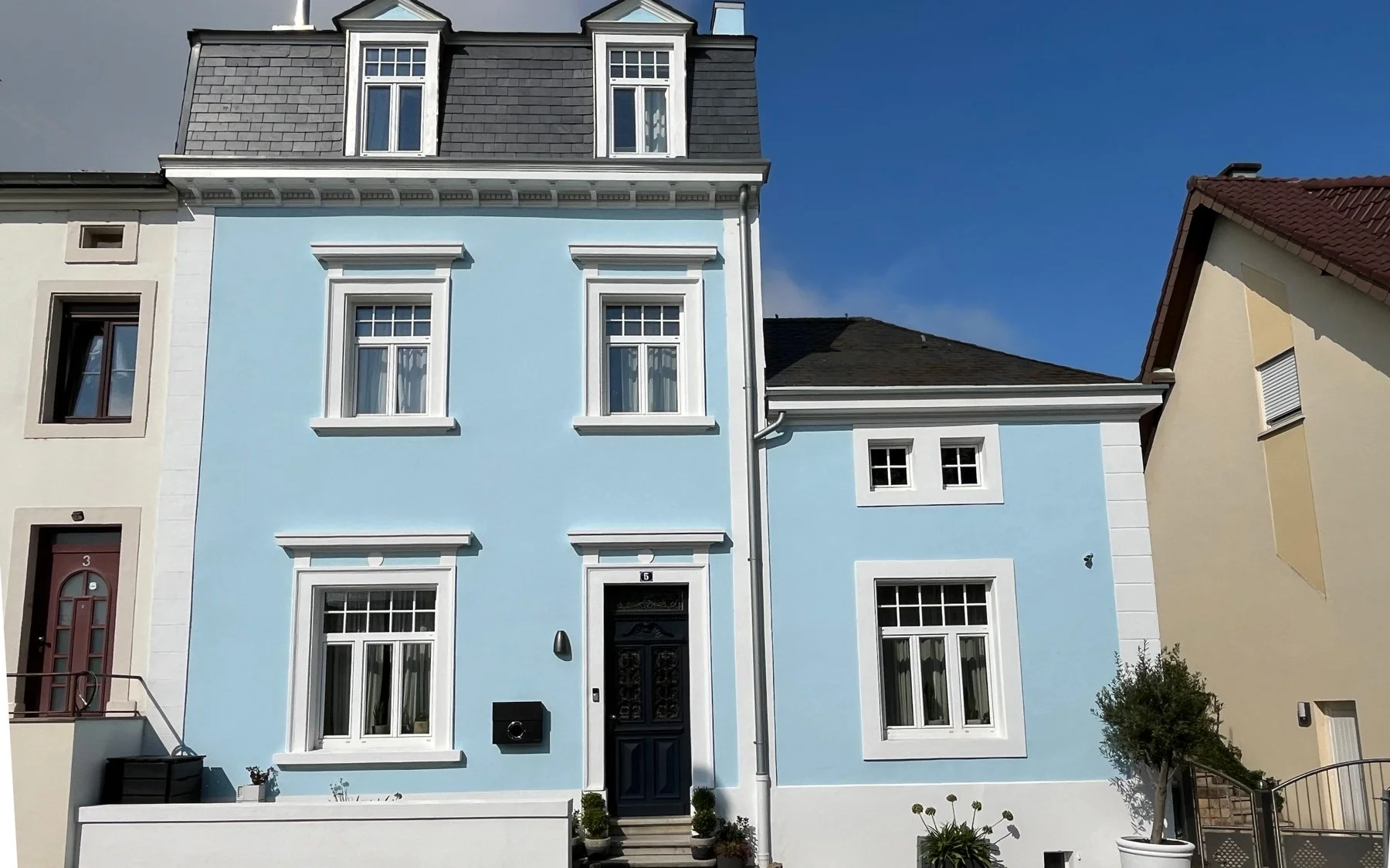
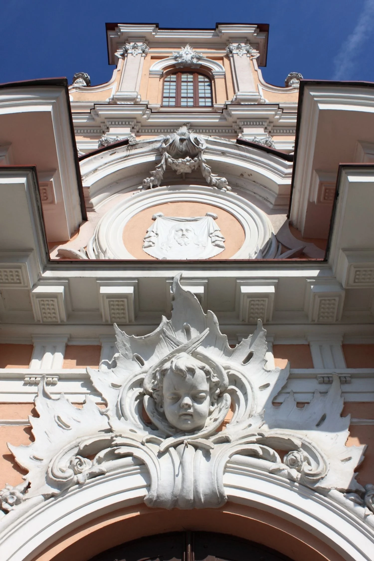
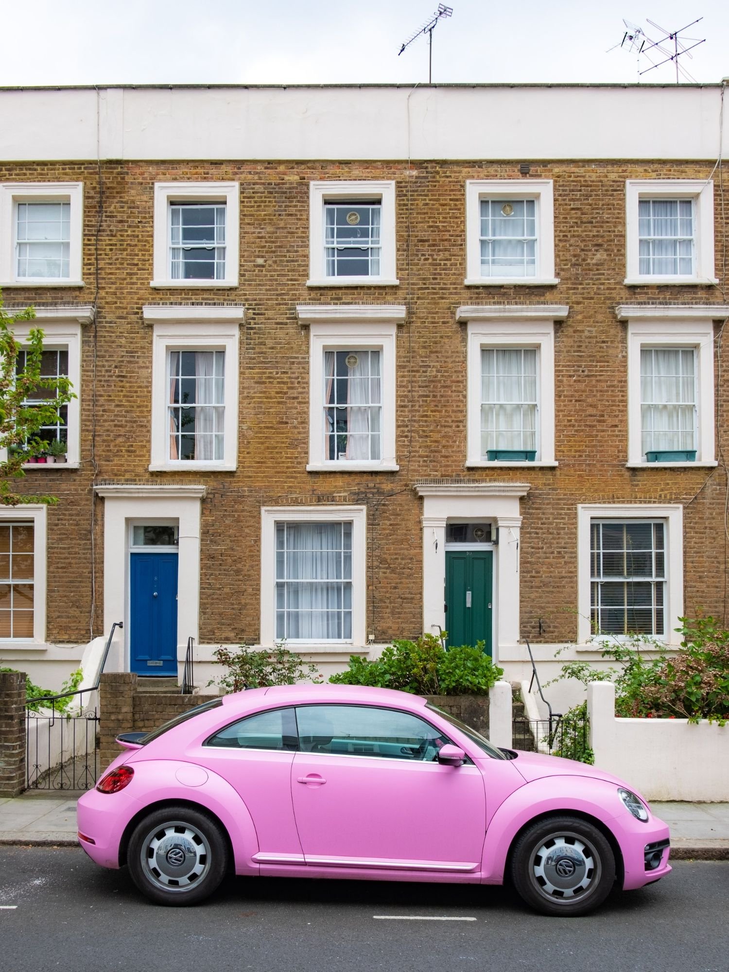
It wasn’t particularly grand. Not listed. Not the kind of place that would end up in a glossy book on European architecture. But it had charm. Wooden shutters, modest proportions, an old iron railing wrapped in ivy. A house you wouldn’t notice unless you cared. And clearly, nobody did. Because now it’s gone.

In its place: nothing yet. Just churned soil and a developer’s sign promising “Prestige Living in Luxembourg”. Prestige, in this case, soon to be rendered in beige render, perforated aluminium, and a strangely hostile number of balconies.Because nothing says “luxurious living” quite like a façade that looks perpetually annoyed.

We demolish quickly. We build quickly. But we lose slowly.

From Façades to Forgetting

Luxembourg has perfected a curious contradiction: we revere our castle ruins while casually signing demolition permits for heritage homes that are perfectly sound. We speak of national identity, of rootedness, of preserving the Luxembourgish language, and then we bulldoze the built evidence of the people who spoke it.

Call it cultural amnesia, paved in granite and LED spotlights.

There was a time when buildings were repaired. Adapted. Reused. But somewhere along the way, preservation became an inconvenience. And demolition? A default.

Walk through towns and village centres today. Count the original buildings. Then count the new white cubes.

The math tells a story, doesn’t it?

What Are We Really Replacing?

In Luxembourg demolition has become the go-to gesture for "improvement." Tear down a villa from the 1930s, possibly with hand-crafted stonework, mature trees, maybe even a story, and replace it with six flats, all priced for investors. The gain is financial. The loss is everything else.

Architecture used to be part of memory. Now it’s just a placeholder until the next build. We are flattening character for yield. And the result?

A landscape that feels newer, taller, shinier - and somehow emptier. Like a new smartphone that's somehow less satisfying than the one it replaced, despite the extra camera lenses.

When did we decide that a 1950s villa had nothing to teach us? That a century-old façade had nothing to show us?

The Book Metaphor, or Why Not Every Story Needs a Sequel

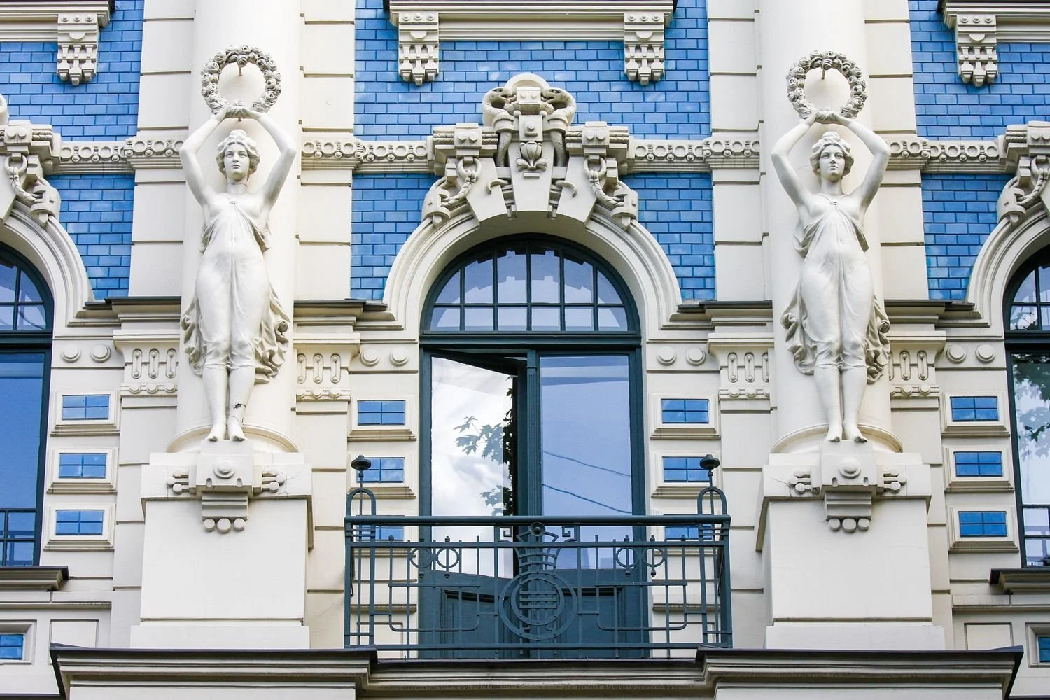
Think of buildings as books.

Some are classics. They deserve to be preserved, re-read, passed on. Others could use revision: a new foreword, a cleaned-up layout, better margins. But very few need to be pulped.

And yet, that’s how we treat them. Entire buildings tossed aside, as if what they offered - their story, their materials, their place in the streetscape - had no value.

As if beauty and proportion could be reproduced in a 3D BIM file and slapped onto a concrete box. Spoiler: they can’t. That’s like saying you can replace Hemingway with ChatGPT. The words might be there, but something essential is missing.

Elsewhere in Europe, They Chose to Read

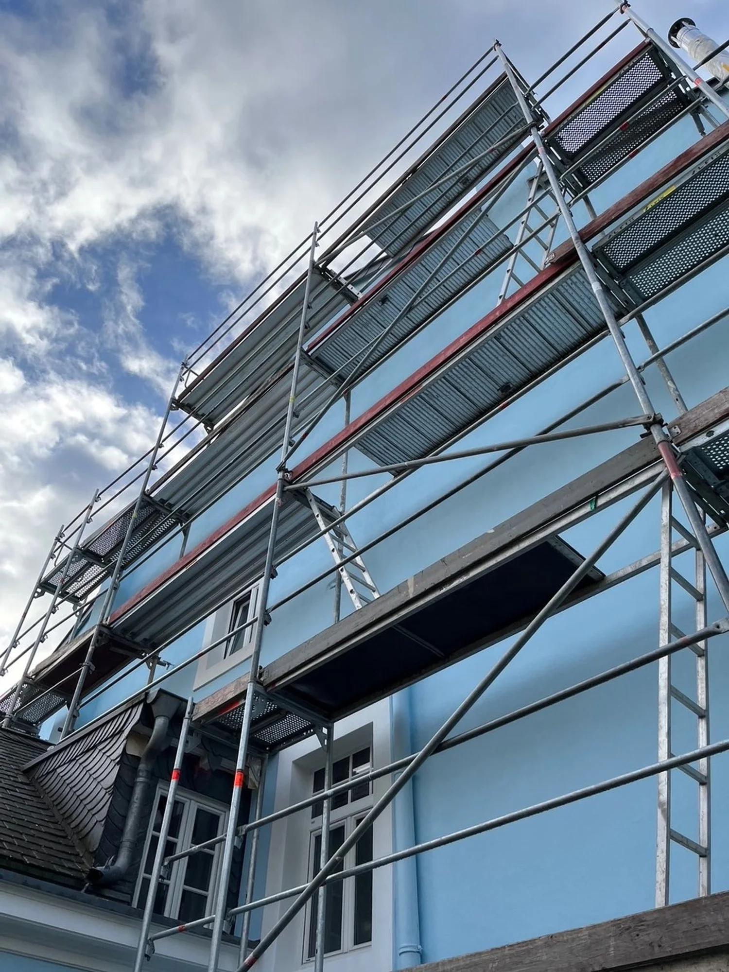
Vienna has quietly renovated hundreds of thousands of homes, many still occupied during works, preserving neighbourhoods and affordability alike. In Paris and Bordeaux, architects like Lacaton & Vassal have added space and dignity to social housing blocks without evicting a single resident or demolishing a wall.

In Brussels, office towers have been turned into housing with breathtaking speed and minimal carbon cost.

They chose to read what was already there. To edit, not erase.

And the result? Cities that feel like cities, not PowerPoint decks with balconies and investor brochures that somehow became three-dimensional.

Meanwhile here...

Here, demolition is often speculative. Developers knock down before they know what they’re building. Sometimes before they secure financing. That’s how you end up with half-finished holes in the ground where beautiful buildings used to stand.

Like the Hôtel du Grand Chef in Mondorf, a graceful structure that held both memory and presence. It was partially demolished for a luxury flat project that later stalled. And the new apartments? Not even built.

A Wealthy Country That Demolishes Its Wealth

Luxembourg is one of the richest countries in Europe. We can afford to preserve. We can afford to renovate.

And yet, we behave like a place in a rush - to replace, to erase, to sell.

It’s as if we’ve collectively decided that architectural character is the one luxury we can’t afford. We apply for EU heritage status while destroying the ordinary buildings that make our towns liveable.

We talk about housing shortages while letting vacant buildings rot. Or worse: tear them down to build five unaffordable units in their place.

It’s not just short-sighted. It’s absurd.

Demolition, Sitte, and the Aesthetic Undercomplexity of It All

Camillo Sitte once warned against cities becoming too geometrically clean, too orderly, too stripped of layers. He championed the complexity of lived-in space, the richness that comes from history pressing up against the present.

Demolition, especially when done en masse, flattens that complexity. It replaces narrative with neutrality. Texture with efficiency.

In short, it gives us the very aesthetic undercomplexity that Sitte spent his career warning against.

And we’re doing it not out of need, but out of habit.

So What Are We Really Preserving?

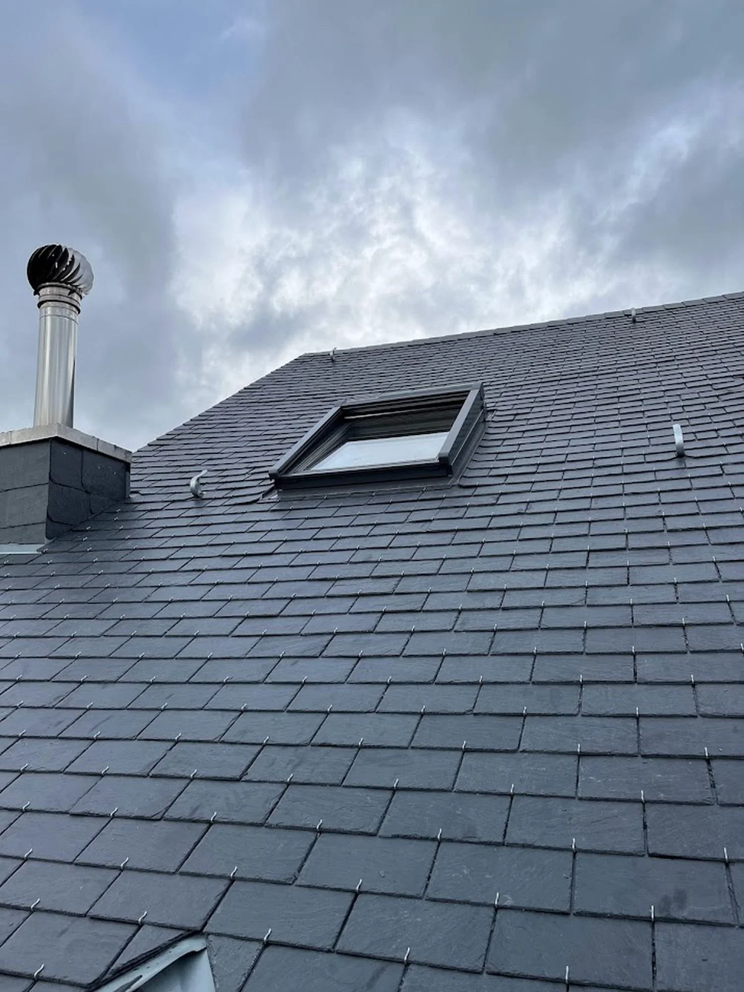
Preserving a building isn’t about nostalgia. It’s about continuity. It’s about trusting that not everything valuable must be new. That age can mean richness. That imperfection can be beautiful.

When we demolish indiscriminately, we erase the physical proof that someone was here before us - someone who built, lived, planted, repaired, walked the same pavement.

We erase context. We erase continuity. We erase past.

And it’s not just a personal concern. Across Europe, and now in Luxembourg too, citizens are beginning to push back. The HouseEurope! Initiative, recently launched with support from Luxembourg’s architects, planners, and cultural organisations, calls for exactly this shift: renovation over demolition, care over erasure.

Their message is simple: stop wasting buildings, stop wasting identity, and start seeing the value that’s already there.

Final Thought: What Would a Renovation Culture Look Like?

Imagine if, instead of tearing down and starting over, we chose to see what already exists - really see it. Its weight, its craft, its quiet presence on the street.

Imagine a Luxembourg where architects and developers were required to live in what they build. Where investors couldn’t demolish until they proved renovation wasn’t possible. Where our first instinct wasn’t clearance, but care.

Maybe we should measure cities not by what they built and add to their skylines, but by what they choose to keep.

By how generously they repair. By what they refuse to throw away.

Because in the end, saving a building saves more than just stone and timber.

It saves a story.

And maybe, if we’re lucky, our place in it.


written by Helen M. Krauss

In Design Matters
Comment

Honk If You’re Important - On Cars, Class, and Quiet Status Wars in Luxembourg

May 10, 2025 Helen Krauss

When we moved to Luxembourg from London, we brought with us the usual illusions: that status was subtle, that intelligence and education still counted, and that the car you drove said very little about who you were.

Our dentist in London drove a VW Beetle. So did we. It wasn’t a statement. It was just... a car. Practical, small, occasionally whimsical. Nobody cared. In fact, in certain circles, driving a car at all was slightly gauche.

Luxembourg, as it turns out, disagrees.

The Cult of the Car (And Why Size Still Matters)

There’s a long tradition in Luxembourg, and indeed, across many small or large, status-anxious nations, of material cues standing in for personal credentials. When people don’t know who you are, they look at what you own. And when they’re not sure what to make of you, they look at your car.

The car is immediate, legible, parked in full view. Unlike your education or career (neither of which is plastered to your garage door), it speaks a language everyone understands. And it tends to speak loudly.

This wasn’t always the case. In post-war Luxembourg, the ultimate status symbol wasn’t necessarily a Porsche, it was land. A stone house. A good roof. You climbed the ladder through ownership, not necessarily through chrome.

But over time, as the country grew wealthier, the car became the mobile façade. A rolling résumé. And in villages and towns where architecture has stagnated, the driveway became the stage.

Village Life, Vehicular Theatre

When we arrived in our historic village home, thoughtfully updated, and, dare I say, quite beautiful, we expected mild curiosity. Maybe even a neighbourly chat about stucco or rain gutters.

What we got was polite distance and almost disdain.

Respect, it turned out, was not anchored to the architectural effort. It came down to what was parked out front. Our loyal blue VW Beetle - charming in London - here seemed to signal a lack of ambition. Or worse, a lack of means.

The real revelation came slowly. A withheld tip about a superior roofing firm: Ironically, we ended up paying a top-tier price for a second-tier roofing firm, unaware that a neighbour a few doors down worked with one of the best.

A raised eyebrow during a casual driveway conversation. A sense that we’d missed a memo everyone else had read.

Eventually, it became clear: we had failed the local visual audit.

When Sustainability Meets Status Anxiety

We had, until then, clung to our small-car principles. One vehicle, low emissions, minimal footprint. A little naïve, perhaps, but sincere.

But the social signals around us grew too loud to ignore.

We bought two more cars. An electric one, to soothe our principles. And an SUV, because nothing else said, “Don’t underestimate us” quite so effectively.

It worked. Subtly. Conversations became warmer. Small favours, previously withheld, began to materialise. The Beetle, though still technically present, had been neutralised. The hierarchy had recalibrated.

And with it, any last illusions about sustainability as a community value quietly dissolved.

What Drives Us

Of course, none of this is really about cars.

It’s about architecture, or the lack of it. In villages where buildings are no longer expressive, where old houses are stripped of identity and new builds are aggressively neutral, the car becomes the substitute. It performs what the architecture no longer does: it signals value, taste, and place.

We’ve built a world where façades are flattened, homes are anonymised, and silence fills the gaps once held by ornament, eccentricity, or craftsmanship. And in that vacuum, the car roars.

Final Thought: The Quiet Cost of Status

We joke now, of course. That you can have four degrees and a vintage terrazzo floor, but if your car isn’t at least five metres long, you’ll remain firmly in second tier. That you could invent the fountain of youth, but if you park it next to a Dacia, no one’s calling you for brunch.

But behind the humour, there’s something sadder. A social ecosystem where respect is calculated by cubic volume. Where sustainability, though publicly adored, is privately penalised. Where heritage matters less than horsepower.

So, the question remains:

In a place where the car carries more cultural weight than the home, what are we really driving toward?

written by Helen M. Krauss

Comment

The Car Test: Why Your Vehicle May Be Speaking Louder Than You Are (Especially in Luxembourg)

May 10, 2025 Helen Krauss

In some places, your car is just a car. In Luxembourg, it's a résumé, a value statement, and occasionally, a class declaration on four wheels.

When we first arrived from London with our sensible little and cute Beetle, we had no idea we were committing social self-sabotage. After all, in a city, a small car is practical. Ecological. Even charming. But Luxembourg has its own logic, and it begins at the kerb.

Because here’s the thing no one tells you:

In many Luxembourgish towns and villages, your car will be judged before your house. And before you. No matter your education, your job, or your restoration efforts, if you’re driving something modest, prepare to be quietly downgraded.

It took us a while to realise that respect here isn’t always earned - sometimes, it’s bought or leased.

Want to know what happens when a sociocultural value system gets outsourced to the car dealership? Or how a Porsche can outshine a beautifully renovated heritage home?

You might want to read this one:

Honk If You’re Important →


written by Helen M. Krauss

Comment

Please Be Seated - A Brief Cultural History of the Bench

May 10, 2025 Helen Krauss

I noticed it while sitting on a newly installed bench in the Park Thermal in Mondorf-les-Bains: hard, metallic, and subtly angled to prevent comfort beyond a few minutes. The kind of design that whispers, Yes, you may sit, but don't think about staying. No cushion, no curve, and certainly no generosity.

Benches are strange creatures. Half invitation, half judgment. They wait patiently in parks, train stations, village squares, mute observers of the human condition. We barely notice them until we need them. And when we do, we don’t just rest - we reveal.

A bench is never just a place to sit. It’s a statement. Of design, yes, but also of what we think people deserve in public space. Backrest or not? Wood or metal? Individual seats or collective span? In some cities, benches are ergonomic poems in steel and cedar. In others, they’re narrow, sloped slabs that make sure no one gets too comfortable - or horizontal.

The Romans, as always, got there first. Their exedrae, a stone benches embedded in public forums, offered shade and social surveillance in equal measure. In the Middle Ages, benches were less civic and more ecclesiastical. Cold stone pews lined monastery cloisters, designed to keep the soul upright and the body humble.

Then came the garden bench: baroque, wrought-iron, often wildly uncomfortable. And later, the Victorian promenade bench, long, generous, proudly municipal. A place to see and be seen, but also to rest without guilt.

But somewhere along the way, benches began to shrink. As if generosity in seating became suspicious. Too inviting, and someone might linger too long. Or lie down. Or be poor.

In Luxembourg, particularly in new developments around Kirchberg or Cloche d'Or, benches often appear as reluctant concessions to human need rather than celebrations of public life. The design language is clear: sit, but don’t stay. Rest, but don’t settle.

A good bench says: “You matter enough to pause.” A bad one says: “Don’t get too comfortable.”

We’ve all had the experience: sitting down only to realize you're being watched. Not in that charming pigeons and poetry way, but in the quiet, unsettling sense that this space is already claimed.

And yet, a well-designed bench is perhaps the most honest piece of architecture. It makes no grand claims, conceals no hidden agendas. It simply offers to hold you for a while.

Benches reveal how we treat space, and how we treat each other. They mark generosity or suspicion, care or calculation. And when they’re done well, they do something remarkable: they give shape to slowness. They invite you to exist, quietly, in public.

We often measure cities by their skylines. But maybe we should measure them by their benches, by how generously they invite us to pause, to observe, to belong.

After all, that’s where real life sits.

And if you’re lucky, where it holds your weight, and maybe your thoughts too.

written by Helen M. Krauss


In Get Inspired
Comment

Design by Delight: Camillo Sitte’s Forgotten Wisdom

May 3, 2025 Helen Krauss

Architect and City Planner (1843 - 1903)

"Only that which the viewer can see and hold in view has artistic value." (Camillo Sitte, 1843-1903)

Long before urban design was guided by optimization algorithms, Camillo Sitte understood something simple: cities should feel good to walk through.

Not just efficient. Not just zoned. But beautiful, inviting, and a little bit unpredictable.

Today, those principles have been mostly paved over. But Sitte’s insights still shine, especially when you realise that your favourite streets probably don’t follow the rules. They follow rhythm. Texture. Surprise.

Even neuroscience agrees.

Read the full post on why your brain prefers winding streets to modern urbanisme.

written by Helen M. Krauss


In Get Inspired
Comment

Camillo Sitte and the Case for Complexity: Why Your Brain Prefers Winding Streets Over Wide Open Nothingness

May 3, 2025 Helen Krauss

There’s a strange little thing that happens when you walk through certain places. You turn a corner. You stop. You linger. Not because the signage tells you to. But because the space invites you. Makes you curious to explore.

It’s not the café. It’s not the cathedral. It’s the composition. Another example is the small moselle town of Remich here in Luxembourg: The old centre has small little openings and winding tiny footpaths between houses. They pique your interest, you feel the impulse to explore and find out where the path leads. Irresistible.

Camillo Sitte (1843 - 1903), the Austrian urban planner with more common sense than most modern zoning boards combined, understood that.

Back in 1889, he wrote “Der Städtebau nach seinen künstlerischen Grundsätzen” (“City Building According to its Artistic Fundamentals”) and argued, quite radically, for his time, that cities should be designed like art, not spreadsheets.

Today, you wouldn’t know it.

Walk through most new developments in Luxembourg (or anywhere else where the planning software and developers get more say than the people).

What do you see?

Vast spaces. Flat façades. Identikit balconies, doors and garages. Colours mostly white and grey. A tragic excess of “rational layout.” It’s not offensive. But it’s not beautiful either. It’s just... there.

And as Sitte might have said: beauty rarely comes from “just there.”

Aesthetic Undercomplexity - Or Why Bland Hurts

Sitte didn’t use the phrase “ästhetische Unterkomplexität” himself, that came later, but he would’ve nodded in grim agreement and everything he wrote was a rejection of it.

He believed that when we strip cities of visual richness, variation, and spatial rhythm, we’re not simplifying, we’re impoverishing.

The plazas and streets he admired weren’t efficient. They were emotionally intelligent.

Irregular. Enclosed. Multi-perspectival. They played with light, surprise, and scale. They created places where people actually wanted to pause. To stay. To belong.

That's why his body of work speaks to me. I lived in quite a few places, and the ones which stuck in my mind and still fill me with longing sometimes, are the ones with aesthetic layering, with delicious visual complexity. They hold your attention in a curious way, they give your mind space to think while anchored by buildings, like for instance, the Heath in Blackheath Village, London.

The village for intimacy, cosiness, human scale, and the heath to expand your mind. All within a bustling city. I believe, you know that a place works when you live there for years and years and still it touches and delights you. 

Compare that to today’s planning: functional rectangles with generous parking and zero soul.

Further, mixed use according to a PAG in Luxembourg also often means in practice: the bakery and the yoga studio share a concrete wall in a building that looks like a converted insurance office. Interspersed with Bauhaus style bland residences. People come and go, but no one ever stays.

The Science Backs Him Up

Modern neuroscience research agrees with Sitte. Our brains are wired to respond to complexity, not chaos, but structured variation.

Environments with texture, depth, and contrast stimulate cognitive activity and emotional well-being. Flatness, uniformity, repetition? That’s how you drain a person’s spirit without saying a word.

No wonder people flee the village core the moment it’s filled with new “units.” The rhythm is gone. The charm evaporates. And nobody wants to live inside an Excel file.

From Vienna to the PAG

It’s curious, really. Sitte was writing in Vienna, a city that still carries layers of old urban intelligence in its bones. But his insights land sharply here in Luxembourg, too - especially in how village centres are being “densified.”

I look out from my own house and see what’s coming. Not bad intentions. Just bad proportions. The idea that function alone is enough to create place.

But we know better.

We’ve walked the streets that work. The ones that hold you, soften you, surprise you. They’re not accidents. They’re compositions. Spatial symphonies. And Sitte understood that and could compose the music.

Final Thought: Complexity Is Not a Flaw

We don’t need more diagrams. We don’t need more Bauhaus architecture. We need more delight.

Camillo Sitte knew that beauty wasn’t a luxury. It was the organising principle. Without it, cities may function, but they will never sing.

And honestly, when was the last time a zoning plan gave you goosebumps?

written by Helen M. Krauss

In Design Matters
Comment

How Florence Did It Right: What Historical Density Looked Like Before Cars, Codebooks, and Concrete

May 2, 2025 Helen Krauss

Compact, not compromised. Florence’s rooftops show how proximity can coexist with poetry.

Walk through Florence’s historic centre, and you’ll feel it immediately: the density is there, but not suffocating. Narrow streets. Shaded alleys. Buildings pressed shoulder to shoulder, but it never feels too close. There’s intimacy, but also openness. Ornament. Flow.

This is what urban closeness used to mean: green courtyards tucked behind heavy wooden doors, creating mystery and curiosity, shared loggias, ground floors that shift from shop to dwelling to atelier, often in the same building. Density wasn’t imposed. It emerged from life.

No one had to add “community features”. The community was the feature.

Of course, Florence isn’t perfect (they had their fair share of architectural egos). But their density came with creativity, restraint, and deep attention to material, scale, and light.

There’s a reason we still love it centuries later.

Read the full article on modern density and how today’s urban design does not work.

written by Helen M. Krauss

In Get Inspired
Comment

“Packing Them In”: A Short Cultural History of Density

May 1, 2025 Helen Krauss

Why today's approach to housing density misses the lessons of centuries.

We’ve heard the sermon by now:

Density is good. It’s sustainable. It saves land. It prevents urban sprawl. It encourages neighbourly interactions, public transport, shared infrastructure. And when done well, it can indeed be a triumph of urban design - think of the historic cores of Florence or Lisbon.

But then there’s modern density.

The kind that slips in under the banner of “smart growth” and “vibrant communities”, only to materialize as a few dozen small flats wedged into what used to be a family home with garden, character, and breathing space. The kind where you start hearing every single cough, argument, and phone notification from next door. The kind where public space becomes private smoking territory, and staircases turn into daily theatre.

Somewhere between Vitruvius, the famous Roman architect, and value engineering, something went very wrong.

To understand where today's density goes wrong, we need to look at where historical density got it right.

A Brief History of Living Close

Let’s be clear: humans have lived densely for millennia. Ancient cities were tightly packed. Medieval towns were rabbit warrens of overlapping lives. In many ways, we’re wired for proximity, it’s where culture happens. Where the market buzzes, the festival spills into the street, and ideas rub elbows with one another. Density, in theory, is not the problem.

But in historic high-density environments, craft met constraint. Narrow alleyways gave way to beautiful courtyards. Buildings touched, but they were lovingly detailed. Streets bustled, but were scaled to humans, not delivery vans. The density was social, architectural, and artisanal. Not just numerical.

Density, the old-fashioned way. Tight quarters, but with restraint and respect.

What we see today is something completely different: a soulless spreadsheet density.

Take, for example, the recent developments here in Luxembourg, where single-family homes were replaced by apartment buildings with lots of small apartments. The developer's brochure calls it “luxury urban living”. The neighbours call it something else entirely. This isn't just a housing solution - it's a cultural imposition.

Measured in units per hectare, not quality per square metre. A top-down policy logic that says “add housing”, without stopping to ask what kind of housing, for whom, in what kind of cultural fabric?

Density vs. Dignity

In Luxembourg, as in many parts of Europe, the solution to housing shortages has been to densify, especially in town and village centres. That means knocking down older homes, slicing up gardens, and putting up apartment blocks in places where the streets were never meant to absorb them.

But we might ask: what kind of future are we implanting?

Because density, if not culturally calibrated, creates tension. Not always the creative kind.

In a country where politeness isn’t exactly an Olympic sport, where noise tolerance is low but building ambition is high, crowding people into tighter quarters doesn’t magically produce urbanity.

It produces friction. Frustration. And more “for sale” signs from those who can afford to flee.

And if the town or village core becomes the default location for this kind of urban pressure, if the old houses and tight lanes are endlessly re-divided and re-coded, then density becomes just another word for dumping.

Lessons from the Past (That We're Ignoring)

The best historical densities didn’t just “fit more people.” They built entire cultures of cohabitation. Shared wells. Arcades. Covered passages. Passive cooling. Shade. Ornament. Large gardens visible from the street. There was density, but with lots of advantages and quality of life.

And crucially: there was a social contract. Behavioural norms. Town planning rooted in how people actually lived - not just what a developer could squeeze in with a rubber-stamp permit and a traffic flow Diagramme.

This social contract wasn't just implicit - it was often codified in local customs, guild regulations, and community expectations. Neighbours knew when to be quiet, when communal spaces could be used for private purposes, and how to negotiate the inevitable frictions of proximity. These weren't just buildings close together; they were communities designed for sustainable coexistence over generations. In a nutshell: People knew how to behave, and this cannot often said for people living close together these days.

Today, we skip the soft parts. We build for headcount, not hospitality. For ROI, not rhythm. Then we act surprised when people feel overwhelmed, boxed in, irritated - or simply leave.

Welcome to spreadsheet urbanism. Geometry: perfect. Humanity: optional.

Final Thoughts: Build Closer, But Build Better

Density isn’t the enemy. But mediocrity design and thought is.

And density without creative design, without the cultural infrastructure that makes close living humane - is simply just one thing: crowding and overcrowding.

Let’s not confuse tight spacing with smart planning.

And let’s stop pretending that stuffing old villages or town centres with flats is automatically progress.

Sometimes it's just a failure of imagination, a lack of understanding of human nature, of cultural understanding, and of long-term thinking.

The real challenge isn't “packing”more people in. It's creating spaces where proximity fosters community rather than conflict, where density enhances rather than diminishes.

Better urban planning would make Luxembourg special. And it is a shame to watch the old adage that money can’t buy imagination.

written by Helen M. Krauss

In Design Matters
Comment

Japanese Philosophy: The Beauty of Broken Things

April 30, 2025 Helen Krauss

Repair can be art. The lines we try to hide may be the ones that hold us, and our homes, together.

“The world breaks everyone, and afterward many are strong at the broken places.” - Hemingway

Kintsugi is the Japanese art of repairing broken pottery with gold, not to hide the cracks, but to honour them. A philosophy that sees damage not as something shameful, but beautiful.

The fracture is the story. The repair is the art.

I think there’s a lesson here for old houses, too.

In a culture obsessed with flawless surfaces and shiny newness, Kintsugi offers a rebellious thought: maybe the crack isn’t the problem. Maybe it’s the point.

Read the full reflection on Kintsugi, hormesis, and what old houses can teach us about resilience.

written by Helen M. Krauss

In Get Inspired
Comment

Kintsugi: Cracked, Not Broken. Why cracks in old houses might be the best part

April 30, 2025 Helen Krauss

In traditional Kintsugi, the break is never concealed. Instead, it’s elevated and transformed into beauty through gold.

We live in an age obsessed with flawlessness. Smooth surfaces. Clean lines. Hidden wiring. Hidden lives. When something breaks, we replace it. When a wall cracks, we panic. When a house shows its age, we pretend it’s a tragedy.

But maybe we’re seeing it all wrong.

The Japanese principle of Kintsugi offers a quiet rebellion against this modern logic. Instead of hiding breakage, it honours it. A broken bowl isn’t discarded, it’s repaired with gold.

The crack becomes the highlight. The history becomes the beauty.

Cracked, not broken. Like homes, like people. Kintsugi reminds us that visible scars can be marks of strength, not shame.

And what if we applied that thinking not just to ceramics, but to our built environment?

What if cracked walls, sagging beams, and awkward extensions weren’t signs of failure, but resilience? Markers of life lived, challenges overcome, structures that refused to give in?

Old houses in Luxembourg have certainly had their share of cracks. War, poverty, neglect, unspeakable tile choices from the 1970s. But still they stand.

And when we renovate them, we often obsess about restoring them to a better past, or worse, dragging them into a sterile present. We straighten, rewire, reframe. But rarely do we let the scars show.

Why?

Do we really believe that imperfection is a threat to value?

Or are we just afraid to admit that beauty can come with a crack, and meaning with a scar?

Hormesis and Houses

Science has a term for this too: hormesis. It’s the paradoxical idea that a reasonable amount of stress makes you stronger. Muscles grow when torn. Immunity builds through exposure. Even wine, in moderate amounts, is better than abstinence (according to some optimistic studies and several winemakers).

What if houses - like humans - respond to stress not just by breaking, but by evolving?

What if that dodgy back room you had to rebuild from the ground up is now the warmest, most characterful part of the house?

What if the awkward hallway you hated at first now frames your favourite view of the garden?

Renovation is rarely smooth. Anyone who’s lived through it knows this. Things go wrong. Budgets burst. You find a dead mouse and asbestos in the attic insulation and a 1982 copy of “Revue” behind the kitchen plasterboard. But over time, something shifts. You begin to see not just flaws, but stories. Not just repairs, but transformations.

What if buildings wore their damage proudly? Kintsugi architecture challenges our obsession with flawless surfaces.

The Gold Is in the Crack

Kintsugi teaches us that repair doesn’t have to be invisible. In fact, the most beautiful repairs are the ones that shine. In homes, that might mean leaving a patch of old wallpaper exposed. Keeping the doorframe that’s been worn by generations of shoulders and elbows. Leaving a ceiling beam just a little uneven, because it tells the truth of how the house stands. Or leaving old traditional cement tiles with little cracks, but still working, still beautiful.

This isn’t romantic nostalgia. It’s a design philosophy, one that challenges the cult of the new, the smooth, the soulless.

It says: value comes from survival. From story. From strength earned, not bought.

And it’s not just aesthetic. Embracing imperfection - thoughtfully, not sloppily - is also a form of rebellion against the disposable mindset that fuels both ecological damage and cultural amnesia.

A home that wears its history with pride doesn’t just shelter you. It teaches you. About patience. About context. About history. About Design.

Final Thought: Renovate Like a Philosopher

So the next time your house cracks - pause before you panic. Look again. Maybe it’s not damage. Maybe it’s gold.

And maybe, like you, the house will simply become stronger in the places where it once broke.

written by Helen M. Krauss


In Design Matters
Comment

I've Never Been Cold in a Well-Built House from 1870

April 29, 2025 Helen Krauss

Winter can be a challenge in historical homes, but with clever and practical solutions, it doesn’t have to be.

Walk into a viewing for an old house, and someone inevitably whispers it: "But what about the heating?"

There it is again. The assumption that anything built before underfloor heating must be a drafty nightmare. That thick walls are the enemy. That comfort comes only in the form of ductwork and digital thermostats.

And yet, here we are in a house from 1870. High ceilings. Stone walls. No plastic sealants or foam-stuffed cavities. And warm. Not just tolerable. Actually warm.

Modern buyer psychology - particularly in Luxembourg - has been shaped by decades of marketing that insists newer is better, sleeker is smarter, and insulation must always be thick enough to muffle thought.

But those rules don’t apply to older homes. They were built with knowledge of air flow, light, and seasonal variation. Our house for instance is wonderfully cool in summer, particularly on the ground floor and first floor, here the thick walls really make a difference. And in winter the warmth from the two working fireplaces is distributed to the entire house.

The real question isn’t whether a historical house can be warm, it’s whether you’re willing to look beyond the brochure logic.

Because heating comfort isn’t about gadgets. It’s about fit. It's about how well a system suits the structure it lives in. And sometimes that means fireplaces, clever zoning, and discreet modern additions like infra-red panels that warm you, not just the air.

And often, it even means, like in our case, lower energy bills than your thoroughly modern neighbour with the heat pump that hums through the night. Particularly these days with very high electricity costs, a heat pump actually seems less and less like a clever solution.

If you’re a buyer standing in front of a charming old façade and nervously picturing frozen mornings, take a breath and relax.

These homes have lasted centuries. They know what they’re doing. What they need is understanding, not renovation by default.

A modern heating system is just one layer. The house already brings the rest.

For the full story of how we heat our 1870 home with charm, practicality and not a heat pump in sight, head over to the main blog post.

written by Helen M. Krauss

In Get Inspired
Comment

Don't Fear Heating Historical Homes: Clever and Practical Solutions

April 29, 2025 Helen Krauss

The kind of entrance that makes you imagine mulled wine waiting just inside. Historical homes with clever heating solutions, are not only beautiful, but also warm.

The Cold Truth (and Why It Might Be Wrong)

Let’s address the seasonal elephant in the room: heating an older home. The mere idea seems to conjure up visions of cold toes, astronomical energy bills, and drafty corners where no blanket dares venture. But here’s the thing: much of that is myth.

I live in a house built in 1870. And while it certainly predates the concept of double glazing and central thermostats, it hasn’t sentenced us to a lifetime of shivering. Quite the opposite. With the right approach, it’s entirely possible to keep a historical house warm, cost-effective, and comfortable without gutting its soul.

Old Buildings: Smarter Than You Think

There’s a quiet logic in the way older homes were built. Thick stone walls, high ceilings, and clever ventilation weren’t aesthetic whims, they were part of a passive design system long before sustainability became a buzzword. These homes were designed to adapt, to breathe, to regulate temperature without any need for polystyrene-stuffed walls or humming devices that simulate fresh air.

Visitors to our former townhouse built in 1912 often commented on the freshness inside. It didn’t feel stale. It felt lived in, seasonal, somehow alive. That’s the genius of breathable walls: they allow a building to behave like the organic, evolving structure it is.

Embracing What You’ve Got (and Tweaking What You Need)

Let’s be honest: heating a historical home isn’t about doing nothing. It’s about working with what’s there, not against it. My approach is pragmatic, not purist. A little gas, a bit of wood, a touch of tech:

• The inherited gas boiler still serves a purpose, though we’ve reduced its role over time.

• Fireplaces are more than just romantic. Our two provide real warmth, atmosphere, and a reminder that heat doesn’t have to be invisible.

• Infra-red heating panels were the real surprise: sleek, silent, low-energy, and remarkably effective. They warm people and objects directly, not just the air, making them ideal for rooms that need a quick temperature boost.

No one system does everything. But together, they form a comfortable, balanced, and highly adaptable setup that doesn’t fight the house - it fits it.

Old meets new: Infrared panels blend discreetly into even the most elegant period interiors, bringing warmth without disturbing the aesthetic.

The Heat Pump Hype (and Why We’re Not Buying It)

Everyone loves a trend. And right now, heat pumps are the darling of the energy-efficiency world. But let’s pause. They’re not a one-size-fits-all solution, and certainly not for homes like ours.

They hum. They require invasive installations. Their bulky exterior units are no friend to a heritage facade. And while they work wonders in tightly sealed modern builds, they often feel like a technological mismatch in homes built to breathe, not suffocate.

That’s before you even get to the inflated price tag and the high maintenance costs.

Insulation Overload and the Myth of the "Sealed Box" Insulation is great. Until it isn’t.

Overdo it, especially with synthetic materials, and you risk turning a house into a damp, unhealthy box. Historic homes aren’t broken versions of modern ones. They’re different species entirely.

We need to stop judging them by modern standards and start appreciating what they already do well. Moisture regulation. Passive temperature balance. Air quality. You can boost comfort without suffocating the structure. Natural materials like cork, hemp, or even sheep’s wool offer solutions without forcing a 19th-century wall to act like a 21st-century one.

Proof that warmth doesn’t require compromise. A fire-lit 19th-century room, as comfortable as it is beautiful.

A Buyer’s Perspective

If you’re eyeing a historical property and wondering whether you’ll freeze through November, let me reassure you: you won’t. With a little common sense and a bit of care, these homes are every bit as comfortable, and in some ways more rewarding, than newer builds.

Ours, for instance, runs on a hybrid system: wood for soul, gas for backup, infra-red for precision. It’s efficient, elegant, and unobtrusive. You won’t find humming units or whirring fans. Just quiet, deliberate warmth that respects the house and your comfort equally.

Heating with Imagination (and Without Regret)

In a time when complexity is sold as innovation, there’s something wonderfully satisfying about a setup that works because it’s simple, not despite it. Historical homes don’t need saving. They need understanding.

So don’t fear the old walls. They’ve stood for centuries, weathered wars, seen fashions come and go. They’ll handle winter just fine, as long as you don’t try to turn them into something they’re not.

And if you need a little extra warmth? A well-placed panel, an extra log on the fire, and a cup of something hot usually does the trick.

What are your experiences with heating older homes? I would love to hear how you’ve made your house a warm home.

written by Helen M. Krauss

In Design Matters
Comment

From Limewash to Latex: A Short, Colourful History of How We Dress Our Walls

April 29, 2025 Helen Krauss

Not quite Luxembourg, but a reminder that façades can still have fun.

Once upon a time, a façade wasn't just a pretty face - it was a breathing skin, a working shield against the elements.

Walk through Luxembourg's older quarters: Pfaffenthal, Grund, or the winding streets of Clausen, and you'll see the evidence of centuries of façade evolution. Some buildings still wear their original limewash, softly aging like weathered cheeks. Others have been "updated" with materials that seem determined to suffocate them from the outside in. The difference isn't just visual, it's almost philosophical.

In the old days, your choices were fairly simple:

Limewash: Easy to apply, beautifully breathable, endlessly re-coatable - if you didn't mind refreshing it every few years. The finish has a subtle depth to it, almost like velvet, catching light differently throughout the day, revealing the hand of its application in gentle brush strokes and variations.

Silicate paints: Introduced in the 19th century, a small revolution. Mineral-based, bonded into the surface itself, extraordinarily durable, and still breathable. They have a particular luminosity, a way of letting the wall beneath still speak while adding their own matte character.

Fast forward to the 20th century, and along comes dispersion paint, synthetic, affordable, easy to apply, promising bright colours that would last forever. Dispersion paints were, and still are, a popular choice for new builds with damp-proof courses, but on historic walls built to breathe, they can trap moisture inside the fabric. The result? Flaking, blistering, hidden decay.

More recently, painters and handymen have embraced silicone-based paints. One coat, water rolls off like pearls, minimal maintenance. Perfect, if you want a façade that behaves like a raincoat. Less perfect, if you value the slow, natural exchange of moisture that keeps old walls alive.

Silicone paints are the fast food of façade treatments: quick, shiny, satisfying in the short term, but not necessarily a recipe for long-term health. A lime-washed wall ages like a face with character; a silicone-coated one is more like bad plastic surgery, initially smooth but increasingly odd-looking as the years pass, with that particular tightness that doesn't fool anyone.

It's no coincidence that our buildings now wear the same quick-fix, maintenance-free surfaces that we've embraced in so many other areas of life. We want our coffees instant, our furniture assembled in minutes, and our façades to be set-and-forget. The idea of seasonal care, of renewing a limewash every few years as part of a building's natural lifecycle? It feels almost quaint in our update-obsessed culture.

A Small Revolution: Historical Colours and Breathable Materials

Luckily, not everyone bought into the "plastic skin" dream.

Companies like Little Greene and Farrow & Ball quietly started reviving historical colour palettes - not just pretty period hues, but colours based on meticulous archival research. Little Greene, in particular, partnered with English Heritage to unearth tones from Georgian, Regency, Victorian and Twentieth Century eras, bringing back the soft whites, muted blues, and grounded earth tones that buildings once wore so naturally.

For our own façade project, we leaned into this philosophy.

We chose a proper mineral-based system: Keim silicate paints. Breathable, durable, and ageing gracefully without peeling or suffocating the walls beneath. For colour, we found inspiration in the historical tones: a calm, balanced tone from Little Greene (Loft White) and a soft, delicate Arctic blue from Caparol.

Choosing the right blue was, let's say, a process:

I spent weeks outside with eight 1x1 metre colour sample boards, studying how the tones shifted in morning mist, harsh midday sun, and golden evening light. It wasn't a decision made lightly, not when you see, daily, how many beautiful façades are ruined by one poorly chosen paint swatch.

At one point it became something of a local event. Neighbours had opinions. Passers-by offered commentary. Even the postman weighed in. My favourite was the elderly gentleman who stopped every day for a week, hands clasped behind his back, to deliver his verdict with Luxembourgish directness: “Gëschter war besser. Dëst hei gesäit aus wéi wann et an d’Musel gefall wier" (Yesterday's blue was better. This one looks like someone dropped it in the Moselle.). Hard to argue with that assessment, really.

In the end, we chose the Caparol Arctic blue, not for technical reasons, but because it was the right colour for the house, in the right light, with the right soul. (And sometimes, after all the research and theory, you simply trust your eyes.)

What's the Façade Really Wearing?

Choosing paint for a historic building isn't just about colour. It's about authenticity.

Do you want a façade that breathes, shifts, ages like a living thing? Or a façade that seals itself off behind a bright, brittle surface, pretending to be something it's not?

Next time you walk down an old street in Luxembourg or anywhere with buildings that have witnessed more than a single generation, look a little closer.

Some façades wear their years lightly. Some wear them badly. And some are just trying, a little too hard, to look young forever.

They're not so different from us, really.

(Stay tuned for the full story of our façade project — the battles, the surprises, and the quiet satisfaction of getting it right.)

written by Helen M. Krauss

In Get Inspired
Comment

Flat Roofs: Modern Design or Just Maximum Profit?

April 28, 2025 Helen Krauss

Modern flat roofs: functional, cost-efficient - and often just a little bit joyless.

You’ve probably noticed. Most new buildings, the so-called “contemporary” ones, are topped not with elegant pitched roofs or intricate slate work, but with something much simpler. A flat lid. Sometimes dressed up as a “roof terrace.” Sometimes not even trying.

It’s the default look of modern construction.

But the question is: why?

Is it good design? Or just the easiest way to squeeze the last square meter of profit from a plot of land?

Just look around in any village or town in Luxembourg and you will see a parade of these flat-topped boxes, each one claiming to be "contemporary design" while really just maximising the developer's return.

The Origins of the Flat Roof: High Ideals, Low Maintenance

The flat roof wasn’t always a developer’s shortcut. Historically, flat roofs have been entirely sensible: in hot, dry climates, where rainfall is minimal and roofs could double as living space. Ancient Mesopotamia had flat roofs long before anyone called it modern.

But here in central Europe, flat roofs didn’t really make an architectural debut until the early 20th century. Enter Bauhaus. Enter Le Corbusier and his famous “Five Points of Architecture,” one of which was, you guessed it, the flat roof.

Back then, the flat roof was a radical idea. A rejection of ornament, of tradition, of pitched roofs and bourgeois pretension. It was meant to be social, functional, even utopian. Roofs were imagined as communal spaces, gardens in the sky, playgrounds for a new era of urban living.

But fast forward a hundred years and here we are in a landscape of hastily built apartment blocks and cookie-cutter duplexes, their flat roofs not utopian, not social, just… flat.

Why Developers Love a Flat Roof

The answer is as old as capitalism itself: it’s cheaper.

It is less material, a simpler structure, no fiddly angles to work out and best of all (from a developer’s perspective): you can build right up to the legal height limit without “wasting” space on a roof shape.

Pitched roofs? Those eat into your floor plans. They make the top-floor apartments a little less square. Flat roofs? You can stack your boxes, fill your cubic meters, and call it modern architecture.

And if anyone asks about design? Just drop the word Bauhaus into the conversation and hope nobody notices the lack of rooftop gardens.

But Does It Make Sense?

In dry climates? Sure.

In central Europe, where rain happens sideways and winter likes to stick around? Not so much.

Flat roofs are notorious for their drainage issues. They require precise engineering, perfect execution, and regular maintenance, three things not exactly famous for being top priorities on tight construction budgets.

Leaky membranes, pooling water, sagging structures. Sound familiar?

The irony, of course, is that the so-called “cheap option” often turns out expensive after all - just not for the developer. For the buyer. For the tenant. For the person stuck with the repair bills when the roof starts misbehaving.

A Design Decision - or Just Cutting Corners?

There’s a world of difference between a flat roof designed with care, and a flat roof slapped on top of a box because it was the cheapest option on the menu.

And here’s the thing: good architecture isn’t just about the look. It’s about how a building works. Over time. In its environment.

So next time someone calls the flat roof “modern,” it’s worth asking:

Is it modern or just maximally profitable?

When we faced our own roofing decisions, the easy path of flat modernism did not beckon as our house is 150 years old. The old solutions, pitched angles, proper drainage, materials tested by centuries, not quarterly profits, were our choice.

Read the story of our own roof project: slate, angles, history and a few hard-earned lessons here!

written by Helen M. Krauss

In Get Inspired

Stucco: The Art of Plaster and a Little Bit of Showing Off

April 27, 2025 Helen Krauss

Stucco at its best: a little bit of showing off, a lot of patience, and a ceiling worth craning your neck for.

Walk through the older quarters of Luxembourg City, around Place Guillaume II or near the cathedral, and you’ll find façades quietly flexing their decorative muscles. Look up. Window frames edged with floral swirls, doorways crowned with plaster curls. Stucco. Still there. Still holding the line between function and a bit of drama.

There’s something about stucco that feels almost too elegant for its own good. Swirling rosettes, leafy borders, the occasional cherub balancing awkwardly on a ribbon of scrollwork. All of it carefully modeled from what is, if we’re honest, just an upgraded mix of lime, sand, and water.

But stucco has never been just decoration. It’s status. It’s ambition. It’s a way of saying look at me, but with a little more poetry than simply shouting.

So, where does stucco actually come from?

Like so many design ideas that refuse to die quietly, stucco has its roots in the ancient Mediterranean. The Greeks and Romans were already smoothing out walls with lime-based plaster, sometimes polished until it almost looked like marble. Did they know they were starting a trend that would last a couple of millennia? Probably not. But here we are.

That early plasterwork was clean, simple, structural. But the version of stucco we tend to think of the swirling acanthus leaves, the ceiling medallions, the theatrical flourishes, arrived much later, and with considerably more flair.

Cue the Renaissance and Baroque periods. Suddenly, walls and ceilings weren’t just surfaces. They were stages. And stucco was the star performer.

In Italy, Germany, Austria, and France, stucco turned interiors into three-dimensional canvases. Forget plain white walls, here were angels, shells, garlands, mythological scenes practically somersaulting out of the architecture. Baroque stucco didn’t know how to do subtle. But it did know how to impress.

Later, when the Neoclassical period took a deep breath and calmed itself down, stucco stayed on. Less gymnastic cherubs, more dignified panels and quiet friezes. Still beautiful. Just with better self-restraint.

What is stucco actually made of?

The recipe hasn’t changed much. Traditional stucco is lime, sand, and water, sometimes with marble dust added for extra smoothness. In Northern Europe, gypsum-based plasters joined the mix, especially for interiors where people were a little less patient about waiting for things to dry.

But as always, it’s not just about the material. It’s about the hands that shape it. Good stucco takes time. Layer after layer, each one needing to set before the next can go on. Reliefs modeled by hand or pressed from molds, depending on the client’s budget and the craftsman’s mood.

The stuccatori’s toolkit hasn’t changed much either. Trowels, spatulas, templates — and the one thing you can’t fake: patience. Watch someone working real stucco, and you’re looking at the same movements their predecessors made when decorating palaces three hundred years ago. A slow, careful choreography that hasn’t needed much updating.

So - is stucco still around, or did we leave it behind with powdered wigs?

Actually… yes, it’s still here. And it might just be having a moment.

After decades of flat white walls and bare-bones minimalism, ornamentation is creeping back in. Ceiling roses, cornices, decorative plaster panels, they’re showing up again in high-end interiors. But not just there. Younger designers are flirting with texture and detail, mixing clean lines with bits of historic bravado. A stucco medallion over a sleek concrete wall? Absolutely. A conversation between centuries.

Because here’s the thing about stucco: it doesn’t need to shout. It just sits there quietly, waiting for you to notice. It invites you to slow down. To look a little closer.

And in a world where everything feels like it’s designed to scroll past at high speed, that feels almost revolutionary.

The next time you’re wandering Luxembourg’s historic center or any other place where the past hasn’t been completely plastered over: glance up. Those medallions, those moldings? They’re more than just decoration. They’re a handshake across time.

It is a conversation between past and present, between craftspeople separated by centuries but united by the same materials, techniques, and desire to transform the everyday into something worth looking at twice.

And they’re still standing.

written by Helen M. Krauss


In Get Inspired Tags Stucco
Comment

Human Storage: A Luxembourg Housing Story (Part IV)

April 24, 2025 Helen Krauss
Split watercolour illustration showing the glossy promise of “Premium Living in Luxembourg” with champagne glasses, contrasted with the reality of overcrowded colocation houses, messy parking, and overflowing bins.

Why pay Champagne prices for a living experience that feels more like warm flat beer in a plastic cup!

“Premium living in Luxembourg”?

The phrase sounds lovely until your next-door neighbour turns their house into a micro-hostel and your peaceful Sunday becomes a tour of suitcase traffic and overflowing bins.

This four-part series takes a closer look at how Luxembourg’s growing room rental market is reshaping our neighbourhoods - and what it means for the quality of life and the future of community life.

1. Livability for Sale

In planning debates, it’s the mantra you hear again and again: density is good. And to be fair, there’s truth in that.

Density supports bakeries, cafés, bus lines, local shops. It’s what allows a place to function without everyone needing to drive ten kilometres for a litre of milk. Done right, density means walkable streets, vibrant squares, chance encounters. Done right, it’s beautiful.

But there’s a thin - very thin - line between density and plain old overcrowding.

Density is what happens when you plan for people. Overcrowding is what happens when you just count them.

Good density comes with infrastructure. It thinks about mobility, waste, water systems, sound insulation. It adds public space as it adds people.

Overcrowding, on the other hand, is what happens when your only real plan is to squeeze as many bodies as possible into spaces never meant to hold them, and hope for the best.

And this is exactly where the colocation / Café Zemmeren model crosses the line.

When a single-family house morphs into a pseudo-hostel, none of the things that make good density work are actually in place:

• No allocated parking for the extra vehicles.

• No soundproofing between rooms.

• No communal kitchens designed to serve ten people.

• No shared agreements, no community-building mechanisms, no neighbours you might recognise three months from now.

The house still looks like a family home from the outside.

But functionally? It’s human storage.

And here’s the thing about storage: you don’t tend to ask the boxes how they’re getting along.

When places become transactional - a bed, a bin, a bathroom slot - the social fabric frays fast. Because why would anyone invest in relationships, in neighbourhoods, in shared responsibility, if they’re gone before the next lease cycle?

But the real kicker is that the logic of real estate is relentless:

• Why stop at six renters if no one is counting?

• Why not seven? Eight?

• Why not double occupancy discounts and a bunk bed special?

Call it flexible living if you want. But the math doesn’t lie.

Densification, when done well, supports community.

But this isn’t densification. It’s extraction.

And no one ever fell in love with a town because of how many people they could pack into one house.

2. Why This Matters (And Why People Are Leaving) or Why Pay Champagne Prices to Live Next Door to a Hostel?

It’s easy to dismiss these things as minor irritations. A bit of extra noise, some parking hassle, the occasional overflowing bin. Nothing serious. Certainly not the stuff of housing policy debates.

Until, of course, you start asking the uncomfortable question:

Why would anyone pay over a million euros to live next to this?

Why spend the better part of your working life financing a home, only to find that the house attached to yours has quietly morphed into what’s essentially a budget hostel with worse management?

Because here’s the thing:

People will pay high prices for beautiful places.

People will pay high prices for well-functioning places.

But very few are happy to pay top euro for what feels like student dorm conditions, minus the campus nostalgia.

And once that perception takes hold, it doesn’t just sit quietly in the corner. It spreads.

The local reputation suffers. The property values follow. And the very landlords who were so eager to squeeze every last drop of rent out of the neighbourhood might one day find themselves struggling to sell, because even desperate tenants eventually get tired of queueing for the bathroom.

Meanwhile, many others are already voting with their feet.

Across the border in France, Germany, Belgium, you’ll find people who once considered themselves part of Luxembourg’s long-term story , until they started wondering why they were paying Champagne prices for a living experience that felt more like warm flat beer in a plastic cup.

It’s not just about affordability. It’s about livability.

Because here’s the harder truth:

Livability isn’t something you can fake with a glossy property brochure. It’s not achieved through floorplans or square metre calculations. It comes from a sense of place. From continuity. From people who know each other, stay long enough to care, and maybe even argue about the hedge height for a decade or two.

Luxembourg has long positioned itself as a place of stability, safety, and quality - not just in finance, but in daily life.

But these things don’t maintain themselves. They require care. They require boundaries.

Because once livability goes, it doesn’t just quietly sneak away. It packs up, moves across the border, and takes your future tax base with it!

3. The Hostel Next Door Might Be Legal, But Is It What We Want?

The thing about bad models is that they spread fast. Especially when they’re profitable. And by the time a community realises what’s happening, the damage is usually well underway and hard to reverse.

The Colocation/Café Zemmeren model thrives in exactly this kind of vacuum:

Where legislation lags.

Where enforcement is timid.

Where responsibility gets passed around like an unwanted side dish at a family dinner: national law blaming local communes, communes blaming national law, and everyone quietly hoping the neighbours don’t make too much noise.

Meanwhile, the ads stay online. The room rentals continue. The “flexible living” narrative rolls on undisturbed.

And with every house that flips from home to business model, the neighbourhood loses just a little more of what once made it worth living in.

But It doesn’t have to be this way.

This isn’t about banning colocation. It’s not about demonising shared living. It’s about setting limits, the kind that protect both tenants and neighbours, that make room for people without turning living spaces into bunk-bed profit zones.

Other places have done it. Even within Luxembourg, a few communes are starting to wake up, realising that waiting until the street is already full of frustration (and illegally parked vehicles) is not a housing strategy.

But too often, action only comes after the complaints pile up. After the character of a neighbourhood has already been hollowed out. After the decent, long-term renters have quietly left, taking their community spirit, their tax returns, and their recycling habits with them.

The choice is still there. But the window is closing.

And the real question Luxembourg should be asking itself is simple:

Do we want homes, or just beds for rent?

Do we want communities, or crowd control?

Because once the hostel vibe takes over, it’s hard to put the genie back in the bottle. And even harder to convince people to stay.

If you’d like to share your thoughts or personal experiences, I would be happy to hear from you.

written by Helen M. Krauss

Comment

Human Storage: A Luxembourg Housing Story (Part III):

April 24, 2025 Helen Krauss
Watercolour illustration of a commune employee sitting at a desk with their hands tied, under a sign reading “Commune” — symbolizing the lack of legal tools and communal helplessness in regulating shared living spaces in Luxembourg.

“Our hands are tied”.

How Communes Lost Control of The Rental Game

This four-part series takes a closer look at how Luxembourg’s growing room rental market is reshaping our neighbourhoods, and what it means for the quality of life and the future of community life.

1. The Policy Gap: Regulate the Hedge, Ignore the Hostel?

The interesting thing is: on paper, the problem shouldn’t exist at all.

Luxembourg has rules. There’s a law. There are regulations. Minimum square metres per person, hygiene standards, safety requirements, registration obligations. All nicely written down, neatly printed, properly filed.

But here’s the catch: laws only work when someone checks.

And if no one’s particularly eager to enforce those rules, if the inspection capacity of the commune consists of one overworked staff member and an excel list gathering dust, then those beautiful regulations remain exactly where they started: on paper.

Meanwhile, landlords play the game with the creativity of a tax consultant in Panama.

• Register the house as a single-family home (because technically, it is).

• Omit the small detail about the six rooms rented separately (because why make life complicated?).

• Let the tenants work out their own pecking order for the bathroom queue.

• Count on the commune not asking too many questions.

And very often, the commune doesn’t.

Not because the mayors and councils want to see their villages hollowed out into rotating-door rental machines. But because the tools to prevent it are blunt, the political appetite for conflict is low, and the preferred strategy is “if no one complains, maybe it’s not happening.”

It’s a stunning approach, really - like refusing to check smoke alarms because the building hasn’t caught fire yet.

Even in communes where concern exists, where officials quietly admit that this model could wreck the character of their neighbourhoods, the fallback excuse is almost always the same:

“Our hands are tied.”

And to be fair, they’re not entirely wrong. The national law does leave some generous grey zones. Unless a property crosses into an official “change of use”, say, converting into classified multi-unit housing, enforcement gets tricky. Add to that the fact that tenants themselves may be reluctant to complain (especially if they’re unsure of their rights or their status), and voilà: the perfect regulatory blind spot.

The result? Most communes operate in reactive mode. Wait for the neighbours to get angry. Hope for the best. Respond when the noise gets too loud - literally and politically.

No proactive caps on rentable rooms per property. No serious checks on parking feasibility. No regular spot inspections to see what’s really happening behind the neatly painted façades.

It’s not about being against colocation.

It’s about being against chaos.

Because if the commune can tell you exactly how high your fence should be and what colour your shutters mustn’t be, surely it should be able to tell you how many unrelated people are allowed to share a bathroom in house intended to be a one-family home.

2. But It’s Affordable Housing! (Or Is It?)

Now, to be fair, there’s always that one argument:

“But isn’t this exactly what we need right now? Affordable housing! Shared living! A flexible solution for people who can’t afford Luxembourg’s insane rental prices!”

It’s a seductive line. It sounds caring. Progressive. Almost noble.

But let’s take a moment to unpack the reality behind the buzzwords.

Because in practice, the “colocation / Cafe zemmeren model” rarely delivers anything resembling affordability, and certainly not dignity. These aren’t friendly flatshares with agreed house rules and communal fondue nights.

They’re overcrowded rooms rented out at eye-watering prices to whoever is desperate enough to say yes.

The going rate? Somewhere between €800 and €1,200 per month. Per person. For a bedroom. Sometimes shared, sometimes with just enough space for a mattress and a suitcase. Sometimes with a mini fridge if you’re lucky, sometimes with the privilege of queueing for the one bathroom alongside seven others.

By the time the so-called “all-inclusive service charges” are tacked on, i.e. electricity, cleaning (if any), Wi-Fi - many tenants end up paying not far off what they could get a small apartment for across the border.

And over there, the toilet is likely to be your own.

Still, the rooms get filled. Not because they’re affordable. But because Luxembourg’s housing market leaves a lot of people with no real choice.

• Temporary workers.

• Seasonal staff.

• People between jobs, between leases, between options.

• Those new to the country, still collecting the golden paperwork: work contract, three payslips, and that magical garantie bancaire.

It’s not affordable housing. It’s housing as last resort, wrapped in the glossy language of “flexibility.”

Let’s call it what it is: monetising the housing crisis.

Like all business models that rely on desperation, it works best when regulation is vague, oversight is absent, and the risk of anyone asking questions stays low.

Because real affordable housing requires structure. Safety. Oversight. Not just four walls and a price per square metre that makes your eyes water.

This? This is something else entirely.

Still curious? The story continues in [Part IV →]

If you’d like to share your thoughts or personal experiences, I would be happy to hear from you.

written by Helen M. Krauss

Comment
Older Posts →
Summary Block
This is example content. Double-click here and select a page to feature its content. Learn more
Featured
Cursus Amet

The Newsletter

Occasional dispatches on design, space and culture. No spam. Just substance.

We respect your privacy.

Subscribed.
Thoughtful dispatches will find you - when it matters.

Contact: hi@foundationsandfacades.com