• Get Inspired
  • Design Matters
  • Luxembourg Matters
  • About Me
Menu

Foundations & Facades

Design Thoughts
From the Edge
Of Luxembourg
Design - Property - Urban Spaces

Your Custom Text Here

Foundations & Facades

  • Get Inspired
  • Design Matters
  • Luxembourg Matters
  • About Me

Please Be Seated - A Brief Cultural History of the Bench

May 10, 2025 Helen Krauss

I noticed it while sitting on a newly installed bench in the Park Thermal in Mondorf-les-Bains: hard, metallic, and subtly angled to prevent comfort beyond a few minutes. The kind of design that whispers, Yes, you may sit, but don't think about staying. No cushion, no curve, and certainly no generosity.

Benches are strange creatures. Half invitation, half judgment. They wait patiently in parks, train stations, village squares, mute observers of the human condition. We barely notice them until we need them. And when we do, we don’t just rest - we reveal.

A bench is never just a place to sit. It’s a statement. Of design, yes, but also of what we think people deserve in public space. Backrest or not? Wood or metal? Individual seats or collective span? In some cities, benches are ergonomic poems in steel and cedar. In others, they’re narrow, sloped slabs that make sure no one gets too comfortable - or horizontal.

The Romans, as always, got there first. Their exedrae, a stone benches embedded in public forums, offered shade and social surveillance in equal measure. In the Middle Ages, benches were less civic and more ecclesiastical. Cold stone pews lined monastery cloisters, designed to keep the soul upright and the body humble.

Then came the garden bench: baroque, wrought-iron, often wildly uncomfortable. And later, the Victorian promenade bench, long, generous, proudly municipal. A place to see and be seen, but also to rest without guilt.

But somewhere along the way, benches began to shrink. As if generosity in seating became suspicious. Too inviting, and someone might linger too long. Or lie down. Or be poor.

In Luxembourg, particularly in new developments around Kirchberg or Cloche d'Or, benches often appear as reluctant concessions to human need rather than celebrations of public life. The design language is clear: sit, but don’t stay. Rest, but don’t settle.

A good bench says: “You matter enough to pause.” A bad one says: “Don’t get too comfortable.”

We’ve all had the experience: sitting down only to realize you're being watched. Not in that charming pigeons and poetry way, but in the quiet, unsettling sense that this space is already claimed.

And yet, a well-designed bench is perhaps the most honest piece of architecture. It makes no grand claims, conceals no hidden agendas. It simply offers to hold you for a while.

Benches reveal how we treat space, and how we treat each other. They mark generosity or suspicion, care or calculation. And when they’re done well, they do something remarkable: they give shape to slowness. They invite you to exist, quietly, in public.

We often measure cities by their skylines. But maybe we should measure them by their benches, by how generously they invite us to pause, to observe, to belong.

After all, that’s where real life sits.

And if you’re lucky, where it holds your weight, and maybe your thoughts too.

written by Helen M. Krauss


In Get Inspired
Comment

Design by Delight: Camillo Sitte’s Forgotten Wisdom

May 3, 2025 Helen Krauss

Architect and City Planner (1843 - 1903)

"Only that which the viewer can see and hold in view has artistic value." (Camillo Sitte, 1843-1903)

Long before urban design was guided by optimization algorithms, Camillo Sitte understood something simple: cities should feel good to walk through.

Not just efficient. Not just zoned. But beautiful, inviting, and a little bit unpredictable.

Today, those principles have been mostly paved over. But Sitte’s insights still shine, especially when you realise that your favourite streets probably don’t follow the rules. They follow rhythm. Texture. Surprise.

Even neuroscience agrees.

Read the full post on why your brain prefers winding streets to modern urbanisme.

written by Helen M. Krauss


In Get Inspired
Comment

How Florence Did It Right: What Historical Density Looked Like Before Cars, Codebooks, and Concrete

May 2, 2025 Helen Krauss

Compact, not compromised. Florence’s rooftops show how proximity can coexist with poetry.

Walk through Florence’s historic centre, and you’ll feel it immediately: the density is there, but not suffocating. Narrow streets. Shaded alleys. Buildings pressed shoulder to shoulder, but it never feels too close. There’s intimacy, but also openness. Ornament. Flow.

This is what urban closeness used to mean: green courtyards tucked behind heavy wooden doors, creating mystery and curiosity, shared loggias, ground floors that shift from shop to dwelling to atelier, often in the same building. Density wasn’t imposed. It emerged from life.

No one had to add “community features”. The community was the feature.

Of course, Florence isn’t perfect (they had their fair share of architectural egos). But their density came with creativity, restraint, and deep attention to material, scale, and light.

There’s a reason we still love it centuries later.

Read the full article on modern density and how today’s urban design does not work.

written by Helen M. Krauss

In Get Inspired
Comment

Japanese Philosophy: The Beauty of Broken Things

April 30, 2025 Helen Krauss

Repair can be art. The lines we try to hide may be the ones that hold us, and our homes, together.

“The world breaks everyone, and afterward many are strong at the broken places.” - Hemingway

Kintsugi is the Japanese art of repairing broken pottery with gold, not to hide the cracks, but to honour them. A philosophy that sees damage not as something shameful, but beautiful.

The fracture is the story. The repair is the art.

I think there’s a lesson here for old houses, too.

In a culture obsessed with flawless surfaces and shiny newness, Kintsugi offers a rebellious thought: maybe the crack isn’t the problem. Maybe it’s the point.

Read the full reflection on Kintsugi, hormesis, and what old houses can teach us about resilience.

written by Helen M. Krauss

In Get Inspired
Comment

I've Never Been Cold in a Well-Built House from 1870

April 29, 2025 Helen Krauss

Winter can be a challenge in historical homes, but with clever and practical solutions, it doesn’t have to be.

Walk into a viewing for an old house, and someone inevitably whispers it: "But what about the heating?"

There it is again. The assumption that anything built before underfloor heating must be a drafty nightmare. That thick walls are the enemy. That comfort comes only in the form of ductwork and digital thermostats.

And yet, here we are in a house from 1870. High ceilings. Stone walls. No plastic sealants or foam-stuffed cavities. And warm. Not just tolerable. Actually warm.

Modern buyer psychology - particularly in Luxembourg - has been shaped by decades of marketing that insists newer is better, sleeker is smarter, and insulation must always be thick enough to muffle thought.

But those rules don’t apply to older homes. They were built with knowledge of air flow, light, and seasonal variation. Our house for instance is wonderfully cool in summer, particularly on the ground floor and first floor, here the thick walls really make a difference. And in winter the warmth from the two working fireplaces is distributed to the entire house.

The real question isn’t whether a historical house can be warm, it’s whether you’re willing to look beyond the brochure logic.

Because heating comfort isn’t about gadgets. It’s about fit. It's about how well a system suits the structure it lives in. And sometimes that means fireplaces, clever zoning, and discreet modern additions like infra-red panels that warm you, not just the air.

And often, it even means, like in our case, lower energy bills than your thoroughly modern neighbour with the heat pump that hums through the night. Particularly these days with very high electricity costs, a heat pump actually seems less and less like a clever solution.

If you’re a buyer standing in front of a charming old façade and nervously picturing frozen mornings, take a breath and relax.

These homes have lasted centuries. They know what they’re doing. What they need is understanding, not renovation by default.

A modern heating system is just one layer. The house already brings the rest.

For the full story of how we heat our 1870 home with charm, practicality and not a heat pump in sight, head over to the main blog post.

written by Helen M. Krauss

In Get Inspired
Comment

From Limewash to Latex: A Short, Colourful History of How We Dress Our Walls

April 29, 2025 Helen Krauss

Not quite Luxembourg, but a reminder that façades can still have fun.

Once upon a time, a façade wasn't just a pretty face - it was a breathing skin, a working shield against the elements.

Walk through Luxembourg's older quarters: Pfaffenthal, Grund, or the winding streets of Clausen, and you'll see the evidence of centuries of façade evolution. Some buildings still wear their original limewash, softly aging like weathered cheeks. Others have been "updated" with materials that seem determined to suffocate them from the outside in. The difference isn't just visual, it's almost philosophical.

In the old days, your choices were fairly simple:

Limewash: Easy to apply, beautifully breathable, endlessly re-coatable - if you didn't mind refreshing it every few years. The finish has a subtle depth to it, almost like velvet, catching light differently throughout the day, revealing the hand of its application in gentle brush strokes and variations.

Silicate paints: Introduced in the 19th century, a small revolution. Mineral-based, bonded into the surface itself, extraordinarily durable, and still breathable. They have a particular luminosity, a way of letting the wall beneath still speak while adding their own matte character.

Fast forward to the 20th century, and along comes dispersion paint, synthetic, affordable, easy to apply, promising bright colours that would last forever. Dispersion paints were, and still are, a popular choice for new builds with damp-proof courses, but on historic walls built to breathe, they can trap moisture inside the fabric. The result? Flaking, blistering, hidden decay.

More recently, painters and handymen have embraced silicone-based paints. One coat, water rolls off like pearls, minimal maintenance. Perfect, if you want a façade that behaves like a raincoat. Less perfect, if you value the slow, natural exchange of moisture that keeps old walls alive.

Silicone paints are the fast food of façade treatments: quick, shiny, satisfying in the short term, but not necessarily a recipe for long-term health. A lime-washed wall ages like a face with character; a silicone-coated one is more like bad plastic surgery, initially smooth but increasingly odd-looking as the years pass, with that particular tightness that doesn't fool anyone.

It's no coincidence that our buildings now wear the same quick-fix, maintenance-free surfaces that we've embraced in so many other areas of life. We want our coffees instant, our furniture assembled in minutes, and our façades to be set-and-forget. The idea of seasonal care, of renewing a limewash every few years as part of a building's natural lifecycle? It feels almost quaint in our update-obsessed culture.

A Small Revolution: Historical Colours and Breathable Materials

Luckily, not everyone bought into the "plastic skin" dream.

Companies like Little Greene and Farrow & Ball quietly started reviving historical colour palettes - not just pretty period hues, but colours based on meticulous archival research. Little Greene, in particular, partnered with English Heritage to unearth tones from Georgian, Regency, Victorian and Twentieth Century eras, bringing back the soft whites, muted blues, and grounded earth tones that buildings once wore so naturally.

For our own façade project, we leaned into this philosophy.

We chose a proper mineral-based system: Keim silicate paints. Breathable, durable, and ageing gracefully without peeling or suffocating the walls beneath. For colour, we found inspiration in the historical tones: a calm, balanced tone from Little Greene (Loft White) and a soft, delicate Arctic blue from Caparol.

Choosing the right blue was, let's say, a process:

I spent weeks outside with eight 1x1 metre colour sample boards, studying how the tones shifted in morning mist, harsh midday sun, and golden evening light. It wasn't a decision made lightly, not when you see, daily, how many beautiful façades are ruined by one poorly chosen paint swatch.

At one point it became something of a local event. Neighbours had opinions. Passers-by offered commentary. Even the postman weighed in. My favourite was the elderly gentleman who stopped every day for a week, hands clasped behind his back, to deliver his verdict with Luxembourgish directness: “Gëschter war besser. Dëst hei gesäit aus wéi wann et an d’Musel gefall wier" (Yesterday's blue was better. This one looks like someone dropped it in the Moselle.). Hard to argue with that assessment, really.

In the end, we chose the Caparol Arctic blue, not for technical reasons, but because it was the right colour for the house, in the right light, with the right soul. (And sometimes, after all the research and theory, you simply trust your eyes.)

What's the Façade Really Wearing?

Choosing paint for a historic building isn't just about colour. It's about authenticity.

Do you want a façade that breathes, shifts, ages like a living thing? Or a façade that seals itself off behind a bright, brittle surface, pretending to be something it's not?

Next time you walk down an old street in Luxembourg or anywhere with buildings that have witnessed more than a single generation, look a little closer.

Some façades wear their years lightly. Some wear them badly. And some are just trying, a little too hard, to look young forever.

They're not so different from us, really.

(Stay tuned for the full story of our façade project — the battles, the surprises, and the quiet satisfaction of getting it right.)

written by Helen M. Krauss

In Get Inspired
Comment

Flat Roofs: Modern Design or Just Maximum Profit?

April 28, 2025 Helen Krauss

Modern flat roofs: functional, cost-efficient - and often just a little bit joyless.

You’ve probably noticed. Most new buildings, the so-called “contemporary” ones, are topped not with elegant pitched roofs or intricate slate work, but with something much simpler. A flat lid. Sometimes dressed up as a “roof terrace.” Sometimes not even trying.

It’s the default look of modern construction.

But the question is: why?

Is it good design? Or just the easiest way to squeeze the last square meter of profit from a plot of land?

Just look around in any village or town in Luxembourg and you will see a parade of these flat-topped boxes, each one claiming to be "contemporary design" while really just maximising the developer's return.

The Origins of the Flat Roof: High Ideals, Low Maintenance

The flat roof wasn’t always a developer’s shortcut. Historically, flat roofs have been entirely sensible: in hot, dry climates, where rainfall is minimal and roofs could double as living space. Ancient Mesopotamia had flat roofs long before anyone called it modern.

But here in central Europe, flat roofs didn’t really make an architectural debut until the early 20th century. Enter Bauhaus. Enter Le Corbusier and his famous “Five Points of Architecture,” one of which was, you guessed it, the flat roof.

Back then, the flat roof was a radical idea. A rejection of ornament, of tradition, of pitched roofs and bourgeois pretension. It was meant to be social, functional, even utopian. Roofs were imagined as communal spaces, gardens in the sky, playgrounds for a new era of urban living.

But fast forward a hundred years and here we are in a landscape of hastily built apartment blocks and cookie-cutter duplexes, their flat roofs not utopian, not social, just… flat.

Why Developers Love a Flat Roof

The answer is as old as capitalism itself: it’s cheaper.

It is less material, a simpler structure, no fiddly angles to work out and best of all (from a developer’s perspective): you can build right up to the legal height limit without “wasting” space on a roof shape.

Pitched roofs? Those eat into your floor plans. They make the top-floor apartments a little less square. Flat roofs? You can stack your boxes, fill your cubic meters, and call it modern architecture.

And if anyone asks about design? Just drop the word Bauhaus into the conversation and hope nobody notices the lack of rooftop gardens.

But Does It Make Sense?

In dry climates? Sure.

In central Europe, where rain happens sideways and winter likes to stick around? Not so much.

Flat roofs are notorious for their drainage issues. They require precise engineering, perfect execution, and regular maintenance, three things not exactly famous for being top priorities on tight construction budgets.

Leaky membranes, pooling water, sagging structures. Sound familiar?

The irony, of course, is that the so-called “cheap option” often turns out expensive after all - just not for the developer. For the buyer. For the tenant. For the person stuck with the repair bills when the roof starts misbehaving.

A Design Decision - or Just Cutting Corners?

There’s a world of difference between a flat roof designed with care, and a flat roof slapped on top of a box because it was the cheapest option on the menu.

And here’s the thing: good architecture isn’t just about the look. It’s about how a building works. Over time. In its environment.

So next time someone calls the flat roof “modern,” it’s worth asking:

Is it modern or just maximally profitable?

When we faced our own roofing decisions, the easy path of flat modernism did not beckon as our house is 150 years old. The old solutions, pitched angles, proper drainage, materials tested by centuries, not quarterly profits, were our choice.

Read the story of our own roof project: slate, angles, history and a few hard-earned lessons here!

written by Helen M. Krauss

In Get Inspired

Stucco: The Art of Plaster and a Little Bit of Showing Off

April 27, 2025 Helen Krauss

Stucco at its best: a little bit of showing off, a lot of patience, and a ceiling worth craning your neck for.

Walk through the older quarters of Luxembourg City, around Place Guillaume II or near the cathedral, and you’ll find façades quietly flexing their decorative muscles. Look up. Window frames edged with floral swirls, doorways crowned with plaster curls. Stucco. Still there. Still holding the line between function and a bit of drama.

There’s something about stucco that feels almost too elegant for its own good. Swirling rosettes, leafy borders, the occasional cherub balancing awkwardly on a ribbon of scrollwork. All of it carefully modeled from what is, if we’re honest, just an upgraded mix of lime, sand, and water.

But stucco has never been just decoration. It’s status. It’s ambition. It’s a way of saying look at me, but with a little more poetry than simply shouting.

So, where does stucco actually come from?

Like so many design ideas that refuse to die quietly, stucco has its roots in the ancient Mediterranean. The Greeks and Romans were already smoothing out walls with lime-based plaster, sometimes polished until it almost looked like marble. Did they know they were starting a trend that would last a couple of millennia? Probably not. But here we are.

That early plasterwork was clean, simple, structural. But the version of stucco we tend to think of the swirling acanthus leaves, the ceiling medallions, the theatrical flourishes, arrived much later, and with considerably more flair.

Cue the Renaissance and Baroque periods. Suddenly, walls and ceilings weren’t just surfaces. They were stages. And stucco was the star performer.

In Italy, Germany, Austria, and France, stucco turned interiors into three-dimensional canvases. Forget plain white walls, here were angels, shells, garlands, mythological scenes practically somersaulting out of the architecture. Baroque stucco didn’t know how to do subtle. But it did know how to impress.

Later, when the Neoclassical period took a deep breath and calmed itself down, stucco stayed on. Less gymnastic cherubs, more dignified panels and quiet friezes. Still beautiful. Just with better self-restraint.

What is stucco actually made of?

The recipe hasn’t changed much. Traditional stucco is lime, sand, and water, sometimes with marble dust added for extra smoothness. In Northern Europe, gypsum-based plasters joined the mix, especially for interiors where people were a little less patient about waiting for things to dry.

But as always, it’s not just about the material. It’s about the hands that shape it. Good stucco takes time. Layer after layer, each one needing to set before the next can go on. Reliefs modeled by hand or pressed from molds, depending on the client’s budget and the craftsman’s mood.

The stuccatori’s toolkit hasn’t changed much either. Trowels, spatulas, templates — and the one thing you can’t fake: patience. Watch someone working real stucco, and you’re looking at the same movements their predecessors made when decorating palaces three hundred years ago. A slow, careful choreography that hasn’t needed much updating.

So - is stucco still around, or did we leave it behind with powdered wigs?

Actually… yes, it’s still here. And it might just be having a moment.

After decades of flat white walls and bare-bones minimalism, ornamentation is creeping back in. Ceiling roses, cornices, decorative plaster panels, they’re showing up again in high-end interiors. But not just there. Younger designers are flirting with texture and detail, mixing clean lines with bits of historic bravado. A stucco medallion over a sleek concrete wall? Absolutely. A conversation between centuries.

Because here’s the thing about stucco: it doesn’t need to shout. It just sits there quietly, waiting for you to notice. It invites you to slow down. To look a little closer.

And in a world where everything feels like it’s designed to scroll past at high speed, that feels almost revolutionary.

The next time you’re wandering Luxembourg’s historic center or any other place where the past hasn’t been completely plastered over: glance up. Those medallions, those moldings? They’re more than just decoration. They’re a handshake across time.

It is a conversation between past and present, between craftspeople separated by centuries but united by the same materials, techniques, and desire to transform the everyday into something worth looking at twice.

And they’re still standing.

written by Helen M. Krauss


In Get Inspired Tags Stucco
Comment

Shared Living - or Human Storage?

April 24, 2025 Helen Krauss
Watercolour illustration of a sardine tin converted into a shared living space with bunk beds and several tenants inside. A bright yellow sign hangs on the outside reading “For Rent! Affordable Rooms! Flexibile Living! A  satirical take

Yes, “flexibile.” Not a typo - just truth in advertising. This housing model may bend the rules, the living standards, and occasionally your patience.

Sharing space can be a beautiful thing.

Flatshares. Co-living communities. Multi-generational homes. Done well, shared living creates connection, affordability, flexibility - and sometimes even friendship.

But what happens when sharing stops being about community and starts being about cramming as many bodies as possible into houses never designed to hold them?

In Luxembourg, this isn’t just a theoretical question. It’s called “Café Zemmeren” or “Colocation” - the quietly booming business model of renting out single-family homes room by room, often to six, eight, or more unrelated tenants. No structural changes. No additional parking. No real oversight.

The ads call it “flexible living” - or, in one particularly honest typo we spotted, “flexibile living.” Which feels oddly accurate, given how often the concept stretches definitions (and sometimes neighbourly goodwill) beyond recognition.

Good for landlords. Less so for neighbours, tenants, and the long-term livability of our towns and villages.

Because density doesn’t have to mean degradation. But when houses turn into bed factories, we all pay the price.

In my four-part series “Human Storage: A Luxembourg Housing Story,” I take a closer look at this trend - where it came from, why it’s thriving, and what it’s really costing us. Not just in rent, but in quality of life.

Read the full series here: Link to Part I

written by Helen M. Krauss

In Get Inspired Tags colocation Luxembourg shared living Luxembourg room rental Luxembourg Café Zemmeren overcrowded rentals housing crisis Luxembourg neighbourhood impact quality of life Luxembourg livability
Comment

The Golden Ratio: When Numbers Make Things Beautiful

April 22, 2025 Helen Krauss

Balanced by Numbers: A living room layout where the Golden Ratio quietly guides the eye and creates harmony.

Somewhere between chaos and control, between wild creativity and ruthless geometry, lies a number.

Roughly 1.618.

The Golden Ratio.

Φ. Phi. Divine proportion. Call it what you like, it’s the math behind why certain things just feel right.
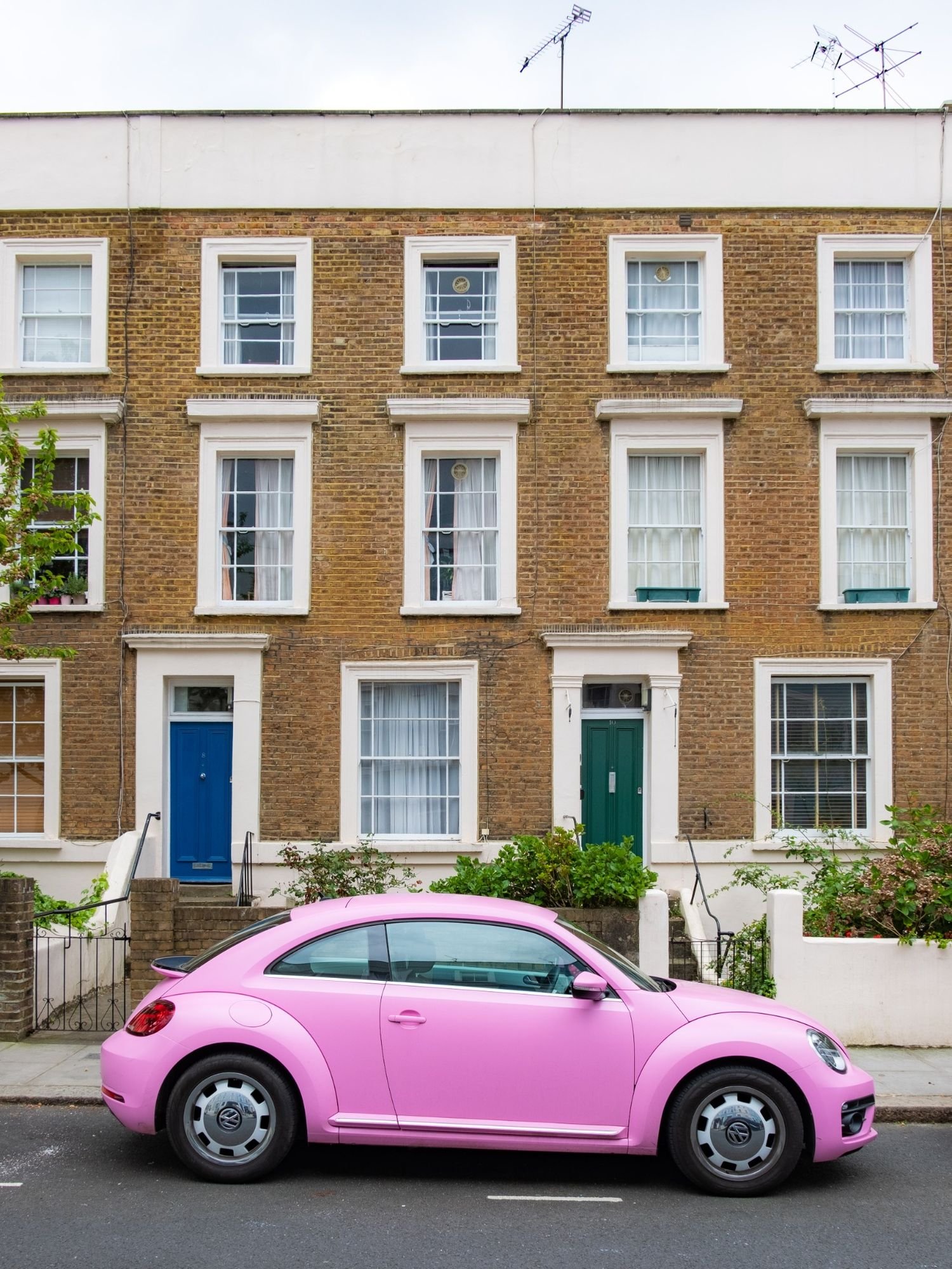
The ancient Greeks knew it. Renaissance artists swore by it. Le Corbusier tried to standardize it. And even today, it keeps showing up in places where beauty happens quietly.

It’s there in sunflowers and seashells. In the Parthenon and the pyramids. In the spirals of galaxies and the curve of a nautilus shell. A strange, mathematical thread tying together nature, art, and design - a cosmic flex, if you will.

But let’s be honest: is the Golden Ratio always intentional?

Probably not.

Leonardo da Vinci may have known what he was doing. The sunflower almost certainly did not.

Yet there’s something undeniably satisfying about the way the Golden Ratio seems to stitch the world together. Not too symmetrical. Not too chaotic. Just balanced enough to keep things interesting.

I experienced this mathematical magic myself when redesigning my study last year. After weeks of frustration with a layout that never felt quite right, I applied the Golden Ratio to determine the ideal desk placement in relation to the window wall. The result was immediate: a sense of balance that had eluded me through dozens of other arrangements. What changed wasn't the furniture itself, but the mathematical relationship between the elements. That's the quiet power of proportion.

So How Do You Use It?

If you're working on a space, whether it’s choosing art for a wall, planning a bookshelf, or designing a facade, here’s the simplest Golden Ratio hack:

Divide the total length by 1.618.

The result? Your smaller, “golden” section. The leftover? The larger, “golden” complement.

Example:

• Have a 2-meter wide wall? 2 ÷ 1.618 ≈ 1.24 meters.

• That means your focal artwork could be around 1.24 meters wide, with the remaining space acting as natural breathing room.

It works for layouts, spacing, furniture placement, even table settings. Aywhere proportion matters more than you might think.

And here’s another easy trick:

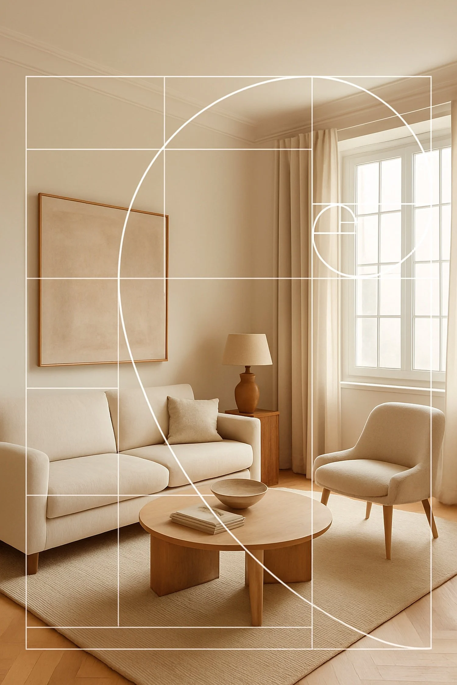
The Golden Rectangle.

Draw a rectangle where the long side is 1.618 times the short side. Cut a square from it, and what’s left? Another Golden Rectangle. This self-repeating elegance is why the Golden Ratio shows up in classical architecture, Renaissance paintings, and occasionally, very good websites.

The ratio works elegantly for three-dimensional spaces too. When arranging furniture in a living room, try this: if your sofa is 2 meters long, place your coffee table approximately 1.24 meters away from the centre of your seating area (2 ÷ 1.618). This creates a conversation zone that feels neither cramped nor disconnected, just right for both intimacy and comfort. The same principle works for dining tables, reading nooks, and garden pathways.

Think of the Golden Ratio as nature's rhythm section: It creates a visual beat that feels neither rushed nor dragging, but perfectly timed. Like the satisfying pause between musical phrases or that perfect moment when a chef knows the dish needs nothing more added, the Golden Ratio is the point where adding or subtracting would only make things worse.

Golden Myths

It's worth noting that not every spiral in art history was consciously designed using the Golden Ratio. Many modern claims about its presence in famous works (like the Mona Lisa or the Great Pyramids) involve rather creative measurements and generous interpretations. Artists throughout history have used many compositional tools and the Golden Ratio being just one.

What matters isn't whether Leonardo was calculating 1.618 on his canvas, but that the proportional relationships that please the human eye often approximate this ratio, whether by mathematical intention or intuitive feeling. The most beautiful designs often arrive at similar proportional conclusions, regardless of their starting point.

So, Design, But Make It Divine

In architecture and interiors, the Golden Ratio is just one way to create proportions that feel… calm. Human. It guides where we place windows, how we shape doorways, even how we arrange furniture. It whispers: step back, this is the right amount of space between things.

It’s not about perfection. It’s about harmony.

A well-proportioned room doesn’t shout. It doesn’t need to. It makes you feel at ease without knowing why.

Proportions: The Quiet Power Move

When proportions are right, you don’t notice them. You just feel the calm. The balance.

When they’re wrong, you can’t put your finger on it, but you sigh. Or frown. Or leave.

Spotting the Absence (a Modern Epidemic)

And speaking of proportions not playing nice…

Look around most new builds. Spot any graceful ratios? Probably not.

Because here’s the thing: the Golden Ratio demands space, patience, and attention. Three things that don’t fit well into the spreadsheet logic of many modern projects and developers driven primarily by profit margins, or planning and urbanism offices focused more on density than dignity and quality of life.

In the rush to maximize square meters and minimize costs, proportions get squeezed. Windows too small. Facades too flat. Floor plans that feel like someone Tetris-ed them five minutes before the deadline.

The result? Spaces that technically function but never feel good.

Good design works invisibly on the nervous system.

The Golden Ratio isn’t the only way to get there. But it’s one of the oldest, and still one of the best.

This mathematical relationship between design and natural patterns points to something deeper: our homes and spaces feel most harmonious when they echo the proportional wisdom of the natural world. Just as biomimicry (which I explore in another piece) looks to nature's solutions for functional design problems, the Golden Ratio offers nature's solution to aesthetic balance. Both approaches recognize that millions of years of evolution might have something to teach our relatively young design studies.

Next time you find yourself drawn to a particular space without knowing exactly why, a room that feels perfectly balanced, a building that seems to "just work," or even a simple shelf arrangement that pleases the eye, look for the hidden mathematics. The Golden Ratio might be quietly working its proportional magic, speaking a numerical language that your intuition understands perfectly, even if your conscious mind never does the math.

What spaces in your world feel most harmonious to you? The answer might be as close as 1.618.

Because even the best design ideas often start with a simple question: What if we listened to the mathematics of beauty?

If this kind of thing fascinates you as much as it fascinates me, you might also enjoy:

Design Lessons from Nature: How Biomimicry is Shaping Our Homes

written by Helen M. Krauss


In Get Inspired
Comment

Terrazzo: The Floor That Took Its Time. A Short History of Patience, Pattern, and Pebbles.

April 21, 2025 Helen Krauss

Old-world artistry in every chip - terrazzo as it once was, where even the smallest fragments told a story.

Our first house in Luxembourg, built in 1912, had one of those floors that made you pause mid-step. Cool underfoot, shimmering in the sunlight, colours of the different floral patterns shifting with the light, and somehow more expressive than the walls around it. A terrazzo floor. Original. Worn. Glorious.

When we had it restored, the craftsman told me something that stuck: "Back then, they worked on a terrazzo floor for months. Today? A few days, max." The restoration process was fascinating as well. They used whenever possible original little stones in the same colours we had, so most often, these were antique stones, salvaged from other terrazzo floors which could not be rescued. 

And just like that, I saw it differently, not just as a beautiful surface, but as a forgotten monument to time.

The terrazzo floor looked even more stunning after it was restored. After the final polish, I could not believe it, the vibrant colours, all came back to life, more intense, and I could imagine how it must have looked the day it was first completed, over a hundred years ago.

A Brief History in Stone and Cement

Terrazzo has been around since the Venetians swept their marble scraps into patterns and sealed them with goat’s milk (yes, really). It was the humble by-product of opulence, an elegant way to reuse what the grander palaces discarded.

Over the centuries, it evolved. By the early 20th century, it had made its way into bourgeois foyers and institutional hallways alike. In the 1920s and 30s, it was prized for its durability and Deco flair. In the post-war years, it became a staple of modernist architecture: sleek, hygienic, democratic.

But somewhere along the way, terrazzo got a reputation problem. Too cold. Too utilitarian. Too… public school corridor.

Until now.

The Comeback of Terrazzo

Terrazzo is back. Not just on floors, but on countertops, tiles, lamp bases, and even wallpaper. Sometimes it’s real, sometimes it’s a pixelated print. Sometimes it’s heartbreakingly beautiful. Sometimes, let’s be honest, it looks like confetti after a bad party.

But when it’s good , really good, it’s a reminder of what design can be: durable, decorative, and deeply rooted in craftsmanship.

Today’s terrazzo is mostly fast and flexible. But the old floors? They were laborious compositions. Marble, quartz, and granite fragments, hand-placed, hand-polished, and sealed in cement. Not just a finish, but a philosophy. A commitment to time.

Why It Still Matters

In a world obsessed with instant transformation, terrazzo whispers a slower truth. It’s not just a surface - it’s a memory map. A celebration of patience. A meditation in minerals.

I still think about our 1912 floor. How it outlasted every owner and every trend. How it held its history in chips and specks and swirls.

And I wonder what we’re leaving behind now - in a world of click-and-go tiles and weekend renovations.Because some things… are worth waiting for. And I savoured every minute I could spend with that terrazzo floor.

It was a joy to walk on every day and I very much miss it and hope that the new owners of our former house,  treasure it as I did.

The original terrazzo floor in our 1912 former home, restored with antique stone and immense care - a reminder that some things are worth preserving.

written by Helen M. Krauss


In Get Inspired
Comment

Why Is There a Lion at Your Door? A Short Investigation into the Suburban Jungle.

April 20, 2025 Helen Krauss

Orange lion with streaks of bird poo. Guarding the threshold between public life and private sanctuary.

The other day I was walking through a quiet neighbourhood in the vineyards of the Moselle. The paving was clean, the lawns trimmed. And then - boom. There he is.

An orange lion. At the doorstep. Staring at me like I owe him tribute.

In Luxembourg (and neighbouring regions), this curious species of decorative guardian is far from endangered. In fact, he seems to thrive. Perched on plinths, flanking doorways, occasionally with a matching sibling on the opposite side - lions are everywhere.

But why? I was wondering. So, I did a bit of brainstorming:

Let's start with the obvious. The lion is a classic symbol of strength, dignity, and territorial dominance. Historically, they guarded temples, palaces, and tombs. In modern-day Moselle, they obviously guard… tile staircases and mailbox number 11.

This is not Versailles. And yet the lion roars on.

Of course, there's a social signalling theory to all this. Nothing says "I am sovereign of my semi-detached castle" quite like a stone (or plastic, or fiberglass) lion in full regalia. It whispers, "Yes, this is a 1970s bungalow, but also possibly the seat of a forgotten dynasty". Much like oversized garage doors or meticulously arranged garden gnomes, these lions serve as suburban status symbols,  though perhaps with a touch more historical gravitas.

The design choices vary wildly: weathered stone for the classically inclined, seen a lot in the small town where I live, white glossy resin for the spiritually ambiguous, and then… this one. 

Neon orange terracotta with streaks of bird poop. A design statement if ever there was one. Equal parts Narnia and nightmare fuel, like if Aslan had an unfortunate encounter with a traffic cone and then was left to weather the elements for a decade.

Is it art? Is it irony? Or is it simply a result of the Luxembourgish DIY spirit gone rogue?

We may never know.

The vibrant orange of this particular specimen is what caught my eye initially – a blazing sentinel impossible to ignore against the muted tones of the neighborhood. It's somehow both wildly out of place and perfectly at home, a contradiction in terracotta.

What's fascinating is how this tradition seems particularly entrenched in the Luxembourg-Moselle region. While garden statuary exists worldwide, the lion doorkeepers here appear with a frequency that borders on cultural requirement rather than mere decoration.

However, this orange Lion stays with me. It is an unforgettable example of the cultural expression in this part of the world.

But one thing's for sure: the doorstep lion is less about the creature itself and more about the need to be seen. To add weight - literal and symbolic - to the threshold between public life and private sanctuary.

It says: "Beyond this point, my rules apply. Step carefully. And maybe, just maybe, bow."

What suburban guardian stands watch at your threshold? And what might it reveal about your own territorial instincts?

written by Helen M. Krauss

In Get Inspired
Comment

Pickets, Prisons and Hedges: A Design History of Exclusion

April 18, 2025 Helen Krauss

Ornate, slightly too tall, and quietly judging you. Fences know things.

Last week I read an article in Wort.lu about an Agricultural Engineer, working for a European Institution in Luxembourg, who ended up in a bureaucratic legal battle with the Luxembourgish environmental agency. His crime? Wanting to build a garden fence, a simple “Staketenzaun” out of wood, very ecological, very sustainable. A fence, which was then apparently classified as a “building” which needed a permit and this permit was denied.

This, naturally, escalated into a “Kleinkrieg”.

And it got me thinking: when did fences become so… emotional?

The answer, as with most quietly insane design legacies, lies in the Neolithic period. Roughly 12,000 years ago, humans began trading their nomadic lifestyles for fields, crops, livestock - and, with them, the need to mark space.

To say: This wheat is mine.

These goats are mine.

This mud hut with the broken roof - also mine.

The fence, then, was never just a barrier. It was the first architectural assertion of possession. A primitive line in the soil that said: I was here. You stay there.

Fast forward twelve millennia and we’ve perfected the art of fencing people out and signaling just the right amount of hostility while doing it.

There’s the classic picket fence, whispering I’m approachable, but please don’t test it.

The chain-link fence, beloved by schoolyards and post-apocalyptic films alike.

The gabion wall, used by architects who want to feel edgy while hiding behind rocks.

The tall manicured hedge, perfect for people who want to say I’m not rude, just deeply private.

Each fence is a design choice, but also a psychological one.

Are you protecting something? Hiding something? Trying to look expensive, or just… safe?

I, for instance, think about fencing in our very small patch in front of the house. I feel surprisingly territorial about it. It is ridiculously small and yet I feel that intense desire to fence it in, to protect it (or us?), since the day we moved in.

Currently, it is a simple “fence-line” done with very primitive looking rough big stones. It feels rather medieval, in a Stonehenge or Flintstone’s way. It really must be changed to something more refined, something more effective. Perhaps: Laser-activated garden perimeters or motion-detecting sprinklers?

And don’t get me started on anti-burglar fences with floral detailing, or the tiny 30cm decorative barriers that politely suggest you could step over me, but we both know you shouldn’t.

In cities, fences reveal who trusts their neighbours, and who believes the world is one bad Tuesday away from chaos. In rural areas, they divide property, and occasionally friends, over five-metre stretches of hedgerow with territorial ambitions.

And yet, the design of fences is rarely discussed in architectural circles. They’re seen as too minor. Too functional. Too… petty.

But minor things can carry major meaning.

And sometimes, a fence is all it takes to turn civilisation back into tribe.

Want more on how public space reveals what we value (or pretend to)?

Read and Explore the Battle for Public Space series → Urban Observations

written by Helen M. Krauss

In Get Inspired
Comment

The Design History of Dog Poo Bags

April 17, 2025 Helen Krauss

Poo Bags and Power Plays: What Your Dog’s Deposits Say About You.

Somewhere between the invention of the flush toilet and the rise of the luxury SUV, someone decided that walking a dog should also involve carrying its warm feces in a thin plastic sack. The dog poo bag - humble, horrifying, oddly political - has quietly become one of the most significant civic tools of the 21st century.

But I was wondering where did it begin?

A Short History of Sh*t Control

I found that the modern dog poo bag emerged in the 1970s, not in a design studio, but as a public health intervention. First in the UK, then in parts of the US and Germany, municipalities began issuing free bags to encourage dog owners to pick up after their pets, a radical shift from the previous norm of simply… looking away. Although I witness this kind of behaviour still occasionally when the dog walker thinks no one is looking.

At first, the bags were nothing more than flimsy grocery bags with a new purpose. But over time, they evolved. Dispensers appeared in parks. Rolls were designed to fit in branded canisters. And the bags themselves?

Black: for discretion. Green: for eco-guilt relief. Pink: for the cheerful nihilists. Here in Luxembourg they tend to be dark grey.

Form, Function, and Performative Morality

Carrying a roll of poo bags clipped to your leash says something. So does pulling one out with flair in front of strangers. It’s not just hygiene. It’s signaling. Proof that you’re a good citizen. A person who obeys invisible contracts - at least as long as someone is actually looking.

But the signaling doesn’t stop there.

There’s also the tie-and-leave brigade, those who diligently bag the waste, knot it into a neat parcel… and then leave it on a tree branch or trail post like a cursed Christmas ornament.

It’s unclear whether this is a failed act of protest, a spatial misunderstanding, or just wishful thinking that the Bag Fairy will collect it. In any case, it is rather disgusting and one of these bags just very nearly missed me during stormy weather the other day when I was out and about. It was a near death experience. I have a very sensitive olfactory perception and usually already almost lose consciousness when I have to clean the cat toilet (normally my husband does it for that reason).

Urban Behaviours and the Illusion of Order

In cities, the dog poo bag becomes a litmus test for how we negotiate shared space. Sidewalks, grassy patches, the tree pit in front of your house, all become contested zones. And the presence (or absence) of little black bags tells us more about urban trust than any town hall ever could.

The bag is design at its most invisible. Disposable. Functional. Slightly humiliating. And yet, it carries the weight of public expectation and private shame.

That’s a lot for a 12-micron sack.

Want more on how public space reveals what we value (or pretend to)?

Read and Explore the Battle for Public Space series → Urban Observations

written by Helen M. Krauss

In Get Inspired
Comment

The Fibonacci Number in Design

April 16, 2025 Helen Krauss

A Fibonacci spiral superimposed on a winding staircase - a perfect union of nature’s math and architectural beauty.

Some numbers just… feel right. The Fibonacci sequence is one of them.

You’ve seen it, even if you don’t know its name. It appears in pinecones, pineapples, spiral staircases, seed patterns, and seashells. And when applied in design, it makes things look natural, even when they’re not.

So what is it, exactly?

The Fibonacci sequence is a simple pattern of numbers: 0, 1, 1, 2, 3, 5, 8, 13, 21…

Each number is the sum of the two before it. But here’s the twist: as the numbers increase, the ratio between them approaches the Golden Ratio, that mysterious 1.618 that seems to make things pleasing to the eye.

Interior designers, architects, and artists have quietly used this sequence for centuries. Not because it’s trendy or spiritual or mathematically elegant (though it’s all three), but because it works. It feels balanced. It calms the chaos. I always use it myself when I design a room.

Fibonacci in Action: A Living Room Example: Want to try using the Fibonacci sequence in your own space? Here's a simple way to start:

Imagine you're designing a living room wall with a combination of artwork and shelving. Using the Fibonacci numbers (0, 1, 1, 2, 3, 5, 8, 13, 21...), you could:

- Choose a base unit of measurement (let's say 20,32cm)

- Hang your main artwork at 86,36 cm wide (8 × 4.25, approximating the Golden Ratio)

- Place a shelf that's 53,34 cm wide beneath it

- Add two smaller decorative pieces that are 33,02 cm and 20,32 cm wide respectively

- Space these elements 12,7 cm apart

This creates a composition where each element relates to the others following nature's proportions. The largest piece draws the eye first, while the smaller elements create a natural visual flow.

In a room, this might mean proportions between furniture and wall space. In a building, it might shape the relationship between height and width. In a layout, it might guide where your eye lands first, second, and third - and whether it feels satisfying or slightly... off.

The Fibonacci spiral - often seen in nautilus shells or sunflower heads - has also inspired furniture, lighting, and even garden layouts. Not because someone had a geometry textbook open, but because nature’s proportions make instinctive sense. Experiment and you will feel it.

And maybe that’s what we’re always chasing in design: the illusion of inevitability.

That sense that a space couldn’t be any other way. That it fits. Exactly. And it can take a while until you reach this state. In our last house it took 2 years until everything seemed perfect. We sold it in a week despite difficult circumstances.

If you’ve ever walked into a room and felt it just worked, without knowing why, the Fibonacci ratio may be quietly behind it.

Curious how nature shapes our interiors in ways we rarely notice?

Read the post: Design Lessons from Nature – How Biomimicry Is Shaping Our Homes

written by Helen M. Krauss

In Get Inspired
Comment

Heritage as a Minority Sport in Luxembourg

April 11, 2025 Helen Krauss

Stone arch and cobbled street in the historic old town of Luxembourg City.

If heritage protection were a sport in Luxembourg, it would be curling. Niche. Mysterious. Played in silence. And usually witnessed by no one.

In 2020, during the European Heritage Days, a protest was held in the capital to draw attention to the slow-motion massacre of architectural heritage across the country. Eighteen associations joined forces. The press turned up. There were signs, slogans, and even hope.

Fifty people came.

Fifty.

In a country of over 600,000. That’s less than the turnout at a poorly advertised cheese festival. And yet, there they stood, civil society groups, preservationists, historians, and a few mildly annoyed homeowners who discovered too late that their façade was about to be “updated.” They held signs like “Rett eise Patrimoine” and “Embauen, net ofrappen” which roughly translate to: “Please stop bulldozing the past, thank you very much.”

It was heartfelt. It was civil. And, as with most things heritage-related in Luxembourg, it was mostly ignored.

Because let’s be honest: preserving buildings is not a popular pastime here. It doesn’t win votes. It doesn’t generate headlines. It’s not shiny. It doesn't photograph well on social media, unless you’re selling it with artisanal sourdough and a linen apron.

The dominant logic is brutal in its simplicity:

• Old buildings are inefficient.

• Poor people live in them.

• They’re best replaced with something that matches the budget forecast and the kitchen showroom catalogue.

The result is a curious urban landscape where the less a building is valued, the more likely it is to house the people society values the least. You see it again and again, in Esch, in Ettelbruck, in villages across the country. Beautiful old houses, assigned to decay or to “social use,” because somewhere along the line, it was decided that heritage is not good enough for the rich.

Which brings us back to the protest. The Lëtzebuerger Denkmalschutz Federatioun, newly founded at the time, pointed out what everyone sort of knew already: the protection system doesn’t really work. The national and communal levels don’t coordinate. The inventories gather dust. The will, politically, socially, culturally, is simply not there.

And yet.

People still protest. People still care. Not many, but enough to keep showing up with their hand-painted signs and their encyclopedic knowledge of sandstone cornices. They come because they know something important: when you lose a historic building, you don’t just lose bricks and plaster. You lose context. You lose identity. You lose a piece of the story that tells you where you are.

And when you lose enough of those stories, you start to forget what the place even meant in the first place.

[Read the full post on heritage protection here →]

written by Helen M. Krauss

In Get Inspired, Heritage
Comment

Question everything!

March 27, 2025 Helen Krauss

Eileen Gray, Interior Designer and Architect

“To create, one must first question everything.”
— Eileen Gray

Eileen Gray (1878-1976), a trailblazer in modern design and architecture, understood that creativity begins with curiosity. Her philosophy - “To create, one must first question everything” - speaks to the heart of innovation. For Gray, true design was never about accepting the status quo but about challenging assumptions and exploring new possibilities.

Take her iconic E-1027 table, for example. This seemingly simple piece wasn’t designed for the sake of aesthetics alone. It was crafted to adapt, its adjustable height allowed it to meet the needs of the moment, whether serving as a functional bedside table or a sophisticated accent in a living room. Gray’s work questioned the rigidity of traditional furniture design, pushing boundaries to create pieces that were as dynamic as the lives they were meant to enhance.

Her words remind us that great design doesn’t start with answers, it starts with questions. Why do we use this material? Why does this object function this way? Why not try something new? By questioning the “rules,” we open the door to innovation, discovering not only what design can be but what it should be.

Gray’s legacy is a call to action for all creatives: dare to ask, dare to doubt, and dare to redefine the world through design.

written by Helen M. Krauss

In Get Inspired
Comment

Design is How It Works - Steve Jobs

February 23, 2025 Helen Krauss
“Design isn’t how it looks. It’s how it works.”
— Steve Jobs

Steve Jobs, a visionary who redefined technology, had a profound understanding of design’s true essence. For Jobs, design wasn’t about aesthetics alone, it was about function. The beauty of a product wasn’t just in its sleek lines or polished finish but in how it seamlessly integrated into daily life.

Take the iPhone as an example. At first glance, its minimalist design is striking, but its true brilliance lies in its intuitive interface. From the swipe of a finger to the effortless transition between apps, every detail was crafted to enhance the user’s experience. Jobs believed that great design is invisible, it doesn’t shout for attention but works quietly and flawlessly in the background, making life easier without the user even realizing it.

This philosophy challenges us to look beyond the surface. Whether designing a space, a product, or even a process, the question isn’t just “How does it look?” but “How does it function?” Great design solves problems, simplifies complexity, and ultimately improves lives.

Jobs’ legacy reminds us that design isn’t just about appearances, it’s about creating things that work beautifully. And in that harmony of form and function, design becomes truly timeless.

written by Helen M. Krauss

In Get Inspired
Comment

The Origin of the Chesterfield Sofa

January 22, 2025 Helen Krauss

When we think of the Chesterfield sofa, it’s easy to dismiss it as just another piece of classic furniture - timeless, yes, but ultimately decorative. Yet this iconic design has roots in more than just aesthetics. Legend has it that the Chesterfield was commissioned in the 18th century by Lord Philip Stanhope, the 4th Earl of Chesterfield, with a very specific purpose: to allow gentlemen to sit upright without wrinkling their perfectly tailored clothing. This wasn’t just about comfort - it was about projecting an image, a philosophy of refinement and control.

The design itself was revolutionary for its time. The deep, button-tufted leather upholstery, low back, and rolled arms created a structure that exuded both elegance and restraint. It wasn’t a piece of furniture you slouched in- it was a seat you inhabited with purpose. And that’s what makes the Chesterfield fascinating. It wasn’t just built to serve a function; it was built to embody an ideal.

Over the centuries, the Chesterfield sofa has shed its exclusive aristocratic ties, becoming a staple in homes, hotels, and offices worldwide. Its adaptability has kept it relevant, with modern versions experimenting with bold fabrics, brighter colors, and unexpected shapes. And yet, the essence remains unchanged: the Chesterfield is more than a sofa. It’s a statement, a silent testament to the power of thoughtful design.

written by Helen M. Krauss

In Get Inspired
Comment

Why Do We Have Skirting Boards?

January 12, 2025 Helen Krauss

Skirting boards, or baseboards, are such a quiet feature of interior design that they often go unnoticed- but their origins are steeped in both function and style. Historically, skirting boards were introduced in the 18th century, particularly in Georgian architecture, as a practical solution to cover the gap between uneven plaster walls and floors. In an era when plastering was imprecise, these boards hid imperfections and protected walls from scrapes and scuffs caused by furniture or cleaning tools.

But skirting boards weren’t just about utility. In well-to-do homes, they became an opportunity to showcase craftsmanship and elegance. Intricate moldings, often carved from solid wood or plaster, reflected the grandeur of the space, with higher baseboards signaling wealth and status. Over time, their design evolved alongside architectural trends - from the minimal lines of modernism to the ornate detailing of Victorian homes.

Today, skirting boards remain an essential part of interior design, blending function with aesthetics. They create a clean visual transition between walls and floors while continuing to protect against daily wear and tear. And for those with a sharp eye for detail, they offer a chance to add a touch of personality to a space. Whether simple or elaborate, skirting boards are proof that even the smallest design elements can have a rich history.

If you would like to read more, see also my blog post “The Devil is in the Details. Always.”

written by Helen M. Krauss

In Get Inspired
Comment
Summary Block
This is example content. Double-click here and select a page to feature its content. Learn more
Featured
Cursus Amet

The Newsletter

Occasional dispatches on design, space and culture. No spam. Just substance.

We respect your privacy.

Subscribed.
Thoughtful dispatches will find you - when it matters.

Contact: hi@foundationsandfacades.com