• Get Inspired
  • Design Matters
  • Luxembourg Matters
  • About Me
Menu

Foundations & Facades

Design Thoughts
From the Edge
Of Luxembourg
Design - Property - Urban Spaces

Your Custom Text Here

Foundations & Facades

  • Get Inspired
  • Design Matters
  • Luxembourg Matters
  • About Me

Parquet Panic and the Scent of Esche: How I Found the Perfect Floor

November 18, 2025 Helen Krauss

There's a particular kind of madness that strikes the design-obsessed when they buy a house. A slow, creeping delirium that begins with words like “just paint” and ends with you comparing twelve near-identical shades of warm neutral at 1 a.m. on a Tuesday.

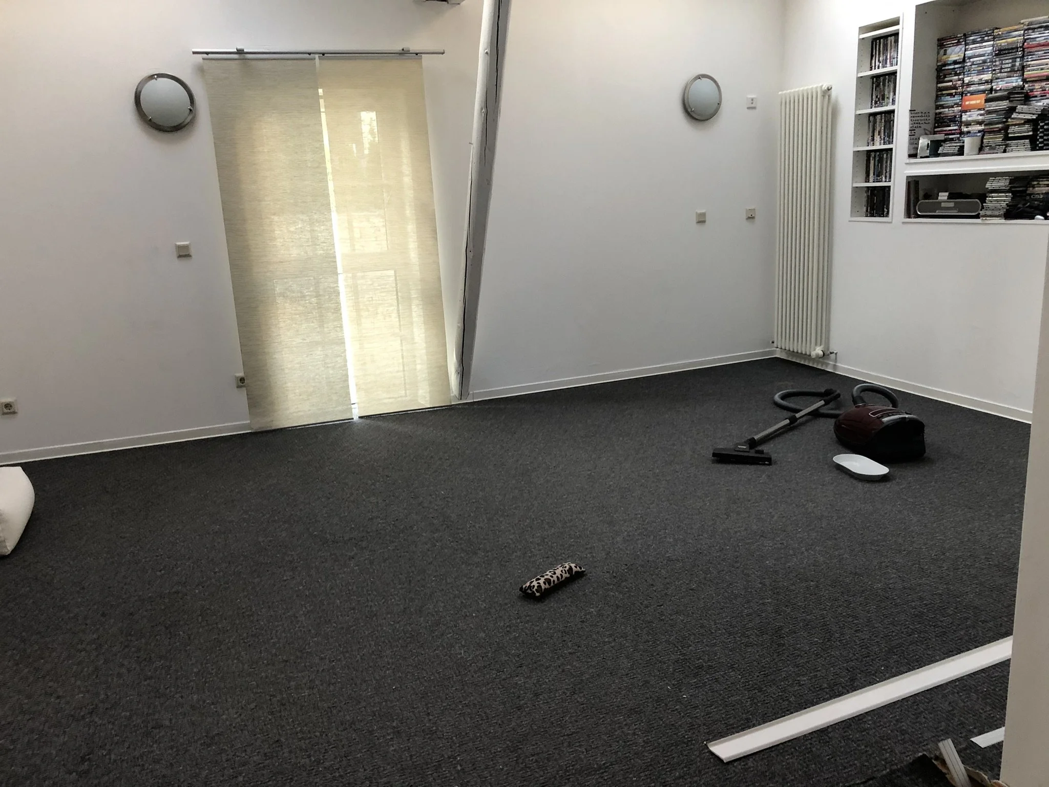
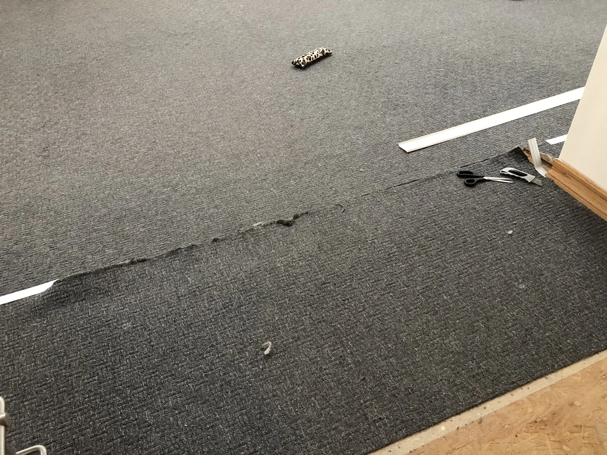
For me, it was the floor. More precisely, the carpet. A heinous grey woolly expanse that haunted the top floor of the new house. It had seen things. It had absorbed things. Even the cats, Dex and Floyd, loved it a little too much.

Enter the Spiral of Perfection

Now, if you're a normal person, you walk into a showroom, pick a floor, and move on. But I am not a normal person. I'm a perfectionist, design enthusiast, and deeply suspicious of anything with visible yellow undertones. Oak was out. Walnut too moody. Bamboo too trendy yoga studio in Berlin. I wanted timeless, not-too-rustic, not too slick. Just the perfect fit.

Parquet began as a luxury for French palaces in the 17th century as intricate wooden mosaics that declared wealth and refinement. Now here I was, centuries later, carrying on that tradition of obsessive wood-grain inspection, albeit with significantly less royal budget and courtly titles.

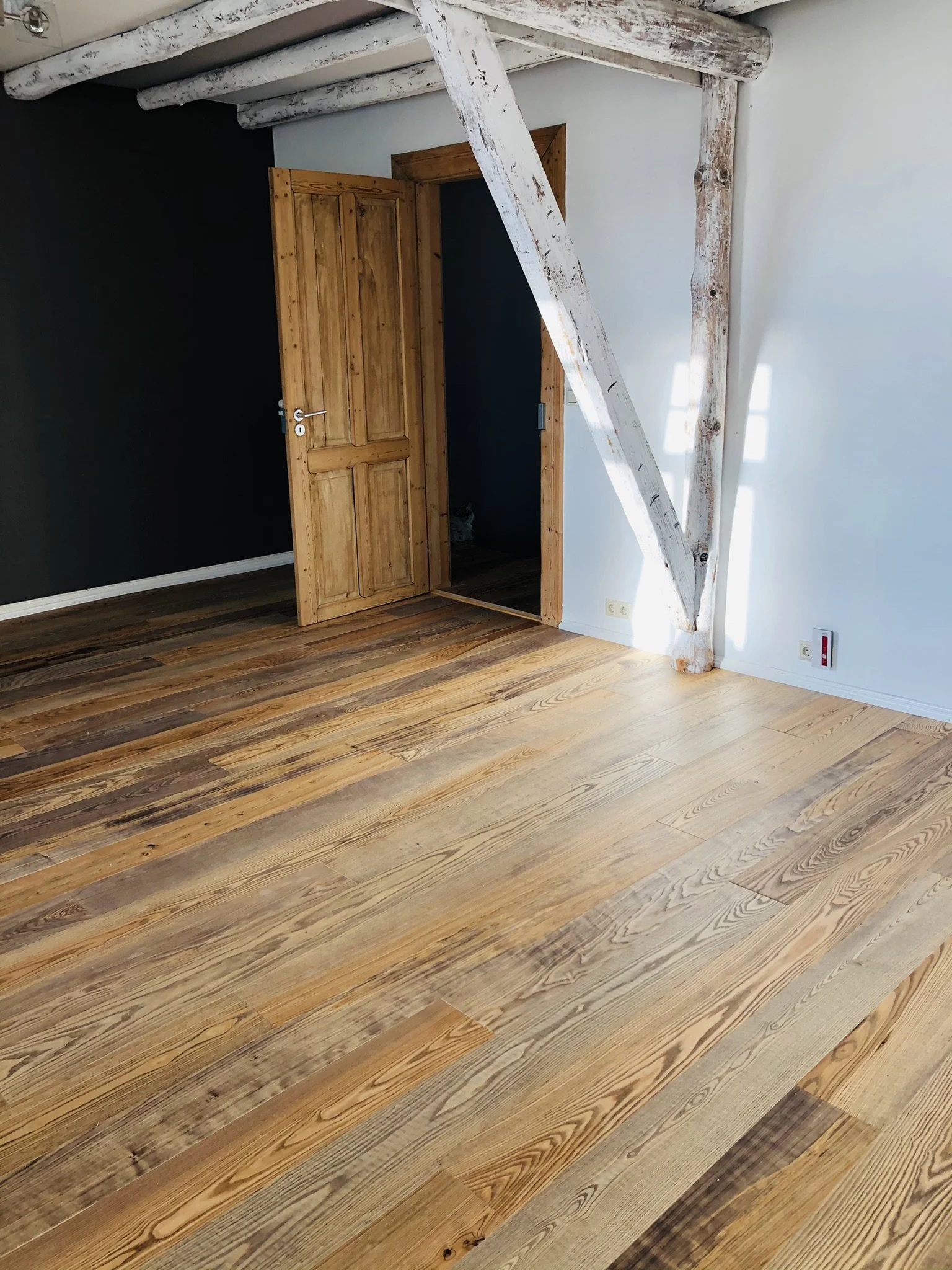
What complicated matters even further: our doors. These glorious, raw-looking wooden doors stained in that unpredictable way that shifts with the light. They are very popular in the UK where I spent a large chunk of my life. Beautiful, yes. But also a colour wildcard. Every parquet wood I liked in isolation suddenly clashed with them.

What a disaster it would've been to get this wrong. You don't want a floor fighting with your doors.

I became… obsessed.

The Great Parquet Pilgrimage

I drove across Luxembourg for months. I crossed borders. I sniffed sample planks like a sommelier. Daniel, my partner, followed along. We were on tour on weekends and evenings. He nodded thoughtfully and occasionally whispered, "This one's nice, no?" only to receive my blank stare because that one was, obviously, far too warm, or cold, or stripey, or dead-looking.

Some showroom staff knew us already by name. Others sighed audibly when we entered. My quest had become, let’s say - slightly unhinged - in a region where parquet is still seen as unpractical. Tiles and laminate rule supreme here: robust, easy to clean, low drama.

The region spanning Luxembourg, Saarland, Eifel, Wallonia, and Lothringen reflects its pragmatic past: mining, farming, steel industry. Beauty came second. The post-war generation embraced practical materials that could take a beating and didn’t require polishing. And that mindset still clings to local culture.

But some still believe in wood underfoot.

When You Know, You Know

We were weeks in and I began to wonder if the perfect floor even existed or if I had simply lost my mind. Possibly both.

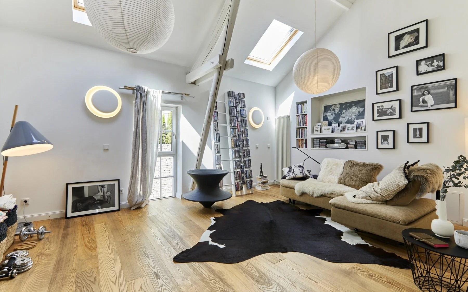
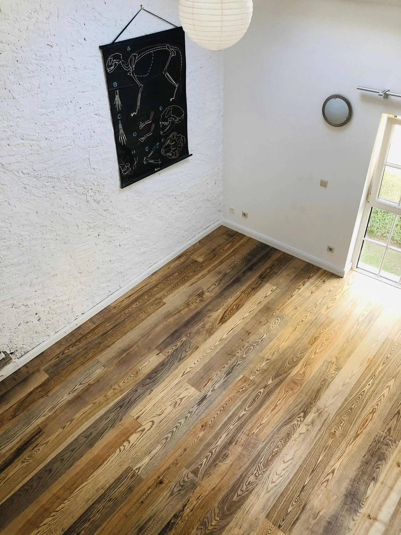
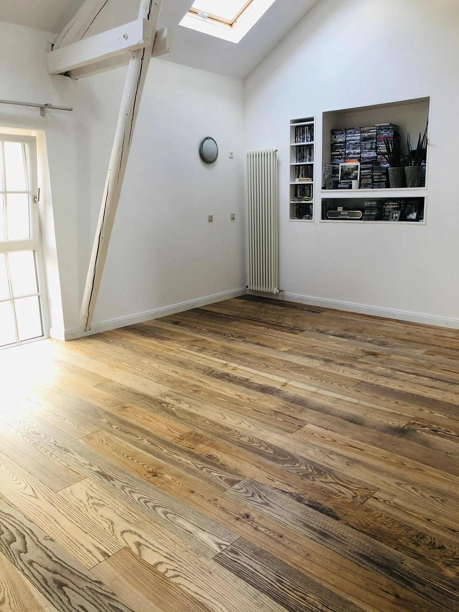
It happened on a Tuesday, of course. But there it was: Individually selected ash planks (Esche). Softly contrasting grain. Slightly smoked, not scorched. Matte but not dusty. A warm grey-brown that looked like it had lived a little. My hands tingled. This was it.

At around 200€/m2, it wasn't cheap. But then again, neither was therapy. And this floor healed something primal.

Pandemic Be Damned

Despite the chaos of 2020, the carpet went. We pried it up with ceremonial flair, discovering decades of dust, questionable cable routing, and possibly a few mummified spiders and paperclips. And under it all, the skeleton of a home waiting to exhale.

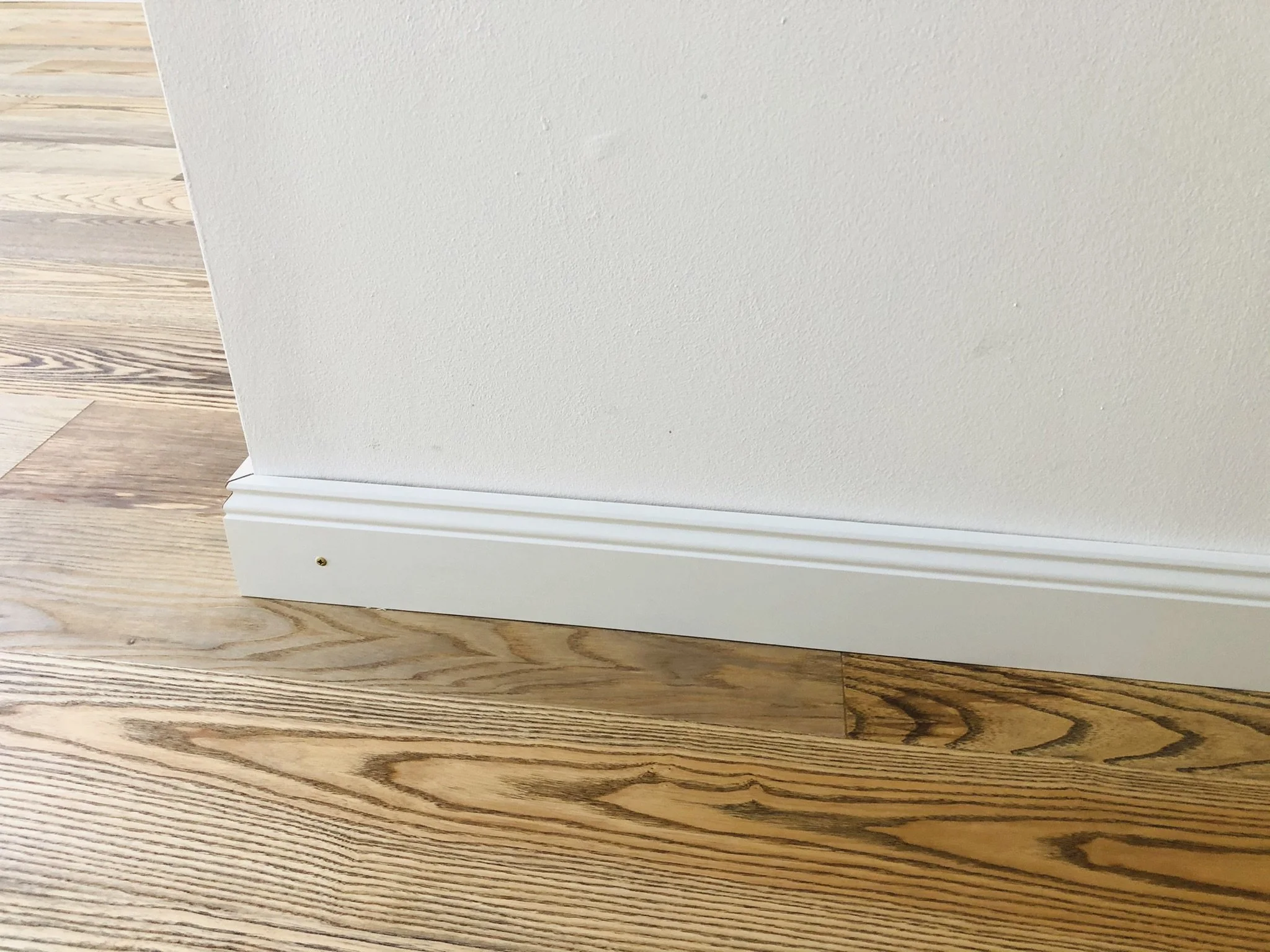
The Esche went in. Even the builders admitted it was unusually beautiful (before grumbling about my refusal to let them glue the skirting boards: "Schrauben bitte, danke.")

Lesson: Never let anyone glue your skirting boards. Screws are reversible. Screws are freedom.

What I Learned Along the Way

The journey taught me that not all parquet is created equal. Thickness matters more than most people realize, and cheap parquet that can't be sanded and refinished is nothing but a false economy waiting to disappoint you years down the line.

I also discovered the cardinal rule of never trusting showroom lighting; those perfectly lit displays lie with the confidence of a used car salesman. Always take samples home and live with them in your actual space, watching how they change throughout the day and light.

Our pets, particularly the cats, staged a full protest against the carpet's removal, but they eventually forgave us when they discovered the superior acoustics for their midnight Olympic sprinting events.

I also learned that skirting boards are where builders inevitably try to cut corners. Don't let them get away with it. Insist on screws, not glue, because screws mean freedom and the ability to change your mind later.

And perhaps most importantly, spending more on something you use every day isn't indulgence, it's wise. Your feet, your sanity, and your soul will thank you for it.

The Aftermath

Today, when I walk barefoot across that floor, I feel joy. Calm. The space is transformed. Light dances differently. The room exhales. Even the cats have come around (see left lower corner:-)

If I had to do it again, I'd only change one thing: I would trust my obsession sooner.

Perfectionism has its price. But so does settling. And between those two, I'd rather be the woman on her hands and knees in a showroom holding a wooden plank up to the light like it's a Fabergé egg, whispering, "Yes. This one speaks to me."

Because in the end, good design isn't just visual. It's visceral.

written by Helen M. Krauss


In Behind the facade
Comment

Prussian Blues, Luxembourg Greys

November 15, 2025 Helen Krauss

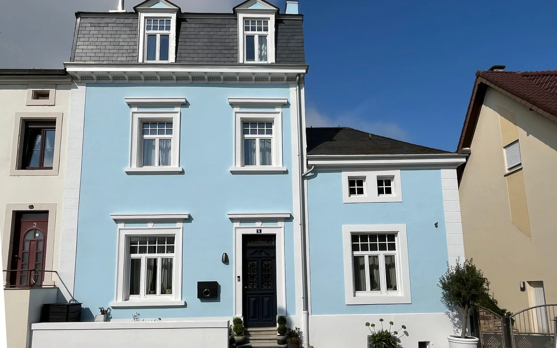
When we bought the house, the back facade was engulfed in ivy. Romantic in the way a Brontë novel is romantic: beautiful and quietly plotting your demise. It crept, tugged at mortar, and scaled all 13 metres to the roof with the stamina of a tax inspector. We tried cuts, the ivy asked for extensions. After multiple rounds of scaffolding to battle the ivy, we finally opted for complete removal and professional facade restoration. An arborist muttered that ivy gets more aggressive with age and suggested our plant might be as old as the house (1870), which is to say, older than my patience. That was the moment the dream of “ivy is so romantic and surely a sustainable home to numerous birds” gave way to new plaster, new paint, new plan, no bird mess on the terrace anymore. And if we were repainting, why not reconsider the colour as well?

Notting Hill in my head, Luxembourg outside the window

The house had been a very pale blue with white frames. Think Notting Hill in London. I checked with Little Greene’s historical palette and Farrow & Ball’s beautiful pastels. The painting company produced 1 x 1 metre test boards and I pinned them to the facade like modern art. The postman developed opinions. The neighbours ran an informal poll.

Two finalists emerged: Little Greene’s Pale Berlin and a Caparol shade called Arctic Blue.

Pale Berlin has that Regency clarity that comes from Prussian Blue. The colour story is irresistible: Prussian Blue was discovered in Berlin by accident in 1704, a turning point in pigment history because it was stable and comparatively affordable. You see it everywhere, from the dials on Big Ben to Brunswick Green (when mixed with Chrome Yellow). Mix it with Lead White and the slight yellow bias of the white tips the blue a little green. That’s how you land on the quietly elegant pale blue Little Greene “Pale Berlin 258.”

I watched those boards through sun, gloom, rain, and that special grey that parks over Luxembourg for days. Arctic Blue won. Clear without being candylike, fresh in bad weather, calm in bright sun. Strong enough to read as blue from the street, restrained enough not to shout at the neighbours. Colour, done.

Now for the paint itself.

Paints: Dispersion versus silicate

The painters kept asking whether we wanted Dispersionsfarbe. In English that’s emulsion or dispersion paint: perfectly fine on many facades, easy to apply, abundant choice. There are also silicone resin paints, popular because they shed water while allowing some vapour movement. A bit like putting rubber on a facade, maybe suitable for a cube where it gives some much needed texture.

And then there is the mineral option: silicate paint. This is where my heart starts beating with interest.

Silicate paint uses liquid potassium silicate as the binder. Instead of forming a plastic film, it chemically bonds to mineral substrates in a process Keim calls silicification. The result is a genuinely breathable, mineral-matte surface that doesn’t blister, peel, or suffocate old render. Colour stays stable for ages because the pigments are mineral and do not throw a tantrum under UV. Algae are less interested. Fire is unimpressed.

There is a catch. It wants proper preparation, the right primer, and a professional who can read technical data sheets without blinking. And it is not the cheapest date in the paint aisle.

But when done properly, it lasts decades, not seasons.

There is something telling about how we've normalized the disposable in construction. We accept that paint should peel and blister every few years, that facades should look tired after a decade. We've trained ourselves to see planned obsolescence as normal, even in something as permanent as our homes. But silicate paint doesn't play that game. It bonds at the molecular level and becomes part of the wall itself.

It's architecture that commits to the long term, a radical concept in a (construction) culture increasingly built around exit strategies.  

Why KEIM Silicate Paint

If you go down the silicate route, you might as well choose the inventor or as the painter put it: the Rolls Royce of paints. KEIM has been making mineral paints since 1878. Their systems are beautifully engineered, unapologetically exacting, and yes, pricier. The reward is longevity and that unmistakable mineral look that never feels plasticky or chalky. Grand buildings (even the White House in Washington!) trust it for a reason.

The process has more steps than normal paints: assess the substrate, repair with mineral materials where needed, use the KEIM primer that suits the base, then apply base and finish from the same system so the chemistry actually bonds. If your painter tries to skip a step, smile sweetly and remove the roller.

Could we get the exact Arctic Blue in KEIM? Of course. They tint with accuracy. So we kept our London-in-my-head blue, but in a paint that behaves like stone. White window frames stayed white. It is a classic because it works: crisp against the blue, serene in bad weather, sunny without looking like a gelato parlour.

Lessons from a Woman Obsessed with Test Boards

Test boards are the only way to make an informed decision. Move them around and look at them at unglamorous hours: morning glare, midday sun light, overcast sulk, drizzle, and that forgiving golden hour. Light is half the colour. Context does the rest. The same blue will look differently against slate, brick, zinc, and the neighbour’s facade colour; ours needed to sing with slate and avoid antagonising a quiet street.

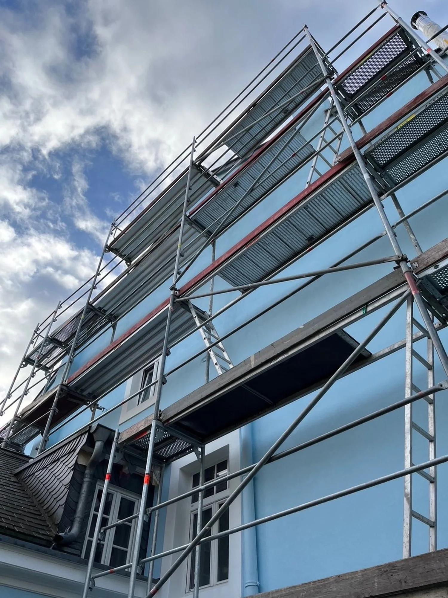
Old houses prefer minerals to plastic, so let them breathe. Budget for scaffolding, then double it if ivy has colonised your life, then you will have to get the facade plastered. We opted for Keim plaster as well, but that’s another story.

Choose a system, because with silicate paints the primer and topcoats are a family and mixing brands invites drama. Expect extra steps. KEIM is fussy for good reason. The result is durability measured in decades, not diary entries.

Standing back from those test boards pinned to our facade like modern art, I realized we were conducting a small rebellion against the beige and grey and the newest brownish-purple trend. Every developer's brochure promises "timeless elegance", but what they deliver is mediocrity with surfaces that age badly, colours that fade, materials that give up.

Choosing Arctic Blue in KEIM wasn't just picking paint. It was insisting that permanence still matters in a world increasingly designed for replacement.

Final Thought

Paint is not just paint. It’s a decision about how your house breathes and weathers, and how it speaks to the street. We kept the romance of blue and white, but traded sentimentality for science where it mattered. If you want the short version: pick your blue slowly, pick your paint wisely, and do not negotiate with ivy.

written by Helen M. Krauss


In Behind the facade
Comment

A New Slate Roof: Supervision and A Fear of Heights

June 10, 2025 Helen Krauss

There’s something humbling about realising your house is taller than you thought. Thirteen metres, to be exact, from ground to rooftop on the gable side (Giebelseite, if I am being technical). Not that I’d measured it before. It was just... our house. You live inside it, not on top of it. Until you suddenly have to.

I only became intimately acquainted with its full height when scaffolding arrived. Poles, platforms, metallic clinks at 7 a.m., and the peculiar intimacy of strangers peering into your upstairs windows while you’re still making coffee. The roofers had promised a two-week job - efficient, clean, no fuss. They said it with the confidence of men who assumed we wouldn’t be checking.

And to be fair, who checks a roof? Most people don’t. That’s sort of the point of a roof: you forget about it, until it fails.

But I didn’t forget. I climbed. I looked. I photographed. I had an expert on call. And I quickly discovered that our gable side, high, hidden, and far from street view, was being treated like a blind spot. A perfect place, in other words, to skip a few steps, cut a few corners, and assume no one would notice.

They were wrong.

Because here’s what I’d learned from other renovations: just because something is out of sight doesn’t mean it should be out of mind. Especially when it’s holding the house together.

So I did what any design-obsessed, renovation-weary homeowner would do: I took a holiday. But not the relaxing kind. The kind where you spend your mornings documenting zinc flashing and your afternoons decoding builder small talk. I was there every day - balancing on a blank with a clipboard and clenched jaw.  And slowly, the work began to match the promise.

Also, I should mention: I have a mild fear of heights. That fear did not appreciate climbing scaffoldings at seven in the morning to peer over details with a cup of coffee in one hand and my phone camera in the other. But necessity is a powerful motivator.

By week three, the two-week project had become five. But something else had changed, too: the roof was beginning to look… right. Precise. Like it belonged not just on any house, but on this house, with its tall silhouette, its quiet grandeur, and its long memory.

And after all the scaffolding, setbacks, and sideways glances, our house was finally getting the roof it deserved.

Slate: A Short Cultural History (and a Subtle Status Marker)

Slate is one of those materials that doesn’t shout. It doesn’t gleam like zinc or flash like copper. But its dignity is unmistakable. For centuries, slate has covered everything from grand civic buildings to quiet mountain homes. It’s the roof you choose when you want something to last, and when you’re not trying to impress anyone but yourself.

Historically, slate was expensive to quarry, difficult to transport, and even trickier to install. Which is why it was often found on properties that mattered - architecturally, symbolically, or socially. In much of Europe, a slate roof was a mark of distinction.

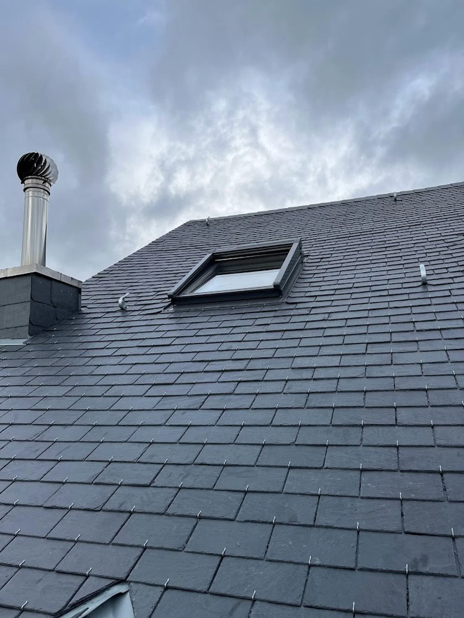
For this roof I opted for high-quality natural slate from Spain, dense, dark grey, smooth-textured, and with excellent longevity. Compared to softer varieties from other regions, this one ages gracefully and holds up beautifully in Luxembourg’s climate.

Which brings us to the 1960s and ’70s. A time of mass construction and minimal budgets. Eternit, that eternally problematic fibre cement product, was everywhere. Light, cheap, and often riddled with asbestos, it became the default choice for developers and budget-conscious owners alike. Our house, like many others, had been “updated” in that era with a practical but joyless grey Eternit roof. Function? Yes. Charm? Not exactly.

So when the time came to replace it, I didn’t just want new tiles. I wanted to restore a level of grandeur. I wanted slate.

The Details They Don’t Tell You

Here’s something most roofing companies won’t advertise: the devil is in the details. And if you don’t ask about them, you won’t get them.

You’d think a new roof quote would include information about the metalwork - what material is being used for gutters, downpipes, and flashing. But no. Unless you insist, you’ll get the cheapest possible option. Aluminium, or worse. Thin, generic, and guaranteed to corrode or buckle within a few years.

I recommend Rheinzink. And proper “Spenglerarbeiten”. No shortcuts.

And I learned something else: most sample tiles they show you are meaningless unless you understand what you’re looking at. There’s Spanish slate, Brazilian slate, Welsh slate, all wildly different in durability, colour, porosity, and finish. Some age gracefully. Others age like milk.

Slate, to its credit, also wins on sustainability. It’s a natural material, non-toxic, recyclable, and incredibly long-lived, often 80 to 100 years or more. Compare that to synthetic options or fibre cement with 15–30 year lifespans and it’s clear: slate isn’t just beautiful, it’s ecological common sense.

So I did the research. I wandered the neighbourhood. I photographed good roofs. I found examples I liked and referenced them in every conversation. If the roofer looked surprised, that was a good sign. It meant I was on the right track.

Supervise. Supervise. Supervise.

There’s no polite way to say it: our roofers were lazy. Not catastrophically bad, just complacent. They assumed the height of the house would protect them from scrutiny. They weren’t prepared for homeowners with a camera, a daily checklist, and the preparedness to call an expert if needed.

I caught small things: uneven edges, inconsistent spacing, rushed detailing around the dormers. And I flagged them all. Calmly, professionally and persistently.

And then there were the comic moments.

Me or my husband showing up out of nowhere, smiling brightly and offering coffee, while they hastily tried to cover up some slapdash shortcut they’d hoped we wouldn’t notice. Or the way they looked slightly guilty, like children caught drawing on the walls - which, to be fair, they were doing, just with slate.

And on the final day, we stood in front of the house with a bottle of wine and some chocolates, trying to wrap things up graciously. They smiled back, all wide-eyed sincerity, and said: “Wir haben das Maximum für euch rausgeholt.”

We smiled. Froze a little. Perhaps twitched. Because what they meant was: We tried our best for you. But what we heard, standing there in awkward silence, was: we squeezed the maximum out of you. And they did. Imagine the exhaustion after this daily climbing marathon for five weeks!

A Roof Reborn

The state of the roof when we bought the house: old Eternit tiles and in overall bad state.

The finished slate roof doesn’t shout. But it doesn’t need to.

It frames the house with quiet elegance. It reflects the sky in soft, matte blues. It anchors the structure in a way that the old Eternit never could. And it signals to those who care to look, that someone paid attention. That this house was worth it.

Year 2022: The new slate roof in all its glory. What a change and it will hopefully hold for another 100 years.

Yes, it cost more. Yes, it took longer. And yes, it required daily vigilance, an uncanny ability to detect laziness from a distance, and a surprising number of emails about how to put slate on a roof.

But it was worth it.

Because quality always is, especially when it’s attached to a building with soul.

I don’t know what kind of roof it had in 1870. But I know what it has now: one that will last, one that belongs, and one that finally matches the architectural soul of the building beneath it.

Final Thought: Restoration Requires Care, Respect and Long-term Thinking

A good roof isn’t just protection from the rain. It’s a declaration of care, of values, of design integrity. It’s what happens when you treat a house not as a commodity, but as a story worth preserving.

This approach of demanding quality, respecting character, and thinking long-term, applies to every part of restoration. Whether you’re choosing tiles, plastering walls, or defending a crooked doorway from demolition logic, the philosophy is the same: build with care. Renovate with conscience. And supervise:-)

written by Helen M. Krauss
In Design Matters, Behind the facade
Comment
Summary Block
This is example content. Double-click here and select a page to feature its content. Learn more
Featured
Cursus Amet

The Newsletter

Occasional dispatches on design, space and culture. No spam. Just substance.

We respect your privacy.

Subscribed.
Thoughtful dispatches will find you - when it matters.

Contact: hi@foundationsandfacades.com