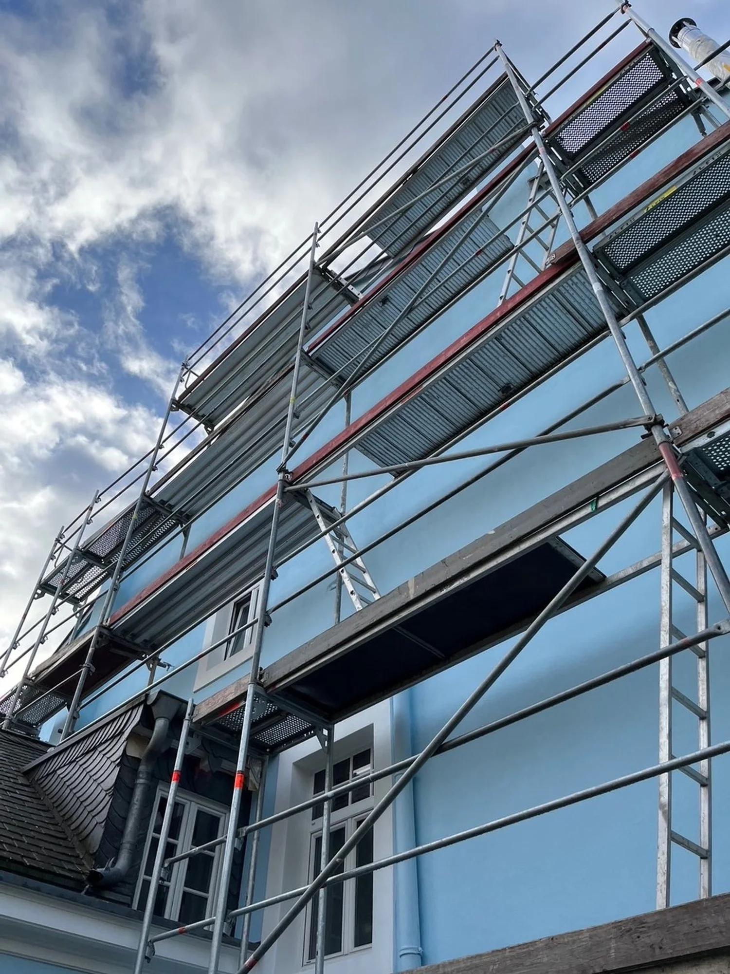
When we bought the house, the back facade was engulfed in ivy. Romantic in the way a Brontë novel is romantic: beautiful and plotting your demise. It crept, tugged at mortar, and scaled all 13 metres to the roof with the stamina of a tax inspector. After multiple rounds of scaffolding to battle the ivy, I finally opted for complete removal and professional facade restoration. An arborist muttered that ivy gets more aggressive with age and suggested the plant might be as old as the house (1870), which is to say, older than my patience. That was the moment the dream of “ivy is so romantic and surely a sustainable home to numerous birds” gave way to new plaster, new paint, new plan, no bird mess on the terrace anymore. And if we were repainting, why not reconsider the colour as well?


Notting Hill in my head, Luxembourg outside the window
The house had been a very pale blue with white frames. Think Notting Hill in London. I checked with Little Greene’s historical palette and Farrow & Ball’s beautiful pastels. The painting company produced 1 x 1 metre test boards and I pinned them to the facade like modern art. The postman developed opinions and the neighbours ran an informal poll.
Two finalists emerged: Little Greene’s Pale Berlin and a Caparol shade called Arctic Blue.
Pale Berlin has that Regency clarity that comes from Prussian Blue. The colour story is irresistible: Prussian Blue was discovered in Berlin by accident in 1704, a turning point in pigment history because it was stable and comparatively affordable. You see it everywhere, from the dials on Big Ben to Brunswick Green (when mixed with Chrome Yellow). Mix it with Lead White and the slight yellow bias of the white tips the blue a little green. That’s how you land on the elegant pale blue Little Greene “Pale Berlin 258.”

I watched those boards through sun, gloom, rain, and that special grey that parks over Luxembourg for days. Pale Berlin was a frontrunner, but on the wall, it felt just a little subdued. Arctic Blue won. Clear without being candylike, fresh in bad weather, calm in bright sun. Strong enough to read as blue from the street, restrained enough not to shout at the neighbours. Colour, done.
Now for the paint itself.
Paints: Dispersion versus silicate
The painters kept asking whether I wanted “Dispersionsfarbe”. In English, that’s standard masonry paint or acrylic: perfectly fine on many facades, easy to apply, abundant choice. There are also silicone resin paints, popular because they shed water while allowing some vapour movement. A bit like putting rubber on a facade, maybe suitable for a cube where it gives some much needed texture.
And then there is the mineral option: silicate paint. This is where my heart started beating with interest.
Silicate paint uses liquid potassium silicate as the binder. Instead of forming a plastic film, it chemically bonds to mineral substrates in a process Keim calls silicification. The result is a genuinely breathable, mineral-matte surface that allows the wall to breathe rather than suffocate old render.
And unlike plastic paints that peel in sheets, silicate is very forgiving. It allows for incredibly easy and seamless local touch-ups because the fresh mineral pigment bonds chemically with the old layers. Colour stays stable for ages because the pigments are mineral and do not throw a tantrum under UV.
There is a catch: It wants proper preparation, the right primer, and a professional who can read technical data sheets. And it is not the cheapest date in the paint aisle.
But it is designed to age gracefully with the building, rather than failing plastically like standard acrylics.
There is something telling about how we've normalised the disposable in construction. We accept that paint should peel and blister every few years, that facades should look tired after a decade. We've trained ourselves to see planned obsolescence as normal, even in something as permanent as our homes. But silicate paint bonds at the molecular level and becomes part of the wall itself.
It's architecture that commits to the long term, a radical concept in a (construction) culture increasingly built around exit strategies.
Why KEIM Silicate Paint
If you go down the silicate route, you might as well choose the inventor or as the painter put it: the Rolls Royce of paints. KEIM has been making mineral paints since 1878. Their systems are beautifully engineered, unapologetically exacting, and yes, pricier. The reward is longevity and that unmistakable mineral look that never feels plasticky or chalky. Grand buildings (even the White House in Washington!) trust it for a reason.
The process has more steps than normal paints: assess the substrate, repair with mineral materials where needed, use the KEIM primer that suits the base, then apply base and finish from the same system so the chemistry actually bonds. If your painter tries to skip a step, smile sweetly and remove the roller.
Could we get the exact Arctic Blue in KEIM? Of course. They tint with accuracy. So I kept the London-in-my-head blue, but in a paint that behaves like stone. White window frames stayed white. It is a classic because it works: crisp against the blue, serene in bad weather, sunny without looking like a gelato parlour.
Lessons from a Woman Obsessed with Test Boards
Test boards are the only way to make an informed decision. Move them around and look at them at unglamorous hours: morning glare, midday sun light, overcast sulk, drizzle, and that forgiving golden hour. Light is half the colour. Context does the rest. The same blue will look differently against slate, brick, zinc, and the neighbour’s facade colour.
Old houses prefer minerals to plastic, so let them breathe. Budget for scaffolding, then double it if ivy has colonised your life, then you will have to get the facade plastered. I opted for Keim plaster as well, but that’s another story.
Choose a system, because with silicate paints the primer and topcoats are a family and mixing brands invites drama. Expect extra steps. KEIM is fussy for good reason. The result is durability measured in decades, not diary entries.
Standing back from those test boards pinned to the facade like modern art, I realized we were conducting a small rebellion against the beige and grey and the newest brownish-purple trend. Every developer's brochure promises "timeless elegance", but what they deliver is mediocrity with surfaces that age badly, colours that fade and materials that give up.
Choosing Arctic Blue in KEIM was insisting that permanence still matters in a world increasingly designed for replacement.

Final Thought
Paint is not just paint. It’s a decision about how your house breathes and weathers, and how it speaks to the street. I kept the romance of blue and white, but traded sentimentality for science where it mattered. If you want the short version: pick your paint wisely, and do not negotiate with ivy.
written by Helen M. Krauss